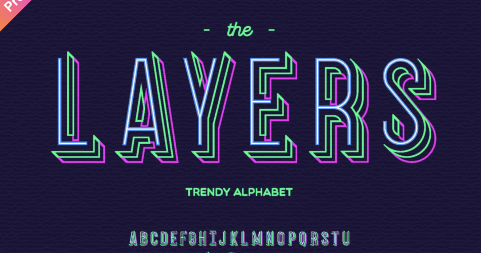
Type is typically one-color. Of course, after it’s set, a user can manipulate letters with a texture or a gradient; but out of the box, a font is usually capable of a single color. This is where layer fonts change the game. With glyphs that are designed to be overlaid on top of each other, layer fonts make it easy to apply multiple colors and other effects without extra steps or leaving the comfort of your typesetting or layout app.
Multi-layered type is not a new concept. “Chromatic” wood fonts for printing large headlines in two or more colors were common way back in the mid-1800s. Polychromatic type continued to be readily available in the photocompositing era when graphic designers sent their text to specialized typesetters to do the precision work required to line up the layers. When digital type took over, there was a noticeable lull in layered type. There were few chromatic fonts available, and making them work was now the complicated and tedious task of the designer who was suddenly given the additional role of typesetter.
But now, thanks to new typefaces (and rediscovering some old ones), better software, and time-saving tricks made possible by OpenType, chromatic type is back! Just a casual glance at graphic design blogs or Pinterest boards is enough to see that layer fonts are in fashion again.
There are plenty of interesting and useful multi-layer typefaces in the FontFont library — it may surprise you to learn we have more than 50 families with layering capabilities (even some Free FontFonts like FF Pullman and FF Koko) — but they are often overlooked because online samplers are optimized for standard, single-layer type. So let’s take a closer, multicolor look at a few and see what they can do.
What Can Layer FontFonts Do?
Make things pretty.
The most obvious use of type layers is to add decorative elements in multiple hues. A variety of FontFonts take advantage of layers to enhance their display qualities, from playful to grungy. Here are a few:
FF Beadmap, FF Minimum, FF Letterine, and FF Flava demonstrate the coloring possibilities of FontFonts with layers.
What Can Layer FontFonts Do?
Add depth and dimension.
One of the more powerful benefits of layers is transforming type from an element that simply sits on a surface to one that has a three-dimensional shape of its own. A single layer font with built-in shadows or faceting can only go so far in simulating depth. With a layer FontFont like FF Primary you can use color to give each surface an appropriate shade, making the type pop off the page or recede into stone. Over at the FontShop blog, David Sudweeks wrote a good tutorial on using FF Primary (and most other layer fonts).
What Can Layer FontFonts Do?
Add realism.
FF Kipp, inspired by a worn set of wood type, is one of the most popular typefaces with a rough, weathered contour. Still, users often overlook its layer variations which can make it an even more convincing emulation of imperfectly printed or painted letters. The extra fonts in the set offer a variety of degradation when overlaid over the base fonts. These extras can also be colored slightly different than the bottom layer resulting in an uneven, painterly effect.
What Can Layer FontFonts Do?
Give text meaning.
Layers aren’t only useful for visual appeal. Among the many smart tricks in FF Mister K are scribble, strikeout, and underline features that can enhance the meaning of text all while staying true to the informal handwritten aesthetic of the typeface. The OpenType-powered annotations are easy to apply, work with words of various lengths, and of course offer the ability to easily adjust coloring. Read more about how to use FF Mister K’s special effects in this info guide.
What Can Layer FontFonts Do?
Clarify text.
One of the graphic designer’s often encountered but seldom discussed challenges is overlaying readable type on a photograph or video. This is particularly tricky when the background has varying values of light and dark. Common hacks include drop shadows and strips of color, but it’s often more engaging when the element backing the type is in harmony with the typeface. This is where FF Jigger shines. Because there are separate fonts for front and back, each can be colored independently. And because it’s type, changes to content or color are easy to make.

