In the realm of typography, few styles have left as profound an impact as the sans-serif fonts. Characterized by its clean lines, absence of decorative flourishes, and versatile nature, the sans-serif font has established itself as a timeless choice for both digital and print mediums. From iconic logos to user-friendly websites, its influence is far-reaching and ever-evolving.
Contents
A Brief History
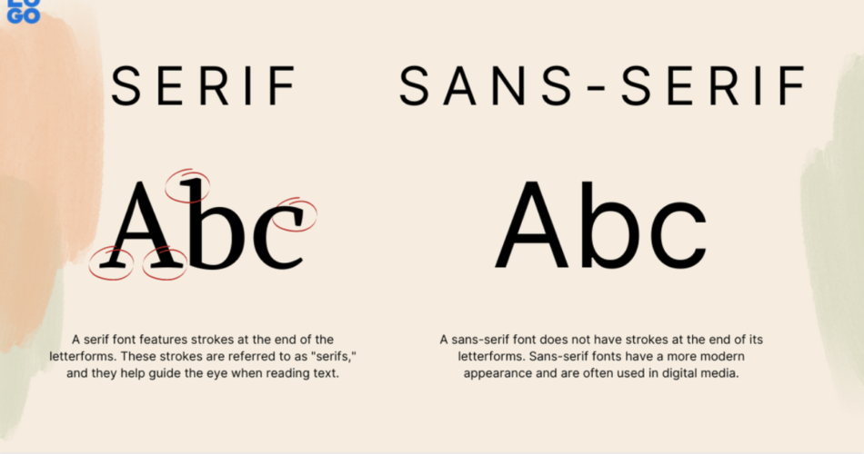
The term “sans-serif” originates from the French word “sans,” meaning “without,” and “serif,” which refers to the small decorative flourishes or extensions added to the ends of characters in serif fonts. The sans-serif style emerged in the early 19th century as a response to the ornate and elaborate serif fonts that dominated print and design. The Industrial Revolution’s emphasis on efficiency, clarity, and simplicity found a perfect visual representation in sans-serif fonts.
One of the earliest notable instances of sans-serif use was the Johnston typeface designed by Edward Johnston for the London Underground in 1916. Its legibility, especially in the fast-paced environment of a subway system, set a precedent for the functional nature of sans-serif fonts.
Clarity and Legibility
The hallmark of sans-serif fonts lies in their legibility, making them a popular choice for body text in digital interfaces and printed materials. The absence of serifs simplifies the letterforms, reducing visual complexity and enhancing readability. This clarity is particularly beneficial in smaller font sizes or low-resolution displays, where every stroke needs to be clear and distinct.
Modern Versatility
As design practices evolved, so did the usage of sans-serif fonts. From their initial application in utilitarian contexts, they have branched out to encompass a wide range of design styles. The clean lines and minimalistic attributes of sans-serif fonts make them a favorite for contemporary design trends such as flat design, minimalism, and even futuristic aesthetics.
Furthermore, sans-serif fonts are inherently adaptable. They can convey a sense of authority and professionalism in corporate branding, evoke a friendly and approachable atmosphere in advertising, or create a sense of modernity and simplicity in website design. This adaptability has led to their widespread use across various industries and design purposes.
Digital Dominance
With the rise of digital media, the importance of sans-serif fonts has grown significantly. In the context of web design, where readability across different screen sizes and devices is paramount, sans-serif fonts often take center stage. Their versatility extends to screens of all kinds, from smartphones to large desktop monitors, ensuring a consistent and pleasant reading experience for users.
Moreover, sans-serif fonts tend to be more legible on screens due to the absence of fine details that can be lost in low-resolution displays. This makes them a popular choice for user interfaces, where clarity and quick comprehension are essential.
Creative Variations
While the traditional sans-serif style emphasizes simplicity and minimalism, designers have also experimented with creative variations that add unique personalities to these fonts. Some sans-serif fonts incorporate subtle design elements, such as rounded corners or geometric shapes, to infuse character without compromising legibility. This blend of creativity and functionality showcases the adaptability of the sans-serif style.
Conclusion
In the vast landscape of typography, the sans-serif font stands as a design cornerstone. Its journey from utilitarian clarity to modern versatility speaks to its enduring relevance and adaptability. As technology continues to shape the way we communicate, the clean lines and legibility of sans-serif fonts ensure that they will remain an integral part of visual communication, offering both timeless elegance and contemporary dynamism.