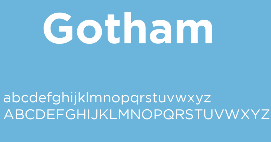
Typography plays a pivotal role in graphic design and branding, as it communicates the essence and personality of a message or brand. Gotham, a versatile and widely acclaimed typeface, has risen to prominence in the world of typography over the past two decades. Developed by type designer Tobias Frere-Jones in 2000 and later released by the Hoefler & Co. foundry, Gotham has become an emblematic choice for designers, marketers, and organizations seeking a clean, modern, and highly legible font. In this article, we will delve into the history, characteristics, and impact of the Gotham font on the design landscape.
Contents
A Brief History of Gotham
Before diving into the intricacies of Gotham, it’s essential to understand its historical context. Gotham emerged during a period when graphic designers were seeking a fresh approach to typography. In the late 20th century, there was a growing trend towards reviving classic typefaces and creating new ones inspired by historical designs. Gotham, however, stood apart from this movement by embracing modernity.
Tobias Frere-Jones, the genius behind Gotham, aimed to design a typeface that encapsulated the spirit of New York City. The name “Gotham” itself is a reference to Gotham City, the fictional home of Batman, which is often used colloquially to refer to New York. This typographic endeavor sought to capture the essence of the city’s energy, architecture, and relentless pace.
Characteristics of Gotham
Gotham font is characterized by several distinctive features that contribute to its widespread appeal and usability:
1. Geometric Simplicity
Gotham’s geometric simplicity is one of its defining attributes. The typeface adheres to a basic geometric structure, with even strokes and an absence of serifs or decorative embellishments. This minimalism makes Gotham exceptionally versatile and easy to read across various applications and sizes.
2. A Full Spectrum of Styles
Gotham offers an extensive family of weights and styles, including Regular, Light, Bold, and Italics, among others. This variety enables designers to use Gotham font in a wide range of design projects, from headlines and body text to logos and signage.
3. Exceptional Legibility
The clean lines and open letterforms of Gotham contribute to its exceptional legibility, even at small sizes. This makes it an ideal choice for web design, print materials, and signage, where readability is paramount.
4. Modern and Timeless
Despite its release in 2000, Gotham maintains a contemporary and timeless feel. It has become a staple in the design world, gracing the pages of magazines, websites, and corporate branding. Its enduring popularity is a testament to its enduring appeal.
5. Widely Used in Branding
Gotham has found a special place in the branding strategies of many prominent organizations. Companies such as Barack Obama’s 2008 presidential campaign, Twitter, and even the city of New York itself have employed Gotham in their logos and marketing materials. This widespread adoption is a testament to Gotham’s ability to convey trust, professionalism, and modernity.
Impact on Design
Gotham’s impact on design extends beyond its visual appeal. Its rise to prominence marked a shift in design philosophy toward simplicity, clarity, and adaptability. Some of the key ways Gotham has influenced design include:
1. Modernizing Corporate Branding
Many corporations seeking a modern, forward-thinking image turned to Gotham for their rebranding efforts. Its sleek, unadorned appearance helps companies convey a sense of professionalism and trustworthiness.
2. Political Campaigns
Gotham font gained recognition during Barack Obama’s 2008 presidential campaign, where it was used prominently in campaign materials and the iconic “HOPE” poster. Its association with hope, change, and progress played a crucial role in conveying the campaign’s message.
3. Digital Age Compatibility
As the digital landscape expanded, Gotham’s legibility and versatility made it a popular choice for web design. Its clean lines and open letterforms ensured that content remained clear and readable across various screens and devices.
4. Revival of Sans Serif Fonts
Gotham’s success contributed to the resurgence of sans-serif typefaces in design. It showed that simplicity could be powerful and that sans-serif fonts were not limited to minimalistic or technical applications but could also convey warmth and approachability.
Gotham’s Contemporary Relevance
As of my last knowledge update in September 2021, Gotham remained a prominent and widely used typeface. However, it’s important to note that design trends evolve over time, and new typefaces may have emerged since then. Nevertheless, Gotham’s timeless design principles and versatility are likely to continue making it a valuable asset in the designer’s toolkit for years to come.
In conclusion, Gotham font is a typeface that transcends its status as a mere font. It is a visual embodiment of modernity, clarity, and adaptability in design. Its geometric simplicity and broad range of styles have allowed it to leave an indelible mark on branding, corporate identity, and communication design. Gotham’s legacy serves as a testament to the power of typography in shaping the visual language of our times.
