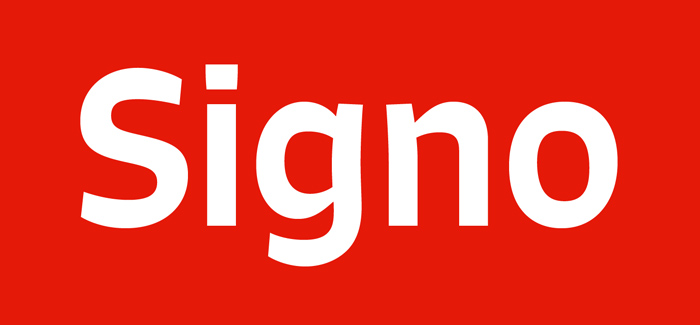
Typography plays a pivotal role in shaping the way we perceive written content. It can convey emotions, establish identity, and enhance readability. In the world of type design, Rui Abreu’s Signo typeface has garnered attention for its modern elegance and versatility. With its clean lines, harmonious proportions, and subtle uniqueness, Signo has become a favorite among designers and typographers alike. In this article, we’ll delve into the intriguing world of Signo Typeface by Rui Abreu, exploring its history, design characteristics, and its significance in contemporary typography.
Contents
The Designer: Rui Abreu
Before we delve into Signo Typeface by Rui Abreu itself, it’s essential to understand the mind behind this exceptional typeface. Rui Abreu, a talented type designer based in Porto, Portugal, is known for his meticulous approach to typography. Abreu’s work is a testament to his dedication to creating typefaces that are both aesthetically pleasing and functional. Signo is one such creation that exemplifies his craftsmanship.
The Genesis of Signo
Signo was first introduced to the world in 2015. Rui Abreu designed this typeface as a contemporary take on classic sans-serif forms. It was created with the idea of blending tradition and modernity, making it suitable for a wide range of design applications, from editorial to branding and beyond.
Design Characteristics
Clean and Geometric
Signo’s most striking feature is its clean and geometric design. The characters are constructed with precision, featuring straight lines, even curves, and consistent proportions. This geometric approach enhances the legibility of the typeface, making it versatile for various contexts.
Elegant and Versatile
Signo strikes a balance between elegance and versatility. Its elegance makes it suitable for high-end branding, fashion, and editorial projects, while its versatility ensures it remains accessible and functional for diverse design needs.
Wide Range of Weights
Signo comes in a variety of weights, from Light to ExtraBold. This expansive range allows designers to choose the right weight for their specific project, whether it’s for headlines, body text, or something in between.
Open Apertures and Distinctive Details
The typeface features open apertures, which improve readability, especially in small sizes. Additionally, it has distinctive details, such as the slightly curved terminals on some characters, adding a touch of uniqueness to the overall design.
Extended Character Set
Signo includes an extensive character set, covering multiple languages and special characters, making it a global typeface suitable for diverse audiences.
Significance in Contemporary Typography
Signo has gained recognition and acclaim in the world of contemporary typography for several reasons:
Adaptability
Its adaptability to various design contexts, from web design to print media, has made Signo a favorite among designers seeking a typeface that can seamlessly integrate into their projects.
Clarity and Legibility
The clear and legible design of Signo ensures that the message in the text remains easily readable, even in challenging conditions or on various screen sizes.
Timeless Aesthetics
Signo’s blend of classic and modern design elements gives it a timeless quality. It doesn’t adhere to fleeting design trends, making it a reliable choice for designers who seek longevity in their projects.
Positive Reception
Designers and typographers worldwide have praised Signo for its elegance and functionality. Its positive reception has led to its inclusion in various design projects, reinforcing its importance in contemporary design.
Conclusion
In the world of type design, Rui Abreu’s Signo typeface stands out as a masterpiece of modern elegance. With its clean lines, versatile weights, and distinctive details, Signo embodies the principles of functionality and aesthetics. It has carved a niche for itself in contemporary typography, earning the admiration of designers and typographers for its adaptability and timeless appeal. As design trends continue to evolve, Signo by Rui Abreu remains a reliable choice for those who appreciate the power of typography to convey messages with clarity and style.
