Typography is more than an art—it’s actually a science. In fact, research on the subject has revealed that choices in font style, letter spacing, font size, font color, and line spacing sparks various reactions from readers. According to Voltage New Media which published the study, typeface affects readability, comprehension, and reader’s mood; a business establishment must therefore convey the right message when it comes to logos, ads, product labels, letterheads, or any virtualization by the company. This principle did not escape casino owners, as evidenced by the powerful and bold marquees in Las Vegas and Atlantic City. One tries to be flashier than the others, while some stand out in their simplicity and classic elegance. Typography styles in casinos, like other businesses in different industries, target a specific market, and creativity plays a crucial role in drawing people in.
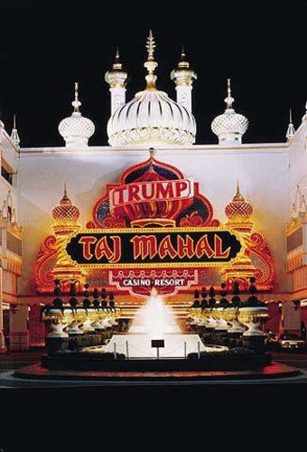
Places like Sin City are more than just a gaming haven; they’re also a place design enthusiasts can get lost in. Admittedly, patrons choose a particular casino not only for the offered table games or slot machines, as these will most probably be the same all throughout the block—for this reason, casinos strive to up the ante by being uniquely designed and virtually engaging. Since the marquee is the first one seen by potential clients, it should grab the most attention. Let’s take for instance the famous Atlantic City casino, the Trump Taj Mahal. Aside from its recent partnership with online gaming platform casino, another move worthy of acclaim is its design, specifically the typography. It veered away from the traditional ostentatious casino signs by incorporating an Indian vibe, with the “Trump” insignia as a banner. This complements the total structure of the casino resort, while at the same time maintaining a formidable look by itself.
Since it has become known as an effective design, many want to add casino typography to their websites. Photoshop Tutorials & Resources gave a step-by-step procedure on how to achieve casino style typography, as follows:
Contents
Step 1:
Select black background, then type text using “Impact” font.
Step 2:
Layer style: tick drop shadow (opacity 100%, angle 95 degrees).
Step 3:
Tick inner shadow box, with opacity at 87% and angle 95 degrees).
Step 4:
Select bevel and emboss option and adjust accordingly.
Step 5:
Add stroke to the font; remember to make it lighter than the one used as font for main text.
Step 6:
Make light bulbs using the Ellipse tool.
Step 7:
Add a backdrop using a textured image by bringing it in the canvas.
Step 8:
Add depth by selecting “overlay” in the blending options.
Step 9:
Add a Gaussian blur. Go to Filter, Blur, then choose Gaussian blur effect.
Step 10:
Add final touches.
