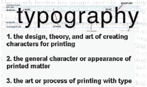
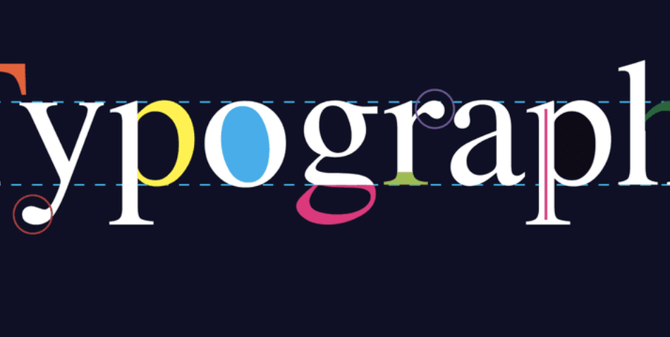
Typography is the art that arranges letters and text to make the copy legible, clear, and visually appealing to the reader. It involves the style, appearance, and structure of the font, aiming to evoke certain emotions and convey specific messages. At its heart,accorrding to typography definition , typography is a crucial part of the design process and plays a significant role in the effectiveness of the written word.

Typography definition
Contents
Elements of Typography
Several elements work together in typography to create a harmonious result:
- Typeface and Font: A typeface refers to the design of lettering that can include variations in size, weight (bold, light, regular), and style (italic, normal, oblique). A font is a specific size and style within a typeface. For example, Arial is a typeface, and Arial Bold 12pt is a font.
- Hierarchy: This arrangement of text signifies importance. Headlines or important points typically use larger, bolder fonts, while body text uses smaller fonts.
- Alignment: Text can align to the left, right, center, or justify. Each alignment has its place and can affect readability and the overall look of the text.
- Spacing: This includes kerning (space between individual characters), tracking (spacing across words or phrases), and leading (space between lines). Proper spacing prevents the text from looking too cramped or stretched out.
- Contrast: Using contrasting fonts or styles can draw attention to specific parts of the text and improve readability.
- Consistency: Keeping consistent rules for the use of typefaces, sizes, and styles throughout a document helps maintain a professional and cohesive look.
Why Typography Matters
Good typography enhances the reading experience. It’s not just about making things look attractive; it also focuses on functionality. Well-designed text is easy to read and understand. Poor typography can lead to confusion, fatigue, and even headaches. It can also distract from the message you’re trying to convey.
In marketing and branding, typography is crucial because it contributes to the brand’s voice and personality. Consider Coca-Cola’s iconic script font or the modern simplicity of Apple’s sans-serif typography. These choices help define the company’s image and how customers perceive them.
Typography in Digital Design
With the rise of digital media, typography has evolved. Screen readability differs from print due to factors like screen resolution and backlighting. As a result, designers must consider aspects such as color contrast, font size, and screen size when creating digital content.
Responsive typography is another aspect of digital design. This means that text should be easily readable on devices of varying sizes, from large desktop monitors to small mobile phones. This requires flexible layouts and scalable vector graphics (SVGs) to ensure text looks good at any size.
Learning Typography
Anyone interested in design should understand typography basics. Many resources are available, from books to online courses, that teach the principles of good typography. Practice is also key. Experimenting with different fonts, sizes, and arrangements can help one develop an eye for what works and what doesn’t.
Conclusion
Typography is a powerful tool in both print and digital media. It’s not just about choosing a font; it’s about creating an experience for the reader. Good typography leads to clear communication, effective branding, and aesthetically pleasing designs. Whether you’re a designer, a marketer, or just someone who appreciates good design, understanding the basics of typography is essential.
