If you’ve ever looked at a piece of text and thought, “Something feels off,” chances are it had poor kerning. Kerning in typography is one of those subtle design elements that can make or break how professional and polished your content looks. While many people overlook it, proper kerning can dramatically improve readability, visual harmony, and brand perception.
In this guide, we’ll break down everything you need to know about kerning in typography, why it matters, and how you can master it — even if you’re just starting out in design.
Contents
- 1 What Is Kerning in Typography?
- 2 Why Kerning in Typography Is So Important
- 3 Real-Life Examples of Kerning in Typography (Good and Bad)
- 4 Common Kerning Mistakes to Avoid
- 5 Tools That Help with Kerning in Typography
- 6 How to Kern Text Like a Pro
- 7 Kerning in Typography for Web vs. Print
- 8 The Psychology of Kerning in Typography
- 9 Kerning in Typography and Branding
- 10 Case Study: Rebranding with Better Kerning
- 11 Typography Terms You Should Know
- 12 Tips for Beginners Learning Kerning in Typography
- 13 FAQs About Kerning in Typography
- 14 Final Thoughts
What Is Kerning in Typography?

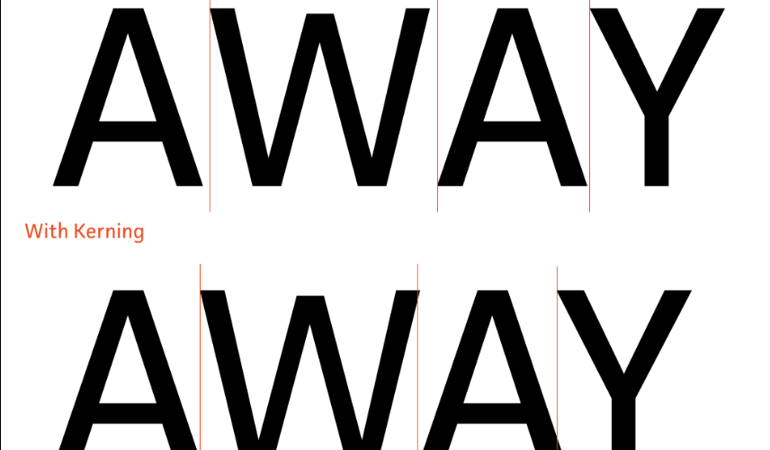
Kerning refers to the process of adjusting the spacing between individual letter pairs to achieve visually pleasing and consistent text. It’s not about uniformly spacing all characters — that’s tracking. Instead, kerning in typography is about tweaking specific pairs like “A” and “V” or “T” and “o” so they don’t appear too far apart or uncomfortably close.
Kerning vs. Tracking vs. Leading
- Kerning: Adjusts space between specific pairs of characters.
- Tracking: Adjusts the overall spacing across a range of characters.
- Leading: Controls the vertical space between lines of text.
Each plays a role in creating legible, attractive type, but kerning is what brings finesse to your typography.
Why Kerning in Typography Is So Important
1. First Impressions Count
Poor kerning can make a brand look amateurish, while good kerning signals professionalism and attention to detail. Imagine a logo or headline with awkward spacing — it can instantly turn people off.
2. Improves Readability
Kerning directly impacts how easy text is to read. Uneven spacing makes your audience work harder to understand your message, which can lead them to bounce or disengage.
3. Boosts Aesthetic Appeal
Balanced spacing creates a visually harmonious composition. Whether you’re designing a flyer, logo, or website, kerning in typography adds that polished, aesthetically pleasing touch.
4. Reinforces Brand Identity
Typography is a cornerstone of visual branding. A well-kerned logotype feels intentional and memorable. Bad kerning? It makes your brand forgettable or, worse, laughable.
5. Supports Effective Communication
Text is meant to convey a message. Poor kerning introduces confusion or misinterpretation. Good kerning ensures your message is clear and easy to absorb.
Real-Life Examples of Kerning in Typography (Good and Bad)
Good Kerning:
- Apple: Their minimalist design philosophy includes impeccable kerning, enhancing readability and brand consistency.
- Nike: Clean, consistent kerning strengthens the brand’s bold identity.
Bad Kerning:
- Public Signs: Ever seen a sign that accidentally reads as a different word because the spacing was off? Bad kerning causes visual confusion.
- Amateur Logos: DIY logos often suffer from poor kerning, which can make the design appear sloppy.
Common Kerning Mistakes to Avoid
- Relying Too Much on Auto-Kerning
- Default settings are good, but not perfect. Always review your text manually.
- Not Checking at Different Sizes
- What looks good at 72pt may not work at 12pt. Always check at various scales.
- Ignoring Specific Letter Pairs
- Watch out for tricky combinations like AV, To, WA, and Yo.
- Inconsistent Spacing in Headlines
- In headlines and logos, kerning inconsistencies stand out more. Be precise.
Tools That Help with Kerning in Typography
Design Software
- Adobe Illustrator
- Adobe InDesign
- Figma
- Sketch
Online Tools
- KernType Game: Learn kerning by practicing.
- FontForge: Open-source font editor that lets you manually adjust kerning.
How to Kern Text Like a Pro
Step 1: Zoom In
Work closely with your letters to get a precise view of the spacing.
Step 2: Look for Visual Balance
Don’t measure the space mathematically — judge it visually. Your goal is optical balance.
Step 3: Use a Grid or Baseline
Maintain alignment while making spacing adjustments.
Step 4: Kern High-Impact Text First
Start with headlines, titles, logos — the elements people see first.
Step 5: Step Back and Review
Look at your work from a distance and across different devices or formats.
Kerning in Typography for Web vs. Print
Web Typography:
- Responsiveness is key.
- Pixel perfection is harder, but CSS tools like
letter-spacinghelp. - Browsers render type differently, so test across devices.
Print Typography:
- Offers more control.
- High DPI allows for finer detail.
- Kerning mistakes are more permanent.
The Psychology of Kerning in Typography
Typography isn’t just a visual tool; it affects how people feel about your content.
Good Kerning Says:
- “This brand pays attention to detail.”
- “This text is easy to read and trustworthy.”
- “This feels professional and credible.”
Bad Kerning Says:
- “This looks rushed or careless.”
- “The brand didn’t invest in quality design.”
- “I can’t take this seriously.”
Your audience might not know the term “kerning,” but they can feel its effects.
Kerning in Typography and Branding
Your brand identity relies heavily on consistent, professional visuals. Logos, packaging, business cards, and ads must all work together. Consistent kerning across brand assets strengthens recognition and builds trust.
Brands like Google, Coca-Cola, and Airbnb obsess over these tiny details — because they know it’s worth it.
Case Study: Rebranding with Better Kerning
Let’s say a small business redesigns their logo and adjusts kerning to fix spacing issues. The result?
- Increased professionalism
- Better recognition
- Higher engagement on digital platforms
- Even improved conversion rates due to perceived trust
Yes, kerning can influence business results.
Typography Terms You Should Know
- Glyph: A single character in a font.
- Baseline: The line upon which letters sit.
- X-height: The height of lowercase letters, specifically the letter “x.”
- Ascender/Descender: Parts of letters that extend above/below the x-height.
- Ligature: Two or more letters combined into a single glyph.
Knowing these helps you kern more effectively.
Tips for Beginners Learning Kerning in Typography
- Start with Sans Serif Fonts: Easier to learn with clean, simple letterforms.
- Print It Out: Sometimes spacing issues are more obvious on paper.
- Get Feedback: Share your work with other designers.
- Use Grayscale: Removing color helps focus purely on spacing.
- Practice Daily: Like any skill, repetition makes you better.
FAQs About Kerning in Typography
What is the purpose of kerning?
Kerning ensures that the spacing between specific letter pairs looks visually balanced.
Can I kern text in Word or Google Docs?
Basic kerning is available, but professional design software offers better control.
Is kerning really noticeable to non-designers?
Yes — even if they can’t name it, people sense when text looks “off.”
Should I manually kern every word?
Focus on key text like logos, headlines, and titles. Body text can use auto-kerning.
Are some fonts better kerned than others?
Absolutely. High-quality fonts are often manually kerned by type designers.
Final Thoughts
Kerning in typography might seem like a tiny detail, but it has a massive impact on how your message is received. It affects readability, visual appeal, brand perception, and even trustworthiness. Whether you’re creating a logo, designing a website, or publishing a brochure, paying attention to kerning can elevate your design from amateur to professional.
Take the time to learn, practice, and perfect it — your audience will notice, even if they don’t know why your design looks so good.