As a seasoned writer and design enthusiast, I’ve always been captivated by the timeless allure of Garamond font. This exquisite typeface, with its rich history and unparalleled elegance, has long been regarded as a true masterpiece of typography. In this article, we’ll delve into the fascinating journey of Garamond font, exploring its origins, characteristics, and the profound influence it has had on the world of design and literature.

Garamond Font
History and Evolution of Garamond Font
Garamond font traces its roots back to the 16th century, when it was developed by the renowned French punch-cutter and typeface designer, Claude Garamond. Inspired by the humanist typefaces of the Renaissance, Garamond created a font that embodied the essence of elegance and readability. Over the centuries, Garamond’s design has undergone various interpretations and adaptations, giving rise to numerous variants that have captivated designers and typographers alike.
The Characteristics of Garamond Font
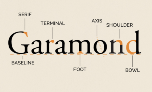
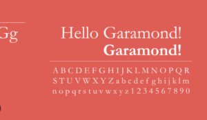
Garamond font is renowned for its exquisite balance and harmonious proportions. Its distinctive features include:
- Elegant Serifs: Garamond’s serifs are delicate and graceful, adding a touch of refinement to the overall appearance of the font.
- Subtle Contrast: The font exhibits a gentle contrast between the thick and thin strokes, creating a sense of visual balance and sophistication.
- Rounded Shapes: The letterforms in Garamond font are characterized by their soft, rounded shapes, contributing to the font’s timeless and classic aesthetic.
- Excellent Legibility: Despite its ornate appearance, Garamond font is highly legible, making it a popular choice for body text in books, magazines, and other printed materials.

Garamond Font
Famous Uses of Garamond Font in Literature and Printing
Garamond font has been a staple in the world of literature and printing for centuries. From the pages of classic novels to the covers of prestigious publications, this typeface has left an indelible mark on the literary and design landscape. Notable examples include the use of Garamond in the original editions of Ernest Hemingway’s “The Sun Also Rises” and the iconic Penguin Classics book series.
The Influence of Garamond Font on Modern Typography
The enduring popularity of Garamond can be attributed to its timeless elegance and its profound influence on the evolution of modern typography. Many contemporary typeface designers have drawn inspiration from Garamond’s design principles, creating their own interpretations and variations that pay homage to this iconic font. The legacy of Garamond continues to shape the way we perceive and interact with the written word, both in print and digital mediums.
Garamond Font in Digital Media and Web Design
As the digital age has transformed the way we consume and create content, Garamond has seamlessly transitioned into the realm of web design and digital media. Its readability and classic aesthetic make it a popular choice for websites, e-books, and digital publications. Designers have leveraged the versatility of Garamond to create visually striking and user-friendly digital experiences that captivate audiences.
Tips for Using Garamond Font Effectively in Various Design Projects
When it comes to utilizing Garamond font in your design projects, there are a few key considerations to keep in mind:
- Pairing Garamond with Complementary Fonts: Garamond pairs beautifully with sans-serif fonts, creating a harmonious contrast that enhances the overall visual appeal of your design.
- Adjusting Kerning and Leading: Careful adjustments to the kerning and leading (line spacing) of Garamond can help optimize its readability and ensure a polished, professional appearance.
- Considering Font Variations: Explore the various Garamond variants, such as Garamond Premier Pro or Adobe Garamond, to find the version that best suits your design needs.
- Ensuring Accessibility: When using Garamond in digital contexts, ensure that the font size and contrast meet accessibility guidelines for optimal readability.
Garamond Font Alternatives and Variations
While Garamond remains a timeless classic, there are several alternatives and variations that designers may consider, depending on their specific project requirements. These include:
- EB Garamond: A modern interpretation of the Garamond typeface, featuring a slightly more pronounced contrast and a more contemporary feel.
- Cormorant Garamond: A versatile Garamond-inspired font that offers a range of weights and styles, making it suitable for a variety of design applications.
- Crimson Text: A Garamond-influenced font with a slightly more robust and sturdy appearance, ideal for body text in longer-form content.
How to Download and Install Garamond Font
Garamond font is widely available and can be easily obtained from various online font repositories. To download and install Garamond font, follow these simple steps:
- Visit a reputable font marketplace, such as Google Fonts, Adobe Fonts, or MyFonts.
- Search for “Garamond” and select the version that best suits your needs.
- Download the font file (typically in .ttf or .otf format).
- Install the font on your computer according to your operating system’s instructions.
- Once installed, the Garamond font will be available for use in your design software and applications.
Explore our comprehensive guide on how to effectively incorporate Garamond into your design projects and unlock the full potential of this timeless typographic masterpiece.
Conclusion
In the ever-evolving world of typography, Garamond stands as a testament to the enduring power of elegant and timeless design. Its rich history, distinctive characteristics, and profound influence on modern typography have cemented its status as a true masterpiece. As designers and writers, we have the privilege of harnessing the captivating beauty of Garamond to create works that inspire and captivate audiences. By embracing the timeless elegance of this iconic font, we can elevate our creative endeavors and leave an indelible mark on the world of design and literature.
