Art Deco, a style that flourished in the early 20th century, is known for its distinctive visual aesthetic, characterized by geometric shapes, bold colors, and a sense of opulence and glamour. At the heart of this captivating design movement lies the art of typography, which played a crucial role in shaping the visual language of the era. Art Deco typography is a unique and captivating style that continues to inspire designers and artists today.
In this comprehensive article, we will embark on a journey through the history, key characteristics, and enduring influence of Art Deco typography. We will explore the iconic examples that have left an indelible mark on the world of graphic design, and delve into the ways in which this timeless style continues to be reinterpreted and reimagined in contemporary design.
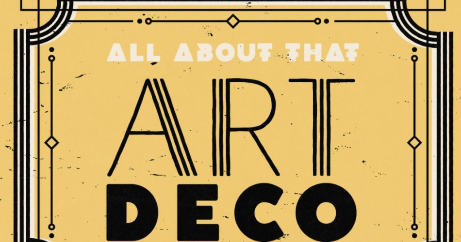
art deco typography
Contents
- 1 History of Art Deco Typography
- 2 Key Characteristics of Art Deco Typography
- 3 Famous Examples of Art Deco Typography
- 4 The Influence of Art Deco Typography on Graphic Design
- 5 Tips for Creating Art Deco Typography Designs
- 6 Exploring the Use of Art Deco Typography in Different Industries
- 7 Art Deco Typography in Contemporary Design
- 8 Resources for Learning and Exploring Art Deco Typography
- 9 Conclusion
History of Art Deco Typography
The origins of Art Deco typography can be traced back to the early 20th century, a time of rapid technological and social change. As the world emerged from the ravages of World War I, a new aesthetic sensibility began to take shape, one that celebrated modernity, optimism, and a sense of luxury.
The Art Deco movement, which gained prominence in the 1920s and 1930s, drew inspiration from a diverse range of sources, including the geometric abstraction of Cubism, the sleek lines of Streamline Moderne, and the opulent decorative arts of the past. Typography, as a fundamental element of visual communication, played a crucial role in this artistic revolution.
Designers and typographers of the era experimented with bold, geometric letterforms, creating a distinct visual language that was both striking and elegant. The use of bold, sans-serif typefaces, geometric shapes, and a focus on symmetry and balance became hallmarks of the Art Deco typographic style.
Key Characteristics of Art Deco Typography
The distinctive features of Art Deco typography can be summarized as follows:
- Geometric Shapes: Art Deco typography is characterized by the use of bold, geometric shapes, such as rectangles, triangles, and chevrons, which are often used to create a sense of dynamism and movement.
- Sans-Serif Typefaces: Art Deco designers favored the use of clean, sans-serif typefaces, such as Futura, Gill Sans, and Helvetica, which were well-suited to the sleek, modern aesthetic of the movement.
- Symmetry and Balance: Art Deco typography often exhibits a strong sense of symmetry and balance, with elements arranged in a visually harmonious and elegant manner.
- Decorative Flourishes: While the overall aesthetic is streamlined and minimalist, Art Deco typography may incorporate decorative flourishes, such as serifs, ligatures, and stylized terminals, to add a touch of visual interest and luxury.
- Bold and Striking: Art Deco typography is characterized by a bold, confident, and attention-grabbing presence, often achieved through the use of large, prominent letterforms and high-contrast color schemes.
- Versatility: The adaptability of Art Deco typography allowed it to be applied across a wide range of media, from posters and advertisements to packaging and product design, making it a versatile and influential style.
Famous Examples of Art Deco Typography
Throughout the heyday of the Art Deco movement, numerous iconic examples of typography emerged, leaving a lasting impact on the world of design. Some of the most renowned and influential examples include:
- Chrysler Building Lettering: The distinctive lettering adorning the iconic Chrysler Building in New York City is a prime example of the Art Deco typographic style, featuring bold, geometric letterforms and a sense of grandeur.
- Coca-Cola Logo: The Coca-Cola logo, which underwent a stylistic transformation in the 1930s, is a classic example of Art Deco typography, with its sleek, streamlined letterforms and decorative flourishes.
- Odeon Cinema Signage: The signage and branding for the Odeon Cinema chain in the United Kingdom is a quintessential representation of Art Deco typography, with its striking, geometric letterforms and bold color palette.
- Pears’ Soap Packaging: The packaging design for Pears’ Soap, featuring a distinctive typographic treatment and geometric patterns, is a celebrated example of the Art Deco aesthetic in the realm of product design.
- Hoover Building Lettering: The lettering adorning the Hoover Building in London, a renowned example of Art Deco architecture, showcases the elegance and refinement of the typographic style.
These and many other iconic examples of Art Deco typography continue to inspire designers and artists, demonstrating the enduring appeal and influence of this captivating design movement.
The Influence of Art Deco Typography on Graphic Design
The impact of Art Deco typography on the world of graphic design cannot be overstated. The distinctive visual language of the movement has left an indelible mark on the industry, influencing the work of countless designers and shaping the aesthetic sensibilities of generations.
One of the primary ways in which Art Deco typography has influenced graphic design is through its ability to convey a sense of luxury, sophistication, and modernity. The bold, geometric letterforms and symmetrical compositions of Art Deco typography have become synonymous with a certain level of elegance and refinement, making them a popular choice for high-end branding, packaging, and advertising.
Furthermore, the versatility of Art Deco typography has allowed it to be reinterpreted and adapted across various design disciplines, from print media to digital platforms. Designers have continued to draw inspiration from the timeless principles of Art Deco, incorporating its visual elements into their work to create a sense of nostalgia, retro-futurism, and timeless appeal.
The influence of Art Deco typography can be seen in the work of contemporary designers, who have reimagined and recontextualized the style to suit the needs of modern audiences. From the use of geometric patterns and bold color schemes to the incorporation of vintage-inspired typefaces, the legacy of Art Deco typography continues to shape the visual landscape of graphic design.
Tips for Creating Art Deco Typography Designs
For designers and artists looking to capture the essence of Art Deco typography in their work, here are some valuable tips to consider:
- Embrace Geometric Shapes: Incorporate bold, geometric shapes, such as rectangles, triangles, and chevrons, into your typographic compositions to create a sense of dynamism and visual interest.
- Opt for Sans-Serif Typefaces: Choose clean, sans-serif typefaces that evoke the sleek, modern aesthetic of the Art Deco movement, such as Futura, Gill Sans, or Helvetica.
- Prioritize Symmetry and Balance: Arrange your typographic elements in a visually harmonious and balanced manner, paying close attention to the overall symmetry of your design.
- Add Decorative Flourishes: While maintaining a streamlined, minimalist approach, consider incorporating subtle decorative flourishes, such as serifs, ligatures, or stylized terminals, to add a touch of luxury and visual interest.
- Experiment with Bold and Contrasting Colors: Embrace a bold, high-contrast color palette to create a striking and attention-grabbing visual impact, characteristic of the Art Deco style.
- Explore Versatile Applications: Recognize the versatility of Art Deco typography and explore its application across a wide range of media, from posters and packaging to digital interfaces and product design.
- Study Historic Examples: Immerse yourself in the rich history of Art Deco typography by studying iconic examples from the past, as this can provide valuable inspiration and a deeper understanding of the design principles that defined the movement.
By incorporating these tips into your design process, you can create captivating Art Deco-inspired typography that pays homage to the elegance and timelessness of this celebrated design style.
Exploring the Use of Art Deco Typography in Different Industries
The timeless appeal and versatility of Art Deco typography have allowed it to be applied across a wide range of industries, each with its unique set of design challenges and considerations.
In the realm of branding and marketing, Art Deco typography has been used to convey a sense of luxury, sophistication, and modernity, making it a popular choice for high-end products and services. Iconic examples include the Coca-Cola logo and the branding for the Odeon Cinema chain.
In the fashion and beauty industries, Art Deco typography has been embraced to create a sense of glamour and opulence, as seen in the packaging and advertising of luxury cosmetic brands and high-fashion labels.
The hospitality and entertainment sectors have also embraced the Art Deco aesthetic, with the distinctive lettering adorning the Chrysler Building and the Hoover Building serving as prime examples of how this typographic style can be used to evoke a sense of grandeur and timelessness.
In the realm of product design, the Pears’ Soap packaging is a renowned example of how Art Deco typography can be seamlessly integrated into the visual identity of a brand, creating a cohesive and visually appealing design.
As the digital age has progressed, the influence of Art Deco typography has also extended into the tech and digital industries, where designers have found innovative ways to incorporate its geometric forms and bold aesthetics into user interfaces, web design, and digital branding.
Across these diverse industries, the enduring appeal of Art Deco typography lies in its ability to transcend time and trends, offering designers a timeless and versatile tool for creating visually striking and memorable designs.
Art Deco Typography in Contemporary Design
While the Art Deco movement may have reached its peak in the early 20th century, its influence on contemporary design remains undeniable. Designers and artists continue to draw inspiration from the distinctive visual language of Art Deco typography, reinterpreting and reimagining it to suit the needs and aesthetics of the modern era.
In the realm of print media, the bold, geometric letterforms and symmetrical compositions of Art Deco typography have been embraced by designers to create eye-catching magazine covers, book covers, and promotional materials that evoke a sense of nostalgia and timeless elegance.
In the digital space, the user interface and web design industries have found innovative ways to incorporate Art Deco-inspired typography, blending the sleek, modern aesthetic of the movement with the dynamic and interactive nature of digital platforms.
The fashion and lifestyle sectors have also continued to draw inspiration from Art Deco typography, incorporating its visual elements into the branding, packaging, and marketing materials of high-end brands and luxury products.
Moreover, the influence of Art Deco typography can be seen in the product design and industrial design fields, where designers have leveraged the style’s geometric forms and bold aesthetics to create visually striking and functional objects that capture the essence of the movement.
As designers and artists continue to explore the rich legacy of Art Deco typography, the style’s enduring appeal and versatility ensure that it will continue to shape the visual landscape of contemporary design for years to come.
Resources for Learning and Exploring Art Deco Typography
For those interested in delving deeper into the world of Art Deco typography, there are a wealth of resources available to help you expand your knowledge and hone your skills:
- Books: Explore publications such as “Art Deco Typography” by Alastair Duncan, “The Art Deco Style” by Bevis Hillier, and “Art Deco: A Mode of Mobility” by Nathalie Lemoine-Bouchard, which provide in-depth analyses and historical insights into the Art Deco movement and its typographic legacy.
- Online Tutorials and Courses: Take advantage of online resources like Skillshare, Udemy, and Domestika, which offer a variety of courses and tutorials focused on the principles and techniques of Art Deco typography design.
- Design Blogs and Magazines: Stay up-to-date with the latest trends and developments in Art Deco typography by following design-focused blogs and magazines, such as Designspiration, AIGA Eye on Design, and Communication Arts.
- Typography Foundries: Explore the offerings of typography foundries like Monotype, FontShop, and Hoefler&Co., which provide a wide selection of Art Deco-inspired typefaces and font families that can be incorporated into your design projects.
- Museum and Gallery Exhibitions: Keep an eye out for museum and gallery exhibitions that showcase the work of Art Deco designers and typographers, as these can offer valuable insights and inspiration for your own creative endeavors.
- Online Design Communities: Engage with like-minded designers and artists on platforms like Behance, Dribbble, and Reddit’s r/typography subreddit to share your work, seek feedback, and learn from the experiences of others.
By tapping into these diverse resources, you can deepen your understanding of the rich history and enduring influence of Art Deco typography, and unlock new avenues for incorporating this captivating design style into your own creative projects.
Conclusion
The timeless elegance and enduring influence of Art Deco typography are undeniable. From the bold, geometric letterforms that defined the movement to the versatility of its application across a wide range of industries, this distinctive design style has left an indelible mark on the world of graphic design.
As we have explored in this article, the history, key characteristics, and iconic examples of Art Deco typography have inspired generations of designers and artists, shaping the visual language of the modern era. By understanding the principles and techniques that underpin this captivating style, designers can unlock new possibilities for creating visually striking and memorable designs that capture the essence of the Art Deco movement.
Whether you’re a seasoned designer or a newcomer to the world of typography, the resources and insights provided in this article can serve as a valuable starting point for your own exploration of the timeless elegance of Art Deco typography. By embracing the bold, geometric forms and symmetrical compositions that define this style, you can create designs that evoke a sense of nostalgia, sophistication, and timeless appeal.
Discover the power of Art Deco typography in your next design project. Explore our comprehensive resources and connect with our community of designers to unlock new creative possibilities. Contact us today to learn more!