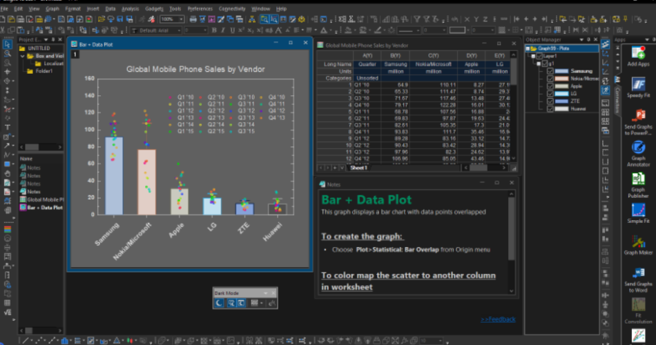
In recent years, dark mode has become a dominant trend in design, and its influence has extended to data visualization. Dark mode graphs are not just a stylistic choice—they’re a functional and aesthetic upgrade that enhances user experience, reduces eye strain, and makes data more engaging. Whether you’re designing dashboards, reports, or presentations, dark mode graphs are a powerful tool for modern data storytelling. In this article, we’ll explore everything you need to know about dark mode graphs, including their benefits, design principles, and best practices.
Contents
What Are Dark Mode Graphs?

Dark mode graphs are data visualizations designed with a dark background, typically using shades of black, gray, or deep blue. The data points, lines, and labels are displayed in lighter, high-contrast colors to ensure readability. This design approach is especially popular in apps, websites, and software that offer dark mode as a user preference.
Why Dark Mode Graphs Are Trending
1. Reduced Eye Strain
- Dark mode reduces the amount of bright light emitted by screens, making it easier on the eyes, especially in low-light environments.
- This is particularly beneficial for users who spend long hours analyzing data or working late at night.
2. Improved Focus on Data
- The dark background minimizes distractions, allowing the viewer to focus on the data itself.
- High-contrast elements like bright lines, bars, or points stand out more prominently.
3. Modern and Sleek Aesthetic
- Dark mode graphs have a sophisticated, tech-savvy look that appeals to modern audiences.
- They align with the design trends of popular platforms like YouTube, Twitter, and Instagram, which offer dark mode options.
4. Energy Efficiency
- On OLED and AMOLED screens, dark mode consumes less power, as black pixels are essentially turned off.
- This makes dark mode graphs a sustainable choice for mobile and web applications.
Key Design Principles for Dark Mode Graphs
Creating effective dark mode graphs requires careful attention to design principles. Here’s how to get it right:
1. Use High-Contrast Colors
- Ensure that data points, lines, and labels are clearly visible against the dark background.
- Opt for bright, saturated colors like neon green, electric blue, or vibrant orange.
2. Avoid Pure Black
- Pure black backgrounds can create harsh contrasts and strain the eyes. Instead, use dark gray or deep navy blue for a softer look.
3. Limit Brightness
- Avoid using overly bright colors for large areas, as they can cause glare. Reserve bright colors for key data points or highlights.
4. Incorporate Gradients
- Gradients can add depth and visual interest to dark mode graphs. For example, use a gradient fill for bar charts or area graphs.
5. Use Subtle Gridlines and Labels
- Keep gridlines and axis labels subtle by using light gray or muted colors. This ensures they don’t overpower the data.
6. Test for Accessibility
- Ensure your dark mode graphs are accessible to all users, including those with color vision deficiencies. Use tools like colorblind-friendly palettes and sufficient contrast ratios.
Best Practices for Dark Mode Graphs
1. Choose the Right Chart Type
- Not all chart types work equally well in dark mode. Bar charts, line graphs, and pie charts are particularly effective, while heatmaps may require adjustments to ensure readability.
2. Add Annotations and Highlights
- Use annotations, tooltips, or highlighted sections to draw attention to key insights. This is especially important in dark mode, where subtle details might be harder to notice.
3. Optimize for Mobile and Desktop
- Dark mode graphs should look great on all devices. Test your designs on both mobile and desktop screens to ensure consistency.
4. Provide a Toggle Option
- If possible, offer users the option to switch between dark mode and light mode. This ensures your graphs are accessible to everyone, regardless of their preferences.
5. Use Consistent Branding
- Incorporate your brand’s colors and style into your dark mode graphs to maintain a cohesive look across all platforms.
Tools for Creating Dark Mode Graphs
Here are some popular tools and libraries for designing dark mode graphs:
- Tableau: Offers built-in dark mode themes and customizable color palettes.
- Power BI: Allows users to create dark mode dashboards with high-contrast visuals.
- D3.js: A JavaScript library for creating interactive, customizable dark mode graphs.
- Chart.js: Supports dark mode with easy-to-implement themes and configurations.
- Figma: Great for designing dark mode graph prototypes with collaborative features.
Examples of Dark Mode Graphs in Action
1. Financial Dashboards
- Dark mode graphs are widely used in financial apps to display stock prices, revenue trends, and investment portfolios. The sleek design enhances the professional look of these platforms.
2. Gaming Analytics
- Gaming platforms use dark mode graphs to showcase player statistics, leaderboards, and performance metrics. The futuristic aesthetic aligns perfectly with gaming culture.
3. Social Media Insights
- Social media managers use dark mode graphs to track engagement metrics, follower growth, and content performance. The design is both functional and visually appealing.
Challenges of Dark Mode Graphs
While dark mode graphs offer many benefits, they also come with a few challenges:
- Color Selection: Choosing the right colors can be tricky, as some shades may not provide enough contrast.
- Printability: Dark mode graphs may not translate well to printed materials, where light backgrounds are more common.
- User Adaptation: Some users may prefer light mode, so it’s important to offer both options.
Conclusion
Dark mode graphs are more than just a trend—they’re a reflection of how design is evolving to meet user needs. By reducing eye strain, improving focus, and offering a modern aesthetic, dark mode graphs are an excellent choice for anyone looking to enhance their data visualization game.
