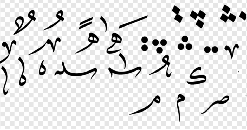
Arabic script, one of the most beautiful and versatile writing systems, has a unique feature that sets it apart from many other writing systems – diacritics. These tiny marks, placed above or below the letters, serve as phonetic guides and help readers pronounce words accurately. Diacritics play a vital role in the Arabic language, ensuring clarity and proper pronunciation. However, their presence also impacts the visual aesthetics of Arabic typography, making it a fascinating subject for exploration.
The Significance of Diacritics in Arabic Script
The Arabic script consists of 28 basic letters, which, when combined, form words and phrases. However, Arabic words can have different meanings depending on the placement of diacritics. Diacritics, also known as “tashkeel,” aid readers in distinguishing between similar-looking words that might have different pronunciations or meanings. In the absence of diacritics, the script would be challenging to read and interpret correctly.
There are three main types of diacritics used in Arabic script:
- Fatha (ـَ): Represents a short “a” vowel sound.
- Kasra (ـِ): Represents a short “i” vowel sound.
- Damma (ـُ): Represents a short “u” vowel sound.
These diacritics, along with other supplementary marks, are crucial for children learning to read and for non-native speakers navigating the complexities of the Arabic language.
Diacritics and Visual Impact on Typography
The presence of diacritics not only serves a functional purpose but also presents unique challenges and opportunities in the realm of Arabic typography. The harmonious balance between legibility and visual aesthetics is a delicate dance that typographers must master to create stunning Arabic designs.
- Legibility: Diacritics enhance the legibility of Arabic text, guiding readers through the correct pronunciation and meaning of words. Adequate spacing between diacritics and letters is crucial to ensure clarity without overcrowding the design.
- Aesthetics: Arabic typography has a rich history of artistic expression. Diacritics provide typographers with an array of design possibilities. By skillfully incorporating diacritics into the overall composition, typographers can create visually engaging and balanced layouts.
- Readability vs. Calligraphy: Balancing readability and aesthetics is a constant challenge in Arabic typography. Diacritics, when not thoughtfully integrated, can disrupt the flow of calligraphic strokes, impacting the overall beauty of the script. Therefore, typographers must tread carefully when adding diacritics to calligraphic designs.
- Modern Applications: In contemporary design, Arabic typography has found its way into various applications, from digital interfaces to advertising and branding. Integrating diacritics into modern designs while preserving the essence of Arabic calligraphy is an exciting task that requires a deep understanding of both tradition and innovation.
The Evolution of Diacritics in Arabic Typography
Arabic typography has evolved significantly over the centuries, influenced by cultural, technological, and artistic developments. The use of diacritics has also witnessed changes throughout this journey.
Traditionally, diacritics were meticulously handcrafted by calligraphers, using a range of styles to suit different scripts and designs. However, with the advent of digital typography, diacritics are now often generated automatically, which has led to concerns about maintaining the artistic quality of the script.
Nonetheless, modern typography tools have also empowered designers to experiment with new styles and create innovative typographic expressions while maintaining diacritics’ functional integrity.
Diacritics play a fundamental role in the Arabic script, ensuring accurate pronunciation and comprehension of words. In the realm of Arabic typography, their presence presents a fascinating challenge for typographers, as they must balance legibility and aesthetics while preserving the essence of Arabic calligraphy. As Arabic design continues to thrive in both traditional and modern applications, the artful exploration of diacritics remains a significant aspect of Arabic typography, showcasing the visual beauty and cultural richness of this ancient script.
