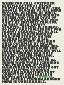
In the world of digital advertising, where flashy visuals and video content often dominate, Fotolia took a daring step that defied conventional wisdom. The stock photo giant, known for its vast library of high-quality visuals, launched a text-only ad campaign that captured attention and sparked conversations across the marketing industry. This bold move not only showcased Fotolia’s creativity but also highlighted the enduring power of simplicity in advertising.
In this article, we’ll explore Fotolia’s text-only ad campaign, its impact, and the lessons marketers can learn from this unconventional approach.
Contents
The Story Behind Fotolia’s Text-Only Ad
Fotolia’s text-only ad campaign was launched in 2014, a time when visual content was becoming increasingly central to digital marketing strategies. The ad featured a simple, black-and-white text message that read:
“A picture is worth a thousand words. But this text ad is worth a thousand pictures.”
At first glance, the ad seemed counterintuitive for a company whose business revolves around selling visual content. However, this simplicity was precisely what made the campaign so effective.
Why a Text-Only Ad Worked for Fotolia
1. Breaking the Noise with Simplicity
In a digital landscape saturated with eye-catching visuals and videos, Fotolia’s text-only ad stood out precisely because it was different. It cut through the clutter and grabbed attention by challenging expectations.
2. Leveraging Curiosity and Irony
The ad’s message was both ironic and thought-provoking. By acknowledging the value of pictures while using only text, Fotolia created a clever paradox that piqued curiosity and encouraged viewers to think deeper about the message.
3. Highlighting the Power of Words
The campaign demonstrated that words, when used effectively, can be just as powerful as visuals. It reminded marketers and creatives that storytelling and messaging are at the heart of any successful campaign.
4. Showcasing Brand Confidence
Fotolia’s decision to run a text-only ad was a bold statement of confidence in its brand. It showed that the company didn’t need to rely on visuals to communicate its value proposition.
The Impact of the Campaign
Fotolia’s text-only ad campaign generated significant buzz in the marketing world. It was widely discussed in industry publications, social media, and forums, earning the company free publicity and reinforcing its reputation as an innovative brand.
The campaign also drove home an important lesson: sometimes, less is more. By stripping away the visuals, Fotolia forced its audience to focus on the message, proving that creativity and boldness can trump even the most elaborate designs.
Lessons for Marketers
Fotolia’s text-only ad campaign offers valuable insights for marketers looking to stand out in a crowded digital space:
1. Embrace Simplicity
In a world of information overload, simplicity can be a powerful differentiator. Don’t be afraid to strip away unnecessary elements and focus on your core message.
2. Challenge Conventions
Sometimes, going against the grain can yield remarkable results. Fotolia’s campaign succeeded because it defied expectations and sparked curiosity.
3. Focus on Storytelling
Whether through visuals or text, storytelling is key to engaging your audience. Fotolia’s ad worked because it told a compelling story in just a few words.
4. Be Bold and Confident
Taking risks can pay off, especially when they align with your brand’s identity. Fotolia’s confidence in its message and brand allowed it to pull off this unconventional campaign.
Conclusion
Fotolia’s text-only ad campaign is a testament to the power of creativity and simplicity in advertising. By daring to be different, the company not only captured attention but also reinforced its position as a leader in the stock photo industry.
For marketers, the campaign serves as a reminder that innovation often lies in challenging the status quo. Whether through visuals, text, or a combination of both, the key to success is crafting a message that resonates with your audience.
