In the realm of typography, certain fonts remain as enduring testaments to letter design art. Garamond is one. Its elegance and history captivate designers, scholars, and readers.
Historical Prelude
Garamond’s story starts in the 16th century, when Claude Garamond, a French typographer, began designing and cutting typefaces in Paris. His innovative approach gained typographical recognition, and his font showcases delicate serifs, harmonious proportions, and refined letterforms.
Initially, Garamond’s types were used for printed materials like books and manuscripts. His attention to detail earned him favor, spreading the use of his fonts across Europe.
Garamond’s Aesthetics
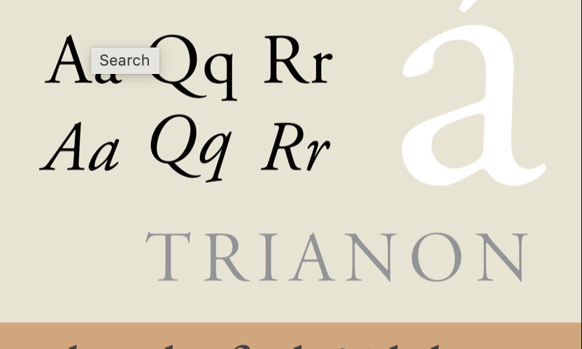
Garamond’s exquisite balance between tradition and modernity stands out. Its letterforms reflect Renaissance calligraphy, with finely tapered, delicate serifs. This lends a graceful and refined look, ideal for sophisticated works.
Proportions of Garamond’s letters enhance its harmonious design. The relationship between uppercase and lowercase heights, character spacing, and line arrangement enhance readability.
Versatility and Usage
Garamond transitions effortlessly between print and screen, making it versatile. It’s a popular choice for body text in books due to legibility. In titles, its timeless charm elevates aesthetics without overpowering.
Digital Age and Beyond
Digital typography transformed font production and consumption. Garamond is available in digital formats, preserving its legacy. Modern designers use it to evoke tradition and sophistication in both print and digital projects.
Conclusion
Garamond’s lasting popularity transcends trends. Its graceful design, rooted in typography’s history, captivates. Its elegance ensures a place in evolving typography, bridging the past and present. Garamond’s legacy continues gracing communication, reminding of craftsmanship shaping type design.