The Harry Potter series is more than just a collection of books and movies—it’s a cultural phenomenon that has captivated millions of fans worldwide. One of the most enchanting aspects of the Harry Potter universe is its typography, which plays a crucial role in creating the magical atmosphere of the wizarding world. From the iconic title font to the intricate designs of the Marauder’s Map, Harry Potter typography is a masterclass in storytelling through design.
In this article, we’ll explore the fascinating world of Harry Potter typography, its history, key elements, and its impact on branding and fan culture. Whether you’re a designer, a Harry Potter enthusiast, or simply curious about the magic of typography, this guide will take you on a journey through the spellbinding art of Harry Potter fonts and lettering.
Contents
What is Harry Potter Typography?
Harry Potter typography refers to the unique fonts, lettering, and design elements used throughout the Harry Potter franchise. It encompasses everything from the iconic title font of the books and movies to the handwritten notes of Hogwarts students and the intricate designs of magical artifacts.
This typography is not just about aesthetics—it’s a storytelling tool that helps immerse fans in the wizarding world. Each font and design choice is carefully crafted to evoke a sense of magic, mystery, and nostalgia.
The History of Harry Potter Typography
The typography of Harry Potter has evolved over the years, reflecting the growth of the franchise and its adaptation into different media. Here’s a brief timeline:
1. The Books (1997–2007)
- The original UK editions of the Harry Potter books featured a custom serif font for the titles, designed to evoke a sense of tradition and timelessness.
- The chapter headings and drop caps were designed to resemble medieval manuscripts, adding to the magical atmosphere.
2. The Movies (2001–2011)
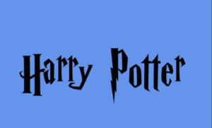
- The movie titles introduced the now-iconic Harry P font, designed by designer Miraphora Mina and Eduardo Lima of MinaLima Studio.
- This custom font, with its lightning bolt-shaped “P,” became synonymous with the Harry Potter brand and is instantly recognizable worldwide.
3. The Wizarding World of Harry Potter (2010–Present)
- The theme parks, merchandise, and spin-off films (like Fantastic Beasts) have expanded the typographic universe of Harry Potter.
- Each new addition to the franchise introduces fresh typographic elements while staying true to the magical aesthetic.
Key Elements of Harry Potter Typography
Harry Potter typography is defined by several key elements that make it unique and memorable:
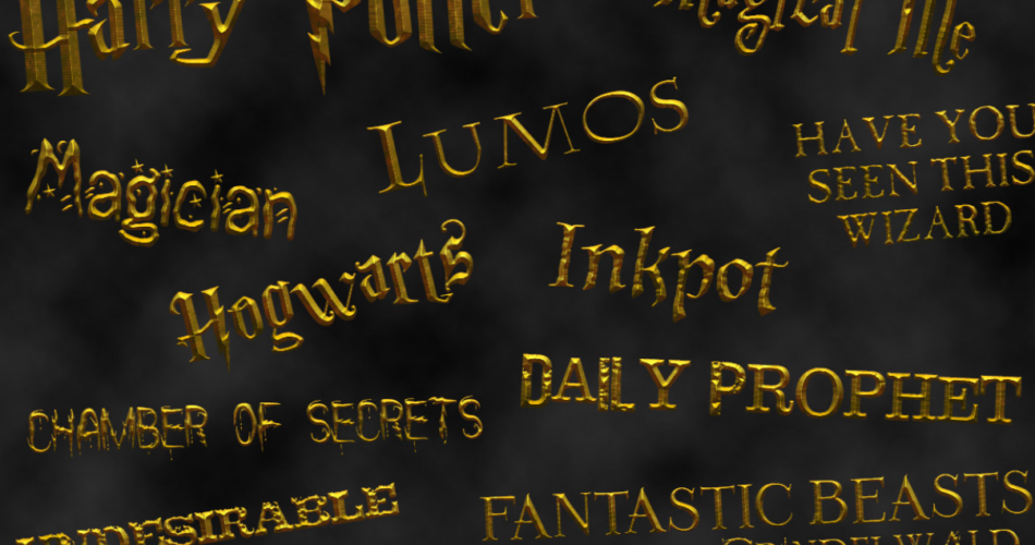
1. The Iconic Title Font
- The Harry P font, used in the movie titles, is the most recognizable element of Harry Potter typography.
- Its bold, serif style and lightning bolt “P” symbolize the magic and adventure of the series.
2. Handwritten and Script Fonts
- Many elements of the Harry Potter universe, such as the Marauder’s Map and handwritten notes, use script fonts to create a sense of authenticity and whimsy.
- These fonts mimic the handwriting of characters like Hermione Granger and Albus Dumbledore, adding a personal touch to the design.
3. Medieval and Gothic Influences
- The typography of Hogwarts and other magical institutions often features medieval and gothic elements, such as ornate serifs and decorative flourishes.
- These designs evoke a sense of history and tradition, reinforcing the ancient and mystical nature of the wizarding world.
4. Magical Artifacts and Props
- The typography of magical artifacts, such as the Daily Prophet and Weasleys’ Wizard Wheezes packaging, is designed to reflect their purpose and personality.
- For example, the Daily Prophet uses bold, newspaper-style fonts, while Weasleys’ Wizard Wheezes features playful, colorful typography.
5. Color and Texture
- Harry Potter typography often incorporates rich colors and textures, such as gold foil, parchment, and aged paper.
- These elements add depth and realism to the designs, making them feel like they belong in the wizarding world.
The Role of Typography in Harry Potter Branding
Typography is a cornerstone of the Harry Potter brand, helping to create a cohesive and immersive experience across all media. Here’s how it contributes to the franchise’s success:
1. Creating a Magical Atmosphere
- The typography of Harry Potter is designed to transport fans into the wizarding world, whether they’re reading a book, watching a movie, or visiting a theme park.
2. Building Brand Recognition
- The iconic Harry P font and other typographic elements are instantly recognizable, making them powerful tools for branding and marketing.
3. Enhancing Storytelling
- Typography is used to convey the personality of characters, locations, and objects, adding depth and richness to the story.
4. Fostering Fan Engagement
- The intricate and detailed typography of Harry Potter invites fans to explore and discover hidden details, creating a sense of wonder and connection.
Examples of Harry Potter Typography in Action
1. The Movie Titles
- The Harry P font, with its lightning bolt “P,” is one of the most iconic examples of Harry Potter typography.
2. The Marauder’s Map
- The handwritten script and intricate designs of the Marauder’s Map make it a fan favorite and a testament to the power of typography in storytelling.
3. The Daily Prophet
- The bold, newspaper-style fonts of the Daily Prophet reflect its role as the wizarding world’s primary source of news.
4. Weasleys’ Wizard Wheezes
- The playful, colorful typography of Weasleys’ Wizard Wheezes captures the fun and mischief of the Weasley twins’ creations.
The Future of Harry Potter Typography
As the Harry Potter franchise continues to expand, so does its typographic universe. Here are some trends to watch:
1. Digital Adaptations
- With the rise of e-books, apps, and digital media, Harry Potter typography is being adapted for new platforms while maintaining its magical aesthetic.
2. Fan-Created Typography
- The Harry Potter fandom is known for its creativity, and fan-created typography is becoming increasingly popular.
3. Cross-Media Consistency
- As the franchise grows, maintaining typographic consistency across books, movies, theme parks, and merchandise will be key to preserving the magic of the wizarding world.
Conclusion
Harry Potter typography is a magical blend of design, storytelling, and branding that has captured the hearts of fans worldwide. From the iconic title font to the intricate designs of magical artifacts, typography plays a vital role in bringing the wizarding world to life.