Typography is the art and technique of arranging type to make written language legible, readable, and visually appealing. It encompasses the selection, size, spacing, and style of typefaces, as well as the overall layout and design of a printed or digital document. Among the many elements that contribute to effective typography, ligatures in typography stand out as a fundamental feature that enhances both the aesthetics and functionality of written communication. Ligatures are special characters created by combining two or more letters into a single, cohesive unit, often used to improve readability and add a touch of elegance to text. Understanding the role of ligatures in typography is essential for designers and typographers aiming to create polished and professional designs.
Contents
- 1 What are Ligatures in Typography?
- 2 History and Evolution of Ligatures
- 3 The Significance of Ligatures in Typography
- 4 Types of Ligatures in Typography
- 5 Examples of Famous Ligatures in Typography
- 6 How to Create and Use Ligatures in Typography
- 7 Ligatures vs. Letter Combinations
- 8 Ligatures in Modern Typography Design
- 9 Conclusion
What are Ligatures in Typography?

Ligatures are a special type of character in typography where two or more letters are combined into a single glyph. This combination is designed to improve the visual flow and appearance of text, often by eliminating unsightly gaps or overlaps between adjacent letters. Ligatures can be found in various scripts, including Latin, Greek, and Arabic, and they have a rich history that spans centuries.
History and Evolution of Ligatures
The use of ligatures in typography can be traced back to ancient times, when scribes and calligraphers would often combine certain letter pairs to create more harmonious and aesthetically pleasing scripts. This practice continued through the development of movable type and the printing press, with early typographers and type designers incorporating ligatures into their typeface designs.
As typography evolved, the role and prevalence of ligatures have shifted. While they were once widely used to improve the look and readability of text, the advent of digital typography and the increased emphasis on standardization have led to a decline in the use of ligatures in some contexts. However, many designers and typographers still recognize the value of ligatures and continue to incorporate them into their work.
The Significance of Ligatures in Typography
Ligatures serve several important functions in typography:
- Aesthetic Enhancement: By seamlessly connecting letters, ligatures can create a more visually cohesive and harmonious appearance, enhancing the overall aesthetic of a typeset text.
- Readability Improvement: Ligatures can help to smooth out the transitions between certain letter combinations, making the text easier to read and reducing visual distractions.
- Historical and Cultural Significance: Ligatures are often associated with traditional and classical typography, and their use can convey a sense of heritage, elegance, and craftsmanship.
- Typographic Flexibility: Ligatures can provide designers with additional typographic tools, allowing them to fine-tune the appearance of text and create unique typographic solutions.
Types of Ligatures in Typography
There are several different types of ligatures used in typography:
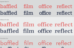
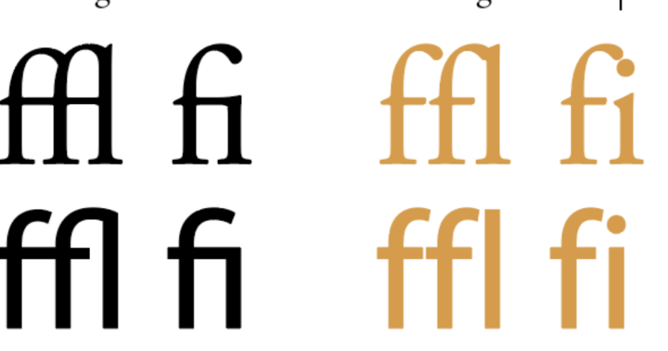
- Standard Ligatures: These are the most common type of ligatures, combining two or more letters that frequently appear together, such as “fi,” “fl,” and “ff.”
- Discretionary Ligatures: These ligatures are used less frequently and are often employed for stylistic or decorative purposes, such as the combination of “ct” or “st.”
- Contextual Ligatures: These ligatures are designed to improve the appearance of specific letter combinations based on their surrounding context, such as the connection between a lowercase “s” and a following lowercase “t.”
- Stylistic Ligatures: These ligatures are primarily used for aesthetic purposes, often in display or decorative typography, and can include more complex or unusual letter combinations.
Examples of Famous Ligatures in Typography
Some of the most well-known and iconic ligatures in typography include:
- The “æ” and “œ” ligatures, which are commonly used in Latin-based scripts.
- The “Th” ligature, which was once widely used in traditional English typography.
- The “ct” and “st” ligatures, which can be found in many classical and historical typefaces.
- The intricate ligatures found in Arabic calligraphy, which are essential for the fluid, connected appearance of the script.
How to Create and Use Ligatures in Typography
In the digital age, the creation and implementation of ligatures have become more accessible. Many modern font formats, such as OpenType, include support for a wide range of ligatures, which can be activated through various software tools and design applications. Designers can choose to use standard ligatures, discretionary ligatures, or even create custom ligatures to suit their specific typographic needs.

Ligatures in Typography
Ligatures vs. Letter Combinations
It’s important to note that not all letter combinations are considered ligatures. True ligatures are designed as a single glyph, with the individual letters seamlessly integrated into a unified form. In contrast, letter combinations that are not specifically designed as ligatures may appear as separate, individual letters, even when they are placed in close proximity.
Ligatures in Modern Typography Design
While the use of ligatures has declined in some contexts, they continue to play an important role in modern typography design. Many designers and typographers recognize the value of ligatures in enhancing the overall aesthetic and readability of their work, particularly in areas such as branding, editorial design, and high-end print publications.
Conclusion
Ligatures are a fascinating and integral aspect of typography, with a rich history and a continued relevance in modern design. By understanding the significance of ligatures, their various types, and how to effectively incorporate them into typographic work, designers can unlock new possibilities for creating visually striking and functionally superior written communication.
Explore the world of ligatures and discover how they can elevate your typography. Contact our design team today to learn more about incorporating ligatures into your next project.
