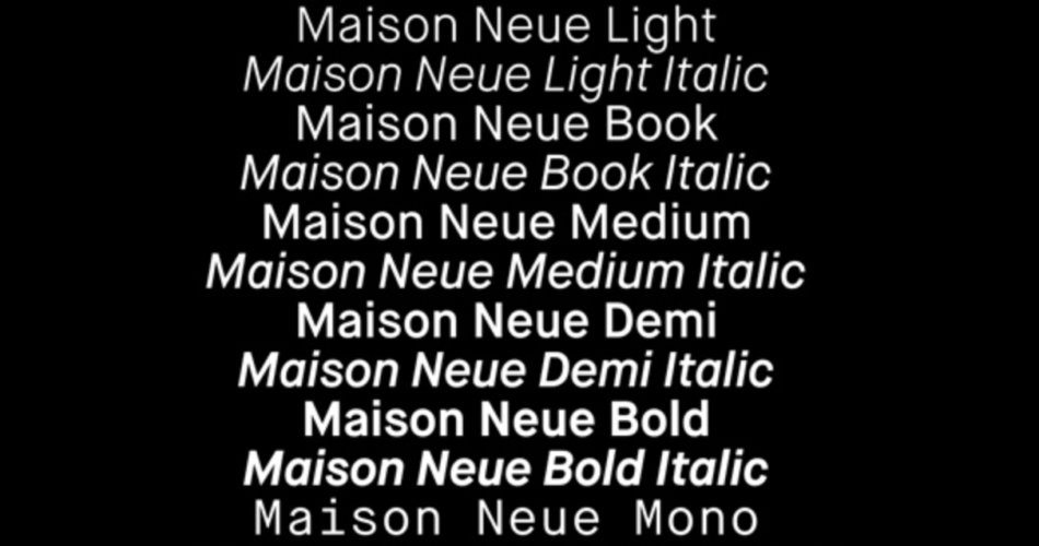
The world of typography is a realm where artistic expression, communication, and design converge. One such striking contribution to this world is the Maison Neue Super Family by Milieu Grotesque. This expansive typeface collection embodies the essence of both tradition and innovation, offering designers a versatile set of fonts that can transform any project. In this article, we will take an in-depth look at the Maison Neue Super Family, delving into its history, features, and the impact it has made in the world of typography and design.
Contents
The Genesis of Maison Neue
Maison Neue, created by Swiss type foundry Milieu Grotesque, is an exquisite and comprehensive typeface family. The inspiration for this project was drawn from the iconic Helvetica typeface, which was developed in the mid-20th century. Maison Neue, however, is more than just a Helvetica-inspired font; it is a unique and distinctive typeface in its own right. The designers at Milieu Grotesque set out to build a typeface that captured the timeless appeal of Helvetica while adding contemporary design elements.
Key Features of Maison Neue Super Family
- Extensive Family: The Maison Neue Super Family is a vast collection of fonts that encompasses multiple styles, weights, and variations. This versatility is a testament to the font’s adaptability for various design projects.
- Modern Aesthetic: Maison Neue retains the clean, modern aesthetic of Helvetica, making it a perfect choice for contemporary designs. The typeface offers the same sense of neutrality and clarity while introducing subtle refinements.
- Variations and Styles: The Super Family includes variations like Regular, Medium, and Bold, offering a full range of weights suitable for headlines, subheadings, and body text. The typeface also features oblique styles for an added touch of elegance.
- Extensive Character Set: Maison Neue supports a wide range of characters, making it suitable for multilingual projects. Its character set includes accented characters, ligatures, and symbols.
- OpenType Features: This typeface family incorporates OpenType features, such as proportional lining and tabular figures, making it incredibly versatile for a variety of design applications.
- Text Readability: Maison Neue is designed with legibility in mind, ensuring that text is easily readable at various sizes. Its well-proportioned letterforms contribute to its superior readability.
- Clean and Timeless Design: The typeface’s clean lines and balanced letterforms make it a timeless choice for branding, editorial design, and digital applications.
Applications and Impact
Maison Neue Super Family has left an indelible mark on the world of typography and design. Its versatility and timeless appeal have made it a popular choice for a wide range of applications:
- Branding: Maison Neue is often selected by brands seeking a clean and modern image. It works exceptionally well for logos, packaging, and corporate identity design.
- Editorial Design: Magazines, newspapers, and books often use Maison Neue for its readability and elegant appearance. Its diverse range of weights allows for flexibility in layout design.
- Digital Design: Web designers and app developers appreciate Maison Neue’s screen-friendly readability. It enhances the user experience by providing clear and legible text on various digital platforms.
- Marketing and Advertising: The typeface’s versatility is particularly valuable in marketing materials. It lends a sophisticated touch to posters, advertisements, and brochures.
Conclusion
The Maison Neue Super Family by Milieu Grotesque is a testament to the enduring power of typography in design. It successfully marries tradition with modernity, capturing the essence of Helvetica while introducing its unique touch. The extensive family of fonts, versatility, and clean, timeless design have cemented Maison Neue’s status as a typographic marvel.
In an era where visual communication plays a pivotal role in our daily lives, typefaces like Maison Neue continue to influence and inspire designers worldwide. Its adaptability, readability, and aesthetic appeal make it a typeface that stands the test of time, demonstrating the enduring impact of thoughtful and innovative typographic design.
