Typography is the backbone of great design, and font pairing is its secret weapon. Combining typefaces isn’t just about aesthetics—it’s about creating balance, hierarchy, and emotional resonance in your work. In this article, we’ll dive into the most popular font pairing trends of 2025, how they align with Google’s emphasis on readability and user experience, and practical tips to elevate your designs.
Contents
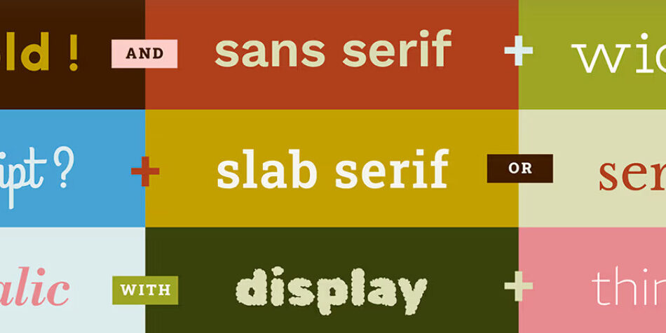
Why Font Pairing is Essential
Font pairing plays a crucial role in design because it:
- Improves Readability: Well-paired fonts make content easier to scan and understand.
- Establishes Hierarchy: Different fonts help distinguish headings, subheadings, and body text.
- Reflects Brand Identity: The right combination can convey your brand’s personality and values.
- Boosts User Experience: Thoughtful typography enhances engagement and keeps users on your page longer—a key factor for SEO.
Google’s focus on user-centric design makes font pairing a critical element for websites and digital content.
Top Font Pairing Trends in 2025
Here are the most exciting font pairing trends shaping design this year:
1. Serif Meets Sans-Serif
This timeless combination remains a favorite for its versatility. Pair a bold serif (like Merriweather) with a clean sans-serif (like Open Sans) for a balanced, professional look.
2. Monospace + Humanist Fonts
Monospace fonts (e.g., Courier) paired with humanist sans-serifs (e.g., Lato) create a tech-inspired yet approachable aesthetic, perfect for modern brands.
3. Handwritten + Minimalist Fonts
Combine a playful handwritten font (like Dancing Script) with a minimalist sans-serif (like Montserrat) for a creative and contemporary vibe.
4. Geometric Fonts + Soft Serifs
Geometric typefaces (e.g., Avenir) paired with soft serifs (e.g., PT Serif) offer a futuristic yet warm feel, ideal for innovative brands.
5. Bold Display Fonts + Neutral Sans-Serifs
Use bold display fonts (like Bebas Neue) for headlines and neutral sans-serifs (like Inter) for body text to create striking contrast.
6. Variable Fonts for Flexibility
Variable fonts allow designers to adjust weight, width, and other attributes within a single font file, making it easier to create cohesive pairings.
Aligning with Google’s Typography Standards
Google prioritizes readability and accessibility, and your font pairings should reflect this. Here’s how:
1. Focus on Readability
- Choose fonts with clear, legible letterforms.
- Avoid overly decorative fonts for body text.
- Ensure sufficient contrast between text and background.
2. Optimize for All Devices
- Use responsive fonts that scale well on desktops, tablets, and mobile devices.
- Increase font sizes for mobile readability (16px or higher for body text).
3. Keep It Simple
- Limit your design to 2-3 fonts to maintain consistency.
- Use different weights and styles within the same font family for variety.
4. Ensure Accessibility
- Select fonts that are easy to read for users with visual impairments.
- Test your pairings using tools like Google Fonts’ accessibility features.
5. Leverage Google Fonts
Google Fonts offers a wide range of free, web-optimized fonts. Popular pairings include:
- Roboto + Roboto Slab
- Poppins + Lora
- Oswald + Merriweather
Practical Tips for Effective Font Pairing
- Start with Contrast
- Pair fonts with distinct characteristics (e.g., serif + sans-serif, bold + light).
- Avoid fonts that are too similar, as they can clash or look monotonous.
- Match Mood and Tone
- Align your font pairings with the emotion you want to evoke (e.g., playful, professional, elegant).
- Test Across Devices
- Ensure your pairings look great on all screen sizes and resolutions.
- Use Design Tools
- Experiment with tools like Fontjoy, Canva Font Pairing, and Google Fonts Combinations to find the perfect match.
Real-World Examples of Successful Font Pairing
Here are some inspiring examples of effective font pairings:
- The New York Times:
- Headline: Cheltenham (Serif)
- Body Text: Imperial (Serif)
- Airbnb:
- Headline: Circular (Sans-Serif)
- Body Text: Circular (Sans-Serif, lighter weight)
- Medium:
- Headline: Charter (Serif)
- Body Text: Freight Sans (Sans-Serif)
Final Thoughts
Font pairing is more than a design trend—it’s a fundamental skill that can transform your work. By staying updated on the latest trends and following Google’s best practices, you can create designs that are not only visually appealing but also functional and user-friendly.
Whether you’re designing a website, crafting a brand identity, or creating social media content, the right font pairing can make all the difference. Experiment, test, and refine your typography to ensure it resonates with your audience and meets modern design standards.