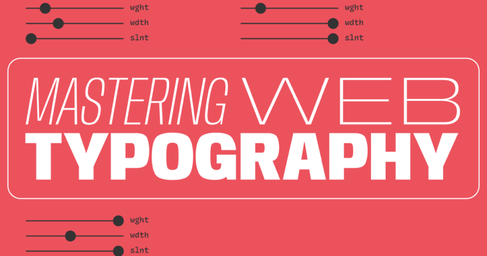
Typography is more than just arranging letters and words on a page; it’s the art and science of communication through typefaces. Mastering typography is a skill that can elevate your design work, whether you’re creating a website, a poster, a book, or any other form of visual communication. In this article, we’ll delve into the world of typography, exploring its history, key principles, and practical tips for achieving typographic excellence.
Contents
The History of Typography
Typography has a rich history dating back centuries. The invention of the printing press by Johannes Gutenberg in the 15th century revolutionized the distribution of written material, making books and documents more accessible to the masses. Gutenberg’s innovation laid the foundation for typography as we know it today.
Throughout history, typography has evolved as new typefaces and printing techniques emerged. From the elegant serifs of Baskerville to the bold, sans-serif designs of Helvetica, each era has seen its own typographic trends and innovations. Understanding this history is crucial for anyone looking to master typography, as it provides a foundation for recognizing and using different typefaces effectively.
The Key Principles of Typography
To master typography, it’s essential to grasp the fundamental principles that govern type design and usage. Here are some key principles to consider:
1. Typeface Selection:
Choosing the right typeface is one of the most critical decisions in typography. Each typeface conveys a distinct mood or personality. Serif fonts, like Times New Roman, evoke tradition and formality, while sans-serif fonts, like Arial, suggest modernity and simplicity. Script fonts can add elegance and flair, while display fonts demand attention. Your choice should align with the message and tone of your design.
2. Hierarchy:
Establishing a clear hierarchy helps guide the reader’s eye and communicate the importance of different pieces of text. Use variations in font size, weight, and style to differentiate headings, subheadings, and body text. Consistency in hierarchy aids comprehension and readability.
3. Alignment:
Text alignment plays a significant role in the overall aesthetics and readability of a design. Common alignment options include left-aligned (ragged right), right-aligned (ragged left), centered, and justified (both left and right aligned). Each choice imparts a different visual rhythm and should align with the design’s purpose.
4. Spacing and Kerning:
Proper spacing between letters (kerning) and lines (leading) is crucial for readability and aesthetics. Adjusting these values can make text more legible and visually pleasing. Tighten the spacing for display text to create impact, but ensure comfortable readability for body text.
5. Consistency:
Consistency is key to a polished typographic design. Maintain uniformity in font choices, sizes, and spacing throughout your project. This coherence ensures a professional and harmonious appearance.
Practical Tips for Mastering Typography
Now that we’ve covered the principles, let’s explore some practical tips to help you master typography:
1. Study Typography:
To become a master typographer, immerse yourself in the world of type. Study famous typefaces, learn about the history of typography, and explore contemporary trends. The more you know, the better equipped you’ll be to make informed typographic decisions.
2. Experiment:
Don’t be afraid to experiment with different typefaces, sizes, and styles. Create mood boards or mockups to test how various type combinations work together. Experimentation can lead to unexpected and exciting results.
3. Use a Grid System:
Grid systems provide a structured framework for organizing and aligning text. They can help you achieve precise typographic layouts and maintain consistency across your design.
4. Pay Attention to Details:
Typography is all about the details. Ensure your text is free of widows, orphans, and other distracting anomalies. Check for consistent spacing and kerning, and proofread meticulously for typos and errors.
5. Seek Feedback:
Don’t work in isolation. Share your designs with colleagues, mentors, or online design communities to gather feedback and insights. Constructive criticism can help you refine your typographic skills.
Conclusion
Mastering typography is a journey that combines creativity, technical knowledge, and a keen eye for detail. Whether you’re a graphic designer, web developer, or content creator, honing your typographic skills can significantly enhance the impact of your work. By understanding the history, principles, and practical tips of typography, you’ll be well on your way to becoming a typographic master, creating designs that are both visually stunning and effective in conveying your message.
