A minimalist modern logo is more than just a simple design—it is a powerful visual representation of a brand. In today’s fast-paced digital world, where attention spans are short, a clean and impactful logo can make a lasting impression. Whether you’re a business owner, graphic designer, or marketer, understanding how to create a minimalist modern logo can set your brand apart from the competition.
This guide will explore the essence of minimalist modern logos, their benefits, and how to create one that aligns with your brand’s identity. We will also discuss famous minimalist logos, trends, and best practices to help you design a logo that stands out.
Contents
What Is a Minimalist Modern Logo?

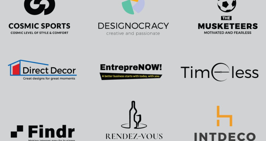
A minimalist modern logo is a simple yet impactful design that embodies the brand’s core values without unnecessary complexity. It typically features clean lines, negative space, geometric shapes, and a limited color palette. The focus is on clarity, functionality, and versatility.
Key Characteristics of Minimalist Modern Logos
- Simplicity – No unnecessary elements, only essential design components.
- Geometric Shapes – Circles, squares, and triangles often define the logo’s structure.
- Negative Space – Smart use of empty space to form secondary images.
- Limited Color Palette – Mostly monochrome or a few complementary colors.
- Typography-Based Design – Simple, clean, and modern fonts.
A well-designed minimalist modern logo should be instantly recognizable and work across multiple platforms and formats.
Why Choose a Minimalist Modern Logo?
Many successful brands have embraced minimalist modern logos due to their numerous advantages. Here’s why they work so well:
1. Timeless Appeal
A minimalist design never goes out of style. Unlike trendy logos that may look outdated in a few years, a clean and simple logo remains relevant for decades.
2. Better Brand Recognition
A logo should be easy to recognize and remember. Minimalist designs help consumers recall a brand faster, making it an effective branding tool.
3. Versatility and Scalability
A minimalist modern logo looks great across different mediums—whether on a business card, billboard, website, or app icon. Simple designs scale better without losing their essence.
4. Enhanced Professionalism
A sleek and modern logo conveys a sense of professionalism and credibility. It signals to customers that your brand is serious, organized, and high-quality.
5. Improved Marketing Effectiveness
Since minimalist logos are easier to remember, they enhance marketing campaigns and social media presence. They also load faster on digital platforms, improving user experience.
How to Create a Minimalist Modern Logo
Step 1: Understand Your Brand Identity
Before designing a minimalist modern logo, define your brand’s personality. Ask yourself:
- What are my brand’s core values?
- What emotions should my logo evoke?
- Who is my target audience?
Step 2: Choose the Right Typography
Fonts play a major role in minimalist logos. Opt for clean, modern, and sans-serif fonts like:
- Helvetica
- Futura
- Montserrat
- Avenir
Avoid overly decorative fonts, as they can make your logo look cluttered.
Step 3: Select a Simple Color Palette
Minimalist logos often use monochrome or limited colors. Consider:
- Black and white for a classic look.
- Muted tones for sophistication.
- A single accent color for brand uniqueness.
Step 4: Use Geometric Shapes and Negative Space
Simple geometric elements can make your logo memorable. Clever use of negative space can add depth while keeping the design minimal.
Step 5: Keep It Scalable and Versatile
Your logo should look great in different sizes. Test its visibility in different formats to ensure it maintains clarity and impact.
Examples of Famous Minimalist Modern Logos
1. Nike
The Nike Swoosh is a prime example of a minimalist modern logo—a simple checkmark that represents motion and speed.
2. Apple
Apple’s half-bitten apple is clean, sleek, and iconic. Its simplicity makes it one of the most recognizable logos in the world.
3. Google
Google’s minimalist wordmark with vibrant colors is an excellent example of how simplicity and color can create a memorable logo.
4. Tesla
Tesla’s logo is a futuristic and minimalist letter ‘T’ that represents innovation and modernity.
Common Mistakes to Avoid When Designing a Minimalist Modern Logo
Even though minimalism is about simplicity, many designers make mistakes when creating minimalist modern logos. Here are some pitfalls to avoid:
- Over-Simplifying – While minimalism is about simplicity, removing too many elements can make the logo unrecognizable or generic.
- Choosing the Wrong Font – A poor font choice can make your logo look unprofessional or outdated.
- Ignoring Negative Space – Smart use of negative space can enhance creativity and meaning.
- Using Too Many Colors – Stick to one or two colors to maintain simplicity.
- Not Considering Scalability – Ensure your logo looks good on both large and small screens.
Minimalist Modern Logo Trends for 2025
The world of branding and design constantly evolves. Here are some trends in minimalist modern logos to watch out for:
1. Abstract Shapes
Many brands are moving towards abstract designs that convey meaning subtly.
2. One-Line Logos
One-line logos are gaining popularity due to their artistic yet minimal approach.
3. Gradient Minimalism
Using soft gradients while keeping the design simple adds a modern touch.
4. Handwritten Minimalism
Personalized, clean, and hand-drawn logos are trending in 2025.
5. Retro Minimalism
Combining vintage aesthetics with minimalist elements creates a unique logo style.
Conclusion
A minimalist modern logo is a crucial branding asset that combines simplicity with impact. By following best practices and avoiding common mistakes, you can create a logo that is timeless, versatile, and memorable.
Whether you’re starting a new business or rebranding an existing one, investing in a well-crafted minimalist modern logo will strengthen your brand identity and leave a lasting impression on your audience. Simplicity is not just a design choice—it’s a powerful branding strategy.