In the ever-evolving realm of web design, staying ahead of the curve is imperative to ensure user satisfaction and engagement. Among the myriad design concepts that have emerged in recent years, one that has gained significant attention is off-canvas design. This innovative approach to layout and navigation has redefined the way websites and applications deliver content and functionality, enhancing user experiences across various devices. In this article, we will explore the concept of off-canvas design, its evolution, and its practical applications.

Canvas
Contents
Understanding Off-Canvas Design
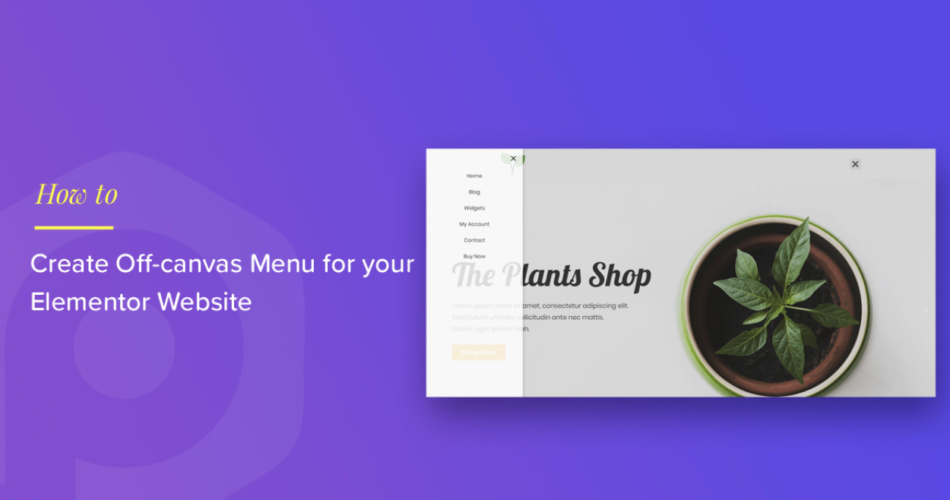
hidden panel design is a web layout and navigation technique that involves moving content, usually navigation menus or sidebars, out of the user’s immediate view, only to reveal it when needed. This concept was popularized by mobile apps but has since made its way into responsive web design. The term “hidden panel” itself originates from the art world, where canvases are used to display artwork. In web design, it signifies content hidden away from the main view, similar to how a canvas might hide artwork when not on display.
The core idea behind off-canvas design is to make the most of limited screen real estate, especially on mobile devices, by tucking away secondary content until the user requests it. This approach streamlines the user interface, reduces clutter, and creates a cleaner, more focused browsing experience.
Understanding Off-Canvas Design
Evolution of Off-Canvas Design
Off-canvas design wasn’t always a prevalent concept in web development. It emerged as a solution to the challenges posed by the rise of mobile devices. Before responsive design and off-canvas layouts, websites struggled to adapt to smaller screens and touch interfaces, often resulting in frustrating user experiences.
The turning point came with the adoption of responsive web design principles, which aimed to create websites that could adapt fluidly to various screen sizes and orientations. Off-canvas design became a prominent feature of this approach, allowing designers to hide secondary content behind easily accessible menus and panels.
With the proliferation of smartphones and the growing importance of mobile web browsing, off-canvas design evolved to include sophisticated gestures and animations. This evolution improved user interactions and brought a level of sophistication to mobile and web app interfaces.
Practical Applications of Off-Canvas Design
hidden panel design offers a plethora of practical applications that cater to the needs of modern web and mobile users. Here are some key areas where off-canvas layouts have proven to be highly effective:
1. Mobile Navigation: Off-canvas menus are commonly used to house navigation elements on mobile websites and apps. Tapping a menu icon slides the navigation panel into view, allowing users to access different sections of the website without cluttering the main content area.
2. Sidebars and Widgets: hidden panel sidebars can host a variety of widgets, such as search bars, filters, or chat boxes. These elements are easily accessible while staying out of the way when not needed, enhancing the overall user experience.
3. Shopping Carts and Checkout Processes: In e-commerce websites and apps, off-canvas design is employed to display shopping carts and streamline the checkout process. Users can review their cart and proceed with purchases without leaving the current page.
4. Content Filters and Sorting Options: When dealing with content-heavy websites, off-canvas panels can be used to display filtering and sorting options. This approach helps users refine their search criteria without overwhelming them with too many choices.
5. Notifications and Alerts: Off-canvas notifications provide a non-intrusive way to alert users about important updates or events. These notifications can be easily dismissed or acted upon when necessary.
Challenges and Considerations
While off-canvas design offers numerous advantages, it also comes with its set of challenges and considerations:
1. Discoverability: Users may not immediately realize that additional content or functionality is hidden off-canvas. Designers must ensure that off-canvas elements are discoverable through clear and intuitive cues, such as icons or animations.
2. Accessibility: Accessibility should be a top priority in hidden panel design. It’s crucial to ensure that all users, including those with disabilities, can access and interact with off-canvas content. Proper markup, ARIA roles, and keyboard navigation support are essential.
3. Performance: Overloading an off-canvas menu with too much content or using resource-intensive animations can negatively impact performance, particularly on mobile devices with limited processing power and bandwidth.
4. Screen Space Management: Careful consideration must be given to the allocation of screen space. Overly large off-canvas menus can still disrupt the user experience by overshadowing the main content.
5. User Testing: As with any design concept, user testing is essential to evaluate the effectiveness of off-canvas layouts. Gathering feedback and making iterative improvements is key to creating a user-friendly experience.

Canvas
Conclusion
Off-canvas design has emerged as a powerful tool in the ever-evolving landscape of web and mobile design. By cleverly concealing secondary content until needed, it enhances user experiences and streamlines navigation on devices of all sizes. However, designers must tread carefully, balancing the benefits of hidden panel design with the potential pitfalls of discoverability, accessibility, and performance.
As technology continues to advance, and user expectations evolve, hidden panel design will likely continue to adapt and innovate. Its versatility makes it a valuable asset for designers seeking to create responsive and user-friendly websites and applications. To stay at the forefront of web design, understanding and effectively implementing off-canvas techniques is an increasingly important skill.