Typography is more than just choosing a font—it’s about conveying emotion, personality, and meaning. In recent years, organic fonts have gained popularity as designers seek to create more natural, human, and approachable designs. These fonts mimic the imperfections and fluidity of hand-drawn or natural forms, offering a refreshing contrast to the rigid precision of geometric or minimalist typefaces. This article explores the history, characteristics, and applications of organic fonts, as well as their growing significance in modern design.
Contents
What Are Organic Fonts?
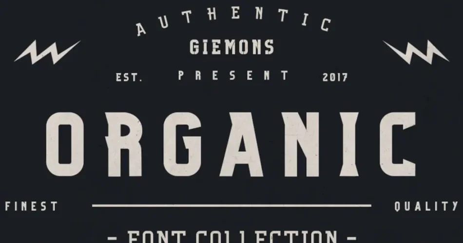
Organic fonts are typefaces that emulate the irregularity and fluidity of natural forms, such as handwriting, brush strokes, or even the shapes found in nature. Unlike geometric or neo-grotesque fonts, which prioritize precision and uniformity, organic fonts embrace imperfections, asymmetry, and a sense of movement. This makes them ideal for designs that aim to feel warm, personal, and authentic.
The History of Organic Fonts
Early Inspirations
The roots of organic fonts can be traced back to calligraphy andhand-lettering, where each stroke was unique and reflected the hand of the artist. Before the advent of digital typography, most typefaces were influenced by the natural flow of handwriting.
The Rise of Digital Organic Fonts
With the rise of digital design tools in the late 20th century, designers began to create fonts that replicated the look of hand-drawn lettering. These fonts combined the convenience of digital typography with the charm of handmade art.
Modern Organic Fonts
Today, organic fonts are more popular than ever, thanks to the growing demand for authentic and human-centered design. They are widely used in branding, packaging, and web design to create a sense of warmth and approachability.
Characteristics of Organic Fonts
Organic fonts are defined by several key features:
- Irregular Shapes:
Unlike geometric fonts, organic fonts often feature uneven strokes, varying widths, and asymmetrical shapes that mimic the imperfections of hand-drawn lettering. - Fluid Lines:
These fonts often have a sense of movement, with curves and lines that flow naturally, resembling brush strokes or calligraphy. - Imperfections:
Organic fonts embrace imperfections, such as uneven edges, slight overlaps, or irregular spacing, to create a more human and approachable feel. - Natural Inspiration:
Many organic fonts are inspired by natural forms, such as leaves, waves, or rocks, giving them a unique and earthy aesthetic. - Warm and Inviting Tone:
The imperfections and fluidity of organic fonts make them feel warm, personal, and relatable, which is why they are often used in designs that aim to connect with audiences on an emotional level.
Popular Organic Fonts
Several organic fonts have become iconic in the world of design:
- Bodoni:
While traditionally a serif font, modern interpretations of Bodoni often incorporate organic elements, such as irregular strokes and fluid curves. - Comic Sans:
Despite its controversial reputation, Comic Sans is an early example of an organic font, with its playful, hand-drawn style. - Lobster:
This popular script font mimics the fluidity of brush lettering, making it a favorite for logos and headlines. - Pacifico:
A casual brush script font, Pacifico is inspired by 1950s surf culture and has a relaxed, organic feel. - Baloo:
A rounded, friendly font with a natural flow, Baloo is often used in designs aimed at children or families.
The Impact of Organic Fonts on Design
Branding and Packaging
Organic fonts are widely used in branding and packaging to create a sense of authenticity and craftsmanship. Brands that want to emphasize natural ingredients, sustainability, or artisanal quality often opt for organic fonts. For example, organic food brands, eco-friendly products, and handmade goods frequently use these typefaces to convey their values.
Web and Digital Design
In the digital space, organic fonts are used to create a more human and approachable user experience. They are particularly popular in websites and apps that aim to feel personal and engaging, such as blogs, portfolios, and e-commerce sites.
Editorial and Print Design
Organic fonts are also used in editorial design to add a touch of personality and warmth to publications. They are often paired with minimalist layouts to create a balance between simplicity and human touch.
Organic Fonts in Contemporary Design
As design trends continue to evolve, organic fonts are becoming increasingly relevant. Here are some ways they are being used in modern design:
1. Handmade Aesthetics
The rise of the handmade and artisanal movement has fueled the popularity of organic fonts. Designers are using these fonts to create logos, posters, and packaging that feel personal and unique.
2. Sustainability and Nature
With growing awareness of environmental issues, many brands are using organic fonts to emphasize their commitment to sustainability and natural products.
3. Emotional Connection
Organic fonts are ideal for designs that aim to connect with audiences on an emotional level. Their imperfections and fluidity make them feel relatable and human, which is why they are often used in campaigns for mental health, wellness, and community initiatives.
4. Variable Fonts
The development of variable fonts has expanded the possibilities of organic typography, allowing designers to adjust weight, width, and other attributes to create custom, dynamic designs.
How to Use Organic Fonts Effectively
- Pair with Minimalist Design:
Organic fonts work well when paired with clean, minimalist layouts. This creates a balance between simplicity and personality. - Use for Emphasis:
Because of their unique style, organic fonts are best used for headlines, logos, or short blocks of text. Avoid using them for long paragraphs, as their irregular shapes can reduce readability. - Choose the Right Context:
Organic fonts are ideal for designs that aim to feel personal, natural, or handmade. Use them in branding, packaging, or editorial design to convey warmth and authenticity. - Experiment with Customization:
Many organic fonts are highly customizable, allowing designers to tweak letterforms, spacing, and other elements to create a unique look.
Conclusion
Organic fonts represent a natural and human-centered approach to typography. Their irregular shapes, fluid lines, and warm tone make them ideal for designs that aim to feel personal, authentic, and approachable. Whether you’re designing a logo, creating a website, or crafting a brand identity, organic fonts offer a unique way to connect with your audience on an emotional level.
As design trends continue to evolve, organic fonts will remain a powerful tool for creating meaningful and impactful designs. By embracing the imperfections and fluidity of natural forms, these fonts remind us that beauty often lies in the details—and sometimes, in the imperfections.