In today’s digital-first world, having a sleek and efficient website is essential. With the increasing variety of devices and screen sizes, businesses must ensure their websites provide a seamless experience for all users. This is where terms like reactive web design and responsive web design come into play.
While they may sound similar, reactive and responsive web design are two distinct approaches to web development. Each has its advantages and drawbacks, and understanding the differences can help you make better decisions when building or upgrading your site.
In this comprehensive guide, we’ll break down what reactive web design is, how it compares to responsive design, and when you should choose one over the other.
1. What Is Reactive Web Design?

Reactive web design is an approach that emphasizes the website’s behavior in response to user interactions and real-time data changes. Rather than simply adjusting layout based on screen size (like responsive design), reactive design makes the user interface dynamic, often adapting in real-time.
Key characteristics:
- Focuses on dynamic UI updates
- Often built using reactive programming frameworks (like React.js or Vue.js)
- Allows for real-time content changes without full page reloads
- Enhances user experience through interactivity and fluidity
For example, a weather website using reactive design might update the forecast in real-time as the user changes location without reloading the page.
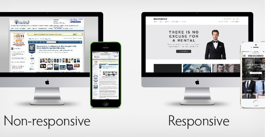
2. What Is Responsive Web Design?
Responsive web design is the practice of designing websites to automatically adjust and optimize layout based on the user’s screen size or device. This ensures a consistent and user-friendly experience across smartphones, tablets, laptops, and desktops.
Key characteristics:
- Uses flexible grids and layouts
- Implements media queries in CSS
- Adapts the design to different screen sizes
- Ensures usability across various devices
A responsive site might rearrange or scale down elements to better fit a smartphone screen without altering the core content or functionality.
3. Key Differences Between Reactive and Responsive Web Design
| Feature/Aspect | Reactive Web Design | Responsive Web Design |
|---|---|---|
| Primary Focus | User interaction & real-time data changes | Device adaptability & screen size |
| Technology Used | JavaScript frameworks (React, Vue, etc.) | HTML, CSS, Media Queries |
| UI Updates | Dynamic and event-driven | Static layout changes based on screen width |
| Performance | Depends on implementation; may be heavy | Lightweight and efficient |
| Development Complexity | Higher (requires JS expertise) | Moderate (mainly front-end dev skills) |
| Use Case | Interactive apps, dashboards, live data apps | General websites, blogs, business sites |
4. When to Use Reactive Web Design
You should consider reactive web design when:
- Your website or app requires real-time data updates (e.g., trading platforms, chat apps, live dashboards).
- You want users to interact with data without page reloads.
- The user experience benefits from seamless interactivity.
Examples:
- Financial dashboards that update in real-time
- Messaging apps with instant updates
- Interactive single-page applications (SPAs)
Pros:
- Superior user experience for interactive apps
- Real-time updates improve usability
Cons:
- Can be complex and require heavy JavaScript
- May impact performance if not optimized properly
5. When to Use Responsive Web Design
Use responsive web design when:
- You need a website that works across all devices
- Your site doesn’t require real-time updates
- You want to keep development simple and cost-effective
Examples:
- Portfolio websites
- Small business websites
- Blogs and eCommerce stores
Pros:
- Easier to implement and maintain
- Ensures compatibility across devices
- Faster load times and SEO-friendly
Cons:
- Not ideal for complex web apps
- Limited interactivity
6. How Reactive Web Design Impacts SEO
While reactive web design isn’t directly an SEO ranking factor, its implementation can influence important SEO metrics:
- Bounce rate: Interactive, engaging sites can reduce bounce rates.
- Dwell time: Users may stay longer on a dynamic site.
- Page speed: Poorly optimized reactive designs can slow down the site.
To make a reactive site SEO-friendly:
- Use server-side rendering (SSR)
- Optimize JavaScript bundles
- Leverage caching and CDN services
7. How Responsive Web Design Impacts SEO
Responsive design is widely recommended by Google. It improves:
- Mobile usability
- Page experience signals
- Indexability and crawlability
Best practices:
- Use fluid grids and flexible images
- Implement viewport meta tags
- Test using Google’s Mobile-Friendly Tool
8. Combining Reactive and Responsive Web Design
Many modern web applications successfully blend reactive and responsive principles. A site can be responsive to screen sizes while also being reactive to user interactions.
Example: An eCommerce site:
- Uses responsive layouts for mobile optimization
- Reactively updates the cart when users add or remove items without reloading
How to achieve this:
- Use a responsive CSS framework (like Tailwind or Bootstrap)
- Build interactivity using React.js or Vue.js
- Optimize for both usability and performance
9. Popular Tools and Frameworks
For Reactive Web Design:
- React.js
- Vue.js
- Angular
- Svelte
For Responsive Web Design:
- Bootstrap
- Tailwind CSS
- Foundation
- CSS Grid/Flexbox
Combining both:
- Use React with Tailwind CSS
- Use Vue.js with responsive CSS breakpoints
10. Developer Skill Sets Required
| Skill Area | Reactive Web Design | Responsive Web Design |
| Front-end Languages | JavaScript, JSX, TS | HTML, CSS |
| Frameworks | React, Angular, Vue | Bootstrap, Tailwind |
| Complexity | High – requires advanced JS knowledge | Moderate – mostly CSS & layout skills |
| Maintenance | More complex | Easier to maintain |
11. Common Mistakes to Avoid
In Reactive Web Design:
- Not optimizing for performance (slow load times)
- Ignoring SEO best practices
- Overloading with too many live components
In Responsive Web Design:
- Forgetting to test on all screen sizes
- Using fixed-width elements
- Poor use of breakpoints
12. The Future of Web Design: Which One Wins?
The future isn’t about choosing between reactive web design and responsive web design—it’s about knowing how and when to use both. Most cutting-edge web applications and platforms today blend the two approaches.
In 2025 and beyond:
- Speed and interactivity will continue to drive UX.
- Google’s Core Web Vitals will reward optimized, user-friendly websites.
- Combining reactive data-driven UI with responsive adaptability will become the new standard.
Conclusion
Both reactive web design and responsive web design serve important roles in modern web development. Reactive design is perfect for interactive, dynamic applications that rely on real-time data. Responsive design ensures that your site works well across all devices.
Instead of choosing one over the other, the best approach may be to integrate both to create a flexible, user-focused, and future-proof website.
Key Takeaways:
- Reactive web design focuses on interactivity and real-time data changes
- Responsive web design ensures adaptability across devices
- Use reactive design for apps, dashboards, and dynamic content
- Use responsive design for general web presence and mobile-friendliness
- The best modern websites combine both for maximum performance and user satisfaction