Serif fonts have long been a staple of design, known for their timeless elegance and readability. However, in recent years, designers have been reimagining this classic style with modern twists, creating typefaces that blend tradition with innovation. These serif fonts with a twist are breathing new life into typography, offering fresh possibilities for branding, web design, and print. In this article, we’ll explore what makes these fonts unique, their benefits, and how to use them effectively while aligning with Google’s best practices for design and user experience.
Contents
What Are Serif Fonts with a Twist?
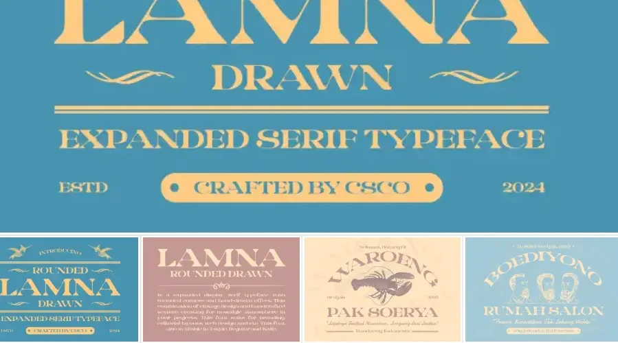
Serif fonts are characterized by the small decorative strokes (serifs) at the ends of letterforms. Traditional serif fonts like Times New Roman and Georgia have been widely used for their readability and formal appeal. However, modern serif fonts with a twist incorporate unexpected elements, such as:
- Unconventional shapes: Unique letterforms that break away from traditional structures.
- Playful details: Ornamental flourishes or quirky serifs.
- Variable weights: Versatile designs that allow for dynamic use across different contexts.
- Geometric influences: Clean, structured lines inspired by modern design trends.
These innovative twists make serif fonts more versatile and appealing for contemporary design projects.
Why Serif Fonts with a Twist Are Trending
1. Balancing Tradition and Modernity
Modern serif fonts bridge the gap between classic elegance and contemporary aesthetics, making them suitable for a wide range of applications.
2. Enhanced Versatility
With unique details and variable styles, these fonts can adapt to both formal and casual designs.
3. Improved Readability
Many modern serif fonts are optimized for digital screens, ensuring they remain legible across devices.
4. Brand Differentiation
Brands can use these fonts to stand out while maintaining a sense of sophistication.
Google’s Perspective on Modern Serif Fonts
Google emphasizes the importance of readability, accessibility, and performance in web design. Here’s how modern serif fonts align with these principles:
1. Readability
- Modern serif fonts are designed with digital screens in mind, ensuring clarity and legibility.
- They often feature larger x-heights and open letterforms, which improve readability on smaller devices.
2. Accessibility
- Many modern serif fonts are optimized for accessibility, with clear distinctions between similar characters (e.g., “I” and “l”).
- They work well with high-contrast color schemes, meeting accessibility standards.
3. Performance
- Web-optimized serif fonts load quickly and scale seamlessly across devices, contributing to better page performance—a key SEO factor.
4. Engagement
- Unique serif fonts can make content more engaging, reducing bounce rates and increasing time spent on your site.
How to Use Serif Fonts with a Twist Effectively
To make the most of these fonts, follow these best practices:
1. Pair with Sans-Serif Fonts
- Combine modern serif fonts with clean sans-serif typefaces for a balanced and contemporary look.
- Example: Pair a bold serif like Playfair Display with a neutral sans-serif like Roboto.
2. Use for Headlines and Branding
- Modern serif fonts are perfect for headlines, logos, and branding elements, where their unique details can shine.
3. Optimize for Digital Use
- Choose fonts designed for screens, with legible letterforms and scalable sizes.
- Test your fonts on multiple devices to ensure consistency.
4. Experiment with Variable Fonts
- Many modern serif fonts are available as variable fonts, allowing you to adjust weight, width, and other attributes for greater flexibility.
5. Prioritize Accessibility
- Ensure sufficient contrast between text and background.
- Avoid overly decorative fonts for body text, as they can reduce readability.
Examples of Serif Fonts with a Twist
Here are some standout modern serif fonts that are redefining the category:
- Playfair Display: A high-contrast serif with elegant, geometric shapes.
- Merriweather: A versatile serif optimized for digital screens.
- Zilla Slab: A hybrid serif-slab font with a modern, approachable feel.
- Abril Fatface: A bold, dramatic serif with vintage-inspired details.
- Lora: A contemporary serif with a balanced, readable design.
Real-World Applications
Modern serif fonts are being used in a variety of creative ways:
- Web Design: Websites use these fonts for headings and call-to-action buttons to create a sophisticated yet modern look.
- Branding: Companies like Vogue and The New York Times use modern serif fonts to convey authority and elegance.
- Print Design: Magazines and posters leverage these fonts for their unique aesthetic appeal.
Conclusion
Serif fonts with a twist are redefining typography, offering a perfect blend of tradition and innovation. By incorporating these fonts into your designs, you can create visually striking, readable, and engaging content that aligns with Google’s emphasis on user experience and performance.
Whether you’re designing a website, crafting a brand identity, or creating print materials, modern serif fonts provide endless possibilities for creativity and impact.