Typography is more than just arranging letters—it’s a powerful tool for communication, emotion, and identity. In the world of sports, typography plays a crucial role in shaping brand identities, creating dynamic visuals, and capturing the energy and passion of athletic competition. Sport typography is a specialized field that combines design, culture, and movement to create impactful visuals that resonate with fans and athletes alike.
This article dives deep into the world of sport typography, exploring its history, key elements, design principles, and its role in modern sports branding. Whether you’re a designer, marketer, or sports enthusiast, this guide will give you a comprehensive understanding of how typography fuels the visual language of sports.
Contents
What is Sport Typography?

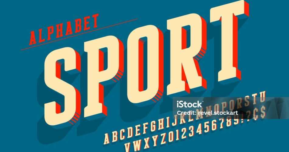
Sport typography refers to the use of typefaces, lettering, and design elements to create visuals that embody the spirit of sports. It’s used in logos, jerseys, posters, advertisements, and digital media to convey energy, strength, speed, and teamwork. Sport typography is not just about aesthetics—it’s about creating an emotional connection with the audience and reinforcing the identity of a team, league, or event.
From the bold, blocky letters of the NBA to the sleek, modern fonts of the Olympics, sport typography is everywhere. It’s a key component of sports branding, helping to differentiate teams, evoke emotions, and build loyalty among fans.
The History of Sport Typography
The evolution of sport typography mirrors the growth of sports as a global phenomenon. Here’s a brief look at its history:
1. Early Days (Late 19th to Early 20th Century)
- Sports logos and typography were simple and functional, often using basic serif or sans-serif fonts.
- Examples include early baseball team logos and Olympic posters.
2. Mid-20th Century
- The rise of television and mass media brought a need for more distinctive and recognizable typography.
- Bold, geometric fonts became popular, reflecting the energy and dynamism of sports.
- Iconic examples include the NFL’s blocky lettering and the NBA’s red-and-blue logo.
3. Late 20th Century to Present
- Advances in design software and digital media allowed for more creative and experimental typography.
- Custom fonts and dynamic layouts became the norm, with a focus on creating unique brand identities.
- Modern examples include the sleek typography of the FIFA World Cup and the bold, angular fonts of esports teams.
Key Elements of Sport Typography
Sport typography is defined by several key elements that set it apart from other forms of typography:
1. Bold and Dynamic Fonts
Sport typography often features thick, heavy fonts that convey strength and power. These fonts are designed to stand out, whether on a jersey, a billboard, or a digital screen.
2. Custom Lettering
Many sports brands use custom-designed fonts to create a unique identity. For example, the NBA’s typography is instantly recognizable and cannot be replicated by standard fonts.
3. Energetic Layouts
Sport typography often incorporates dynamic layouts, such as slanted text, overlapping letters, or asymmetrical designs. These layouts mimic the movement and energy of sports.
4. Color Psychology
Colors play a crucial role in sport typography. Bold, contrasting colors like red, blue, and yellow are commonly used to evoke excitement and passion.
5. Cultural Influences
Sport typography often reflects the culture and history of a team or event. For example, the typography of the Olympics incorporates elements from the host country’s culture.
Design Principles of Sport Typography
Creating effective sport typography requires a deep understanding of design principles. Here are some key considerations:
1. Legibility
Even the most dynamic typography must be easy to read. This is especially important for jerseys and scoreboards, where clarity is essential.
2. Consistency
Sport typography should be consistent across all platforms, from print to digital media. This helps to reinforce brand identity and build recognition.
3. Emotion
Typography should evoke the emotions associated with sports, such as excitement, determination, and teamwork. This can be achieved through the choice of font, color, and layout.
4. Adaptability
Sport typography must work in a variety of contexts, from large banners to small mobile screens. Designers need to ensure that their typography is scalable and versatile.
5. Innovation
The best sport typography pushes boundaries and sets trends. Designers should experiment with new techniques and technologies to create fresh and exciting visuals.
The Role of Sport Typography in Branding
Sport typography is a cornerstone of sports branding. Here’s how it contributes to building a strong brand identity:
1. Creating Recognition
Distinctive typography helps fans instantly recognize their favorite teams or events. For example, the bold, italicized font of the NFL is synonymous with American football.
2. Building Loyalty
Typography that resonates with fans can foster a sense of belonging and loyalty. This is especially important for teams with a strong fan culture.
3. Conveying Values
The style of typography can communicate the values of a team or event. For example, sleek, modern fonts may convey innovation, while classic serif fonts may evoke tradition and history.
4. Enhancing Merchandise
Typography is a key element of sports merchandise, from jerseys to caps. Well-designed typography can make merchandise more appealing and marketable.
Examples of Iconic Sport Typography
1. NBA
The NBA’s typography is bold, dynamic, and instantly recognizable. The red-and-blue logo, with its slanted lettering, embodies the energy and excitement of basketball.
2. FIFA World Cup
Each FIFA World Cup features custom typography that reflects the culture of the host country. The 2022 Qatar World Cup typography, for example, incorporated Arabic calligraphy.
3. Olympics
The Olympics use sleek, modern typography to convey unity and global participation. The typography often includes elements from the host country’s culture.
4. Esports
Esports teams use bold, futuristic fonts to appeal to a younger, tech-savvy audience. The typography often features sharp angles and vibrant colors.
The Future of Sport Typography
As technology evolves, so does sport typography. Here are some trends to watch:
1. 3D Typography
Advances in 3D design software are enabling designers to create more immersive and dynamic typography.
2. Motion Typography
With the rise of digital media, motion typography is becoming increasingly popular. Animated fonts can add an extra layer of energy and excitement.
3. Personalization
Fans are increasingly seeking personalized experiences. Customizable typography, such as jerseys with fan names, is becoming more common.
4. Sustainability
As sustainability becomes a priority, designers are exploring eco-friendly materials and techniques for sport typography.
Conclusion
Typography is more than just design—it’s a language that captures the essence of athletic competition. From the bold, dynamic fonts of the NBA to the sleek, modern typography of the Olympics, sport typography plays a vital role in shaping the visual identity of sports.
As technology and design continue to evolve, the possibilities for typography are endless. Whether you’re a designer, marketer, or sports fan, understanding the art and science of sport typography can help you create visuals that inspire, excite, and connect.