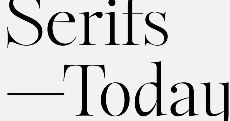
In the ever-evolving world of typography, trends come and go, but some styles stand the test of time. Enter the Serif Renaissance a revival of classic serif typefaces that are making a bold return in modern design. Once considered traditional or outdated, serif fonts are now being reimagined and embraced by designers, brands, and digital platforms alike. This resurgence is not just a nostalgic nod to the past but a testament to the versatility, elegance, and timeless appeal of serif typography.
Contents
What is the Serif Renaissance?
The Serif Renaissance refers to the renewed popularity of serif typefaces in contemporary design. Serif fonts, characterized by the small lines or strokes attached to the ends of letters, have a long history rooted in print media, particularly in books, newspapers, and formal documents. However, with the rise of digital design in the early 2000s, sans-serif fonts took center stage due to their clean, minimalist, and screen-friendly aesthetics.
Fast forward to today, and serif fonts are experiencing a renaissance. Designers are blending the classic elegance of serifs with modern touches, creating typefaces that feel both timeless and fresh. This trend is evident across various mediums, from branding and web design to social media and advertising.
Why Are Serif Fonts Making a Comeback?
1. A Shift Toward Authenticity and Trust
In an age dominated by digital content, serif fonts evoke a sense of authenticity, credibility, and tradition. Their historical association with print media lends them an air of authority, making them a popular choice for brands looking to establish trust and professionalism.
2. Improved Screen Readability
Advancements in screen technology and font rendering have made serif fonts more readable on digital devices. High-resolution displays and responsive design techniques ensure that serif typefaces look sharp and legible, even on smaller screens.
3. The Rise of Maximalism
As design trends shift away from ultra-minimalism, maximalism is gaining traction. Serif fonts, with their intricate details and decorative elements, align perfectly with this trend, adding depth and personality to designs.
4. Versatility in Branding
Serif fonts are incredibly versatile. From bold, modern serifs like Bodoni to classic, elegant ones like Garamond, there’s a serif typeface for every brand personality. This adaptability makes them a favorite among designers crafting unique brand identities.
5. Nostalgia and Emotional Connection
The Serif Renaissance taps into the power of nostalgia. For many, serif fonts evoke memories of cherished books, vintage advertisements, and timeless art. This emotional connection resonates with audiences, making serif typography a powerful storytelling tool.
How the Serif Renaissance is Shaping Design Trends
1. Modern Serifs in Web Design
Web designers are increasingly incorporating modern serif fonts into their projects. These typefaces add a touch of sophistication and contrast beautifully with clean, minimalist layouts. Examples include Merriweather, Playfair Display, and Lora.
2. Serifs in Branding and Logos
Major brands are embracing serif fonts to convey elegance and trustworthiness. For instance, Vogue, Tiffany & Co., and The New York Times have long used serif typography in their logos. Today, even tech companies like Squarespace and Medium are adopting serifs to stand out in a crowded market.
3. Editorial and Print-Inspired Design
The Serif Renaissance has brought a resurgence of editorial-style design, with serif fonts playing a central role. Magazines, blogs, and online publications are using serifs to create a polished, print-like aesthetic that captivates readers.
4. Pairing Serifs with Sans-Serifs
One of the most popular design techniques is pairing serif fonts with sans-serifs. This combination creates a dynamic contrast, balancing tradition with modernity. For example, a bold serif headline paired with a clean sans-serif body text can make a striking visual impact.
How to Use Serif Fonts Effectively in Your Designs
1. Choose the Right Serif for Your Brand
Not all serif fonts are created equal. Consider your brand’s personality and audience when selecting a typeface. For a modern, edgy look, opt for geometric serifs like Rockwell. For a more traditional feel, classic serifs like Times New Roman or Baskerville are excellent choices.
2. Prioritize Readability
While serif fonts are more readable than ever, it’s essential to ensure they work well in your design context. Use larger font sizes for body text and avoid overly decorative serifs for long paragraphs.
3. Experiment with Pairings
Don’t be afraid to mix serif fonts with other typefaces. Pairing a serif with a sans-serif or script font can create a balanced and visually appealing design.
4. Leverage Contrast and Hierarchy
Use serif fonts to establish a clear visual hierarchy. For example, use a bold serif for headlines and a lighter serif or sans-serif for subheadings and body text.
5. Stay On-Trend with Modern Serifs
Explore contemporary serif typefaces like DM Serif Display, Zilla Slab, or Libre Baskerville. These fonts offer a fresh take on traditional serifs, making them perfect for modern designs.
The Future of the Serif Renaissance
As we move further into the digital age, the Serif Renaissance shows no signs of slowing down. With their ability to blend tradition with innovation, serif fonts are proving to be a versatile and enduring choice for designers. Whether you’re designing a website, crafting a brand identity, or creating editorial content, serif typography offers a timeless elegance that resonates with audiences across generations.