Gradient backgrounds have become a popular design trend, offering vibrant, eye-catching visuals for websites, social media, and branding. However, pairing the right font color with a gradient background can be tricky. So, what color font goes best with gradient background? In this article, we’ll explore the principles of color theory, practical tips, and examples to help you make the perfect choice.
Contents
What Color Font Goes Best with Gradient Background?
What color font goes best with gradient background? The answer depends on several factors, including the gradient’s colors, contrast, and the overall design aesthetic. The goal is to ensure readability while maintaining visual harmony. Here are some key considerations:
1. Contrast is Key
High contrast between the font color and the gradient background ensures readability. For example, a light font on a dark gradient or a dark font on a light gradient works well.
2. Complementary Colors
Using complementary colors (opposite on the color wheel) can create a striking effect. For instance, a blue gradient background pairs beautifully with orange or yellow text.
3. Neutral Fonts for Bold Gradients
If your gradient is vibrant and colorful, neutral font colors like white, black, or gray can balance the design and keep the focus on the background.
4. Transparency and Overlays
Adding a semi-transparent overlay to the gradient background can make it easier to choose a font color. This technique softens the gradient, allowing for more flexibility in text color selection.
Tips for Choosing the Right Font Color
Now that we’ve answered what color font goes best with gradient background, let’s dive into practical tips for making the right choice:
1. Test Multiple Colors
Experiment with different font colors to see what works best. Tools like Adobe Color or Coolors can help you visualize combinations.
2. Consider the Gradient’s Dominant Color
Identify the dominant color in your gradient and choose a font color that contrasts well with it. For example, if the gradient is predominantly purple, a white or yellow font might work best.
3. Use Gradient Text
For a modern look, consider using gradient text that complements the background. This technique works well for headings or logos.
4. Prioritize Readability
No matter how visually appealing your design is, readability should always come first. Avoid using font colors that blend into the background.
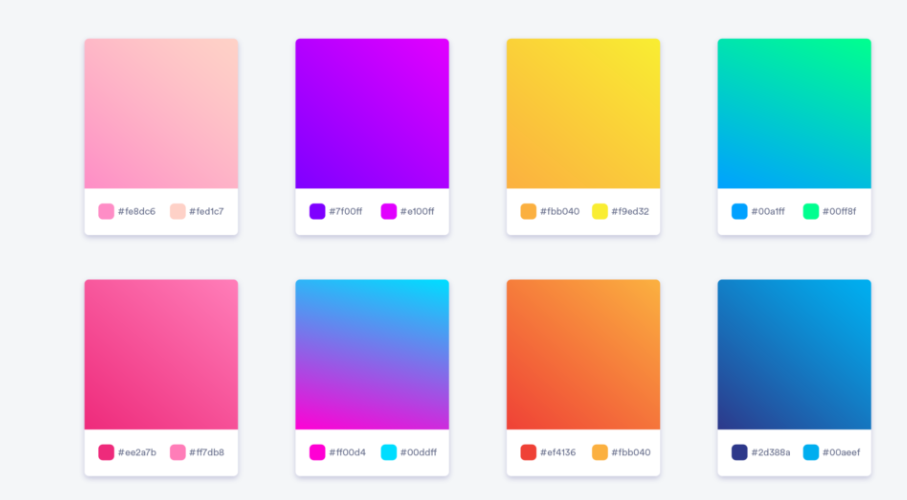
Examples of Font Colors for Gradient Backgrounds
To better understand what color font goes best with gradient background, let’s look at some examples:
1. Light Gradient Background
- Gradient: Light pink to light yellow
- Font Color: Dark gray or navy blue
2. Dark Gradient Background
- Gradient: Deep blue to black
- Font Color: White or light yellow
3. Vibrant Gradient Background
- Gradient: Bright orange to red
- Font Color: White or light gray
4. Subtle Gradient Background
- Gradient: Pale green to soft blue
- Font Color: Dark green or charcoal
Tools to Help You Choose the Perfect Font Color
If you’re still wondering what color font goes best with gradient background, these tools can help:
- Adobe Color: Create and test color palettes for your gradient and font.
- Coolors: Generate complementary colors and gradients effortlessly.
- Contrast Checker: Ensure your font color meets accessibility standards for readability.
- Canva: Experiment with gradient backgrounds and font colors in a user-friendly interface.
Common Mistakes to Avoid
When choosing what color font goes best with gradient background, avoid these common pitfalls:
- Low Contrast: Fonts that blend into the background make text hard to read.
- Overly Bright Colors: Neon fonts on vibrant gradients can strain the eyes.
- Ignoring Accessibility: Ensure your design is accessible to all users, including those with visual impairments.
Conclusion: What Color Font Goes Best with Gradient Background?
So, what color font goes best with gradient background? The ideal font color depends on the gradient’s colors, contrast, and the overall design aesthetic. By prioritizing readability, experimenting with complementary colors, and using design tools, you can create stunning visuals that captivate your audience.
Whether you’re designing a website, social media post, or branding material, understanding what color font goes best with gradient background will elevate your design game. Remember, the key is to strike the perfect balance between creativity and functionality.