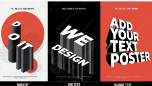
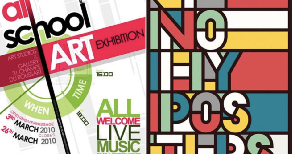
Firstly, let’s understand what a typography poster is. It’s a unique form of artwork that primarily uses letters and words as its main design elements. Unlike traditional posters that heavily rely on images or patterns, these posters focus on text. This text can convey a message, evoke an emotion, or make an artistic statement. Every detail, including the fonts, sizes, colors, and arrangement of the letters, is carefully chosen.

Typography Poster
Contents
The Power of Fonts
Moving on to fonts, they play a key role in any typography poster. Different fonts carry different feelings. Some appear serious and formal, while others seem fun and casual. Designers pick the right font for their posters, allowing them to share the feeling they want. For instance, a rock concert poster might use bold, loud fonts, whereas a wedding invitation might prefer elegant, fancy ones.
The Role of Color and Contrast
Next, we have colors which significantly contribute to typography posters. They set the mood, highlight important words, and make the text stand out against the background. Contrast refers to the difference between colors, like black on white. This contrast makes the text easy to read and more visually striking.
Layout and Composition: The Art of Arrangement
Then there’s the layout, which is how designers arrange the text on the poster. They think about where each word should go, guiding your eyes through the poster. Sometimes the words might follow a straight line, or they could scatter across the canvas. Designers also adjust the spacing between letters and lines, known as kerning and leading, ensuring the poster looks balanced and clear.
Beyond Aesthetics: The Message
Typography posters are not just about aesthetics; they also need to communicate something. The words on the poster send a specific message, whether it’s a famous quote, an inspiring saying, or just a single powerful word. The way designers present the text underscores that message.
Creating Your Own Typography Poster
Are you inspired to create your own typography poster? Here’s a simple guide:
Choose Your Message:
Decide what you want your poster to say.
Pick Your Fonts:
Look for fonts that match your message’s feeling.
Experiment with Colors:
Choose colors that make your words pop.
Arrange Your Text:
Move your words around until the layout looks good.
Once you’re happy with your design, print it out and share it!
Conclusion
Finally, typography posters are an exciting blend of art and language. They show that words aren’t just for reading; they can also be beautiful to look at. Whether you’re making your own or admiring others, these posters offer a powerful medium for communication and artistic expression.
