Contents
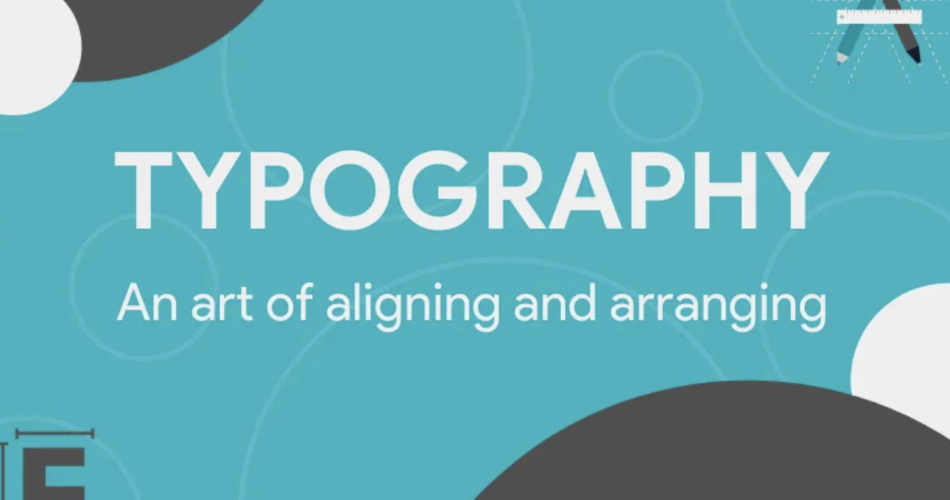
The Art of Typography
Typography art is arranging letters and text in a way that makes the copy legible, clear, and visually appealing to the reader. It involves font styles, appearance, and structure, which aims to elicit certain emotions and convey specific messages.
At its core, typography is a crucial element of graphic design, but it’s much more than just choosing pretty fonts. It’s a blend of art and science, requiring a deep understanding of readability, accessibility, and aesthetics.
Why Typography Matters
Imagine opening a book or visiting a website and finding the text hard to read or so bland that it doesn’t hold your attention. That’s bad typography. Good typography, on the other hand, can capture the reader’s interest and make the reading experience enjoyable.
Here are some reasons why typography is important:
- Readability: The primary goal of typography is to ensure that the text is easy on the eyes. This means considering factors like font size, line spacing, and letter spacing.
- Hierarchy: Typography helps to create a visual hierarchy, guiding the reader’s eye to the most important information first.
- Branding: Fonts can be powerful tools for branding. They can express personality and set the tone for a brand’s voice.
- Engagement: Well-designed typography can increase reader engagement. When text is aesthetically pleasing, readers are more likely to stick around and absorb the message.
Elements of Typography
To understand typography, one must be familiar with its basic elements:
- Font and Typefaces: A typeface is the design of the lettering, which can include variations in size, weight (bold, regular, light), and style (italic, normal). A font is what you use; a typeface is what you see.
- Hierarchy: Using different sizes, weights, and styles to guide the reader’s eye to the most important information.
- Alignment: Text can be aligned to the left, right, centered, or justified. Each alignment serves a different purpose and affects the readability of the text.
- Color: Color can be used for emphasis and to convey mood or brand identity.
- Consistency: Keeping the typography consistent throughout a design creates a cohesive look and feel.
- Contrast: Contrast between text and background is essential for readability. High contrast is typically more readable, while low contrast can be used for a subtle effect.
Tips for Effective Typography
Here are some tips to keep in mind when working with typography:
- Choose a typeface that fits the message you want to convey.
- Make sure there is enough contrast between the text and the background.
- Don’t use too many different fonts in a single design.
- Use alignment to create a clean and organized layout.
- Pay attention to the spacing between letters and lines.
- Create a visual hierarchy to help readers prioritize information.
Conclusion
Typography is an art form that requires careful consideration and practice. Whether you’re designing a website, creating a poster, or publishing a book, good typograph is key to communicating effectively with your audience. By mastering the principles of fonts, you can enhance the readability, impact, and elegance of your text.