Have you ever looked at a page of text and felt like it was easy to read or maybe hard to follow? A big part of that feeling comes from something called “leading typography. Leading is the space between lines of text, and it plays a huge role in how we read and understand what’s on the page.
Contents
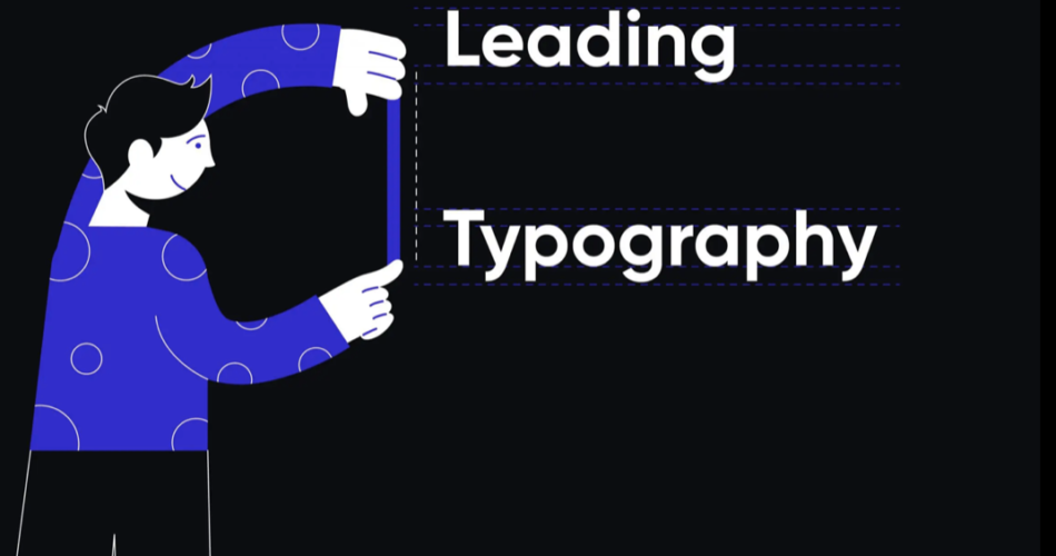
What is Leading?

Leading (pronounced like the metal ‘lead’) is a term that comes from the days of hand-setting type for printing. Printers would actually put thin strips of lead between rows of type to create space. Today, we don’t use metal strips, but the concept is the same. It’s measured from the baseline of one line of text to the baseline of the next line. The baseline is where the letters sit.
The term might seem old-fashioned, but its importance has not diminished with time. In fact, with the rise of digital media and various screen sizes, leading has become more crucial than ever.
Why is Leading Typography Important?
Good leading makes text more readable and pleasant to look at. If lines are too close together, they can blend into one another, making it hard to follow along. If they’re too far apart, your eyes have to work harder to move from one line to the next. Finding the right balance is key.
Here’s why leading matters:
- Readability: Proper leading helps readers move smoothly from one line to the next. It guides the reader’s eye in a natural flow, reducing strain and improving the overall reading experience.
- Appearance: Text with good leading looks organized and neat. It gives the page a clean, uncluttered look, which is aesthetically pleasing.
- Comprehension: When text isn’t cramped, it’s easier to understand and remember. Good leading can improve comprehension by allowing the reader to focus on the content rather than struggling with the layout.
How to Choose the Right Leading
Choosing the right leading depends on several factors:
- Font Size: Larger text usually needs more leading. As the font size increases, so should the space between lines to maintain readability.
- Font Style: Some fonts have taller letters, which might need extra space. Fonts with complex designs or larger x-heights (the height of lowercase letters) may require more leading.
- Line Length: Longer lines might need more leading to be clear. If a line is too long, the reader’s eye may have difficulty moving to the next line accurately.
- Purpose: Are you writing a novel or a textbook? Different types of text may require different leading. For example, textbooks often use more leading to accommodate notes and annotations.
A general rule is to start with leading that’s about 20-30% more than the font size. So, if your text is 10 points, try leading between 12 and 13 points.
Leading Typography in Different Types of Text
Different kinds of writing need different leading:
- Books: Often use tighter leading to fit more words on a page. This helps reduce the number of pages and the overall cost of printing.
- Websites: May use looser leading to help readability on screens. On a screen, the light can make closely set lines harder to read, so more space is often beneficial.
- Magazines: Can vary leading to create a certain style or feel. Magazines often play with leading to add visual interest and match the tone of the content.
Tips for Perfect Leading
Here are some tips to get your leading just right:
- Test it Out: Print your text or look at it on different devices to see how it reads. What looks good on one device might not work on another.
- Keep it Consistent: Use the same leading throughout your document for a uniform look. Consistency helps the reader’s eye move smoothly through the text.
- Adjust for Context: Consider your audience and the way they’ll read your text. If you’re designing for older readers or those with visual impairments, you might want to use more leading.
Leading is a powerful tool in leading typography that can make your text stand out and ensure it’s easy to read. By understanding and using leading effectively, you can improve the clarity and visual appeal of any written material. Remember, the goal is to create a comfortable reading experience, so take the time to find the leading that works best for your text. With careful attention to leading, you can enhance not only the look of your text but also its impact on readers.