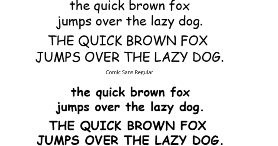
Comic Sans, a font that has sparked much emotion since its inception in the 1990s, continues to divide opinions. Some adore its casual and playful feel, while others deem it unprofessional and overused. But what’s the story behind this font, and why does it provoke such strong reactions?
Comic Sans
Contents
The Birth of Comic Sans
Vincent Connare, an employee at Microsoft, designed Comic Sans in 1994. He was part of the team developing a program called Microsoft Bob, designed to simplify computer use for beginners. The program featured a cartoon dog named Rover who offered tips and advice. Connare observed that the speech bubbles used Times New Roman, a formal font that clashed with the comic book style of the characters. This observation led him to create a new font that would better align with the fun, informal vibe of the program.
Comic books in Connare’s office, particularly “The Dark Knight Returns” by Frank Miller and “Watchmen” by Alan Moore and Dave Gibbons, inspired the design of Comic Sans. He aimed to encapsulate the same feeling of comic book text, resulting in the creation of Comic Sans.
The Rise of Comic Sans
Despite not being used in Microsoft Bob, Comic Sans made its debut in the Windows 95 Plus! pack. From there, it became available on most computers and began to proliferate. People used it for everything from birthday invitations to business presentations. Its widespread use can be attributed to its status as one of the few available fonts with a casual look.
The Love-Hate Relationship with Comic Sans
Teachers and parents quickly embraced Comic Sans for its readability and child-friendly appearance. It found frequent use in schools, children’s materials, and party flyers. However, as its popularity grew, many designers and typographers started criticizing it. They argued that people often misused Comic Sans in inappropriate contexts, like official documents or corporate websites, where a more formal font would be more suitable.
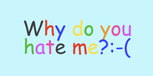
Critics argue that Comic Sans appears unprofessional due to its irregular letter shapes and lack of sophistication. A movement called “Ban Comic Sans” emerged in 2002, advocating for the avoidance of the font in professional settings due to its frequent misuse.
The Significance of Comic Sans
Despite the criticism, Comic Sans offers some benefits. For instance, people with dyslexia often find it easier to read because the unique shapes of the letters help prevent confusion. It also continues to hold a special place in the hearts of many who associate it with friendliness and nostalgia.
Conclusion
Comic Sans is a font that can stir strong feelings, whether of affection or disdain. Its creation aimed to be informal and approachable—a goal it certainly achieved. While it may not be the best choice for every situation, it has carved out its niche in the world of typography. Loved or hated, everyone seems to have an opinion about Comic Sans, and its story forms a fascinating chapter in the history of design.