Typography plays a crucial role in design, as it has the power to communicate messages, evoke emotions, and enhance the overall aesthetic appeal of any project. From websites and print materials to social media graphics, the right choice of fonts can make a significant impact on the success of your design. In this guide, we will explore discover how to use downloaded fonts professionally to elevate your typography game. Learn essential tips and best practices for creating visually appealing designs..
Contents
- 1 Understanding Downloaded Fonts and Their Potential in Design
- 2 Choosing the Right Downloaded Fonts for Your Project
- 3 Installing and Managing Downloaded Fonts on Different Operating Systems
- 4 Best Practices for Pairing Fonts and Creating Harmonious Typography
- 5 Tips for Using Downloaded Fonts in Different Design Mediums
- 6 Common Mistakes to Avoid When Using Downloaded Fonts
- 7 Tools and Resources for Finding and Downloading High-Quality Fonts
- 8 Examples of Professionally Designed Projects Using Downloaded Fonts
- 9 Conclusion and Final Thoughts on Mastering the Art of Typography with Downloaded Fonts
Understanding Downloaded Fonts and Their Potential in Design
Downloaded fonts refer to the vast array of typefaces available for download from various online platforms. These fonts offer designers an extensive range of options beyond the default system fonts, allowing for more creative and personalized designs. With downloaded fonts, you can find unique typefaces that align with the specific tone, style, and message of your project. Whether you’re looking for a bold and attention-grabbing headline font or a subtle and elegant body text font, downloaded fonts can provide the versatility you need.
When working with downloaded fonts, it’s essential to consider factors such as legibility, readability, and compatibility across different devices and platforms. Some fonts may look stunning on a computer screen but fail to translate well on mobile devices or in print. It’s crucial to test your chosen fonts across various mediums to ensure they maintain their visual appeal and functionality.
Choosing the Right Downloaded Fonts for Your Project
Choosing the right downloaded fonts for your project can be a daunting task, given the vast selection available. However, with a clear understanding of your design goals and the message you want to convey, you can narrow down your options effectively. Here are some key considerations when selecting downloaded fonts:
- Match the Tone and Style: Consider the overall tone and style of your project. Are you aiming for a formal and professional look, or do you want to evoke a playful and casual vibe? The font should align with the intended mood and personality of your design.
- Consider Readability: Legibility is paramount when it comes to typography. Ensure that the font you choose is easy to read, both in small and large sizes. Avoid overly decorative or intricate fonts that may compromise readability.
- Ensure Compatibility: Check the compatibility of your chosen fonts across different devices and software. Fonts that work well on your computer may not render correctly on other platforms. Opt for fonts that have extensive cross-platform support.
Remember, the goal is to find a balance between aesthetics and functionality. Take your time to explore different font options, experiment with combinations, and seek feedback from peers or clients to ensure the fonts you choose align with the project’s objectives.
Installing and Managing Downloaded Fonts on Different Operating Systems
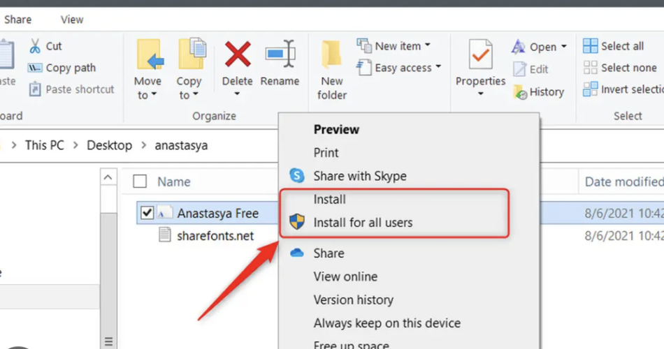
Once you have selected the perfect downloaded fonts for your project, the next step is to install and manage them on your operating system. Here’s a step-by-step guide on how to install and manage downloaded fonts on different operating systems:
Windows:
- Download the font file (usually in .ttf or .otf format) and locate it in your downloads folder.
- Right-click on the font file and select “Install” from the context menu.
- The font will be installed and available for use in any software that supports fonts.
To manage your installed fonts on Windows:
- Go to the Control Panel and open the “Fonts” folder.
- Here, you can view, install, uninstall, and organize your fonts.
macOS:
- Download the font file (usually in .ttf or .otf format) and locate it in your downloads folder.
- Double-click the font file to open it in Font Book.
- Click the “Install Font” button to install the font on your system.
To manage your installed fonts on macOS:
- Open Font Book (found in the Applications folder).
- Here, you can view, install, uninstall, and organize your fonts.
Linux:
- Download the font file (usually in .ttf or .otf format) and locate it in your downloads folder.
- Copy the font file to the “~/.fonts” directory in your home folder. If the directory doesn’t exist, create it.
- Refresh your font cache by running the command “fc-cache -f -v” in the terminal.
To manage your installed fonts on Linux:
- Open your file manager and navigate to the “~/.fonts” directory.
- Here, you can view, install, uninstall, and organize your fonts.
By following these steps, you can easily install and manage downloaded fonts on different operating systems, ensuring that you have quick access to the fonts you need for your design projects.
Best Practices for Pairing Fonts and Creating Harmonious Typography
Pairing fonts is an art form that can greatly enhance the visual impact of your design. When done correctly, font combinations create a harmonious and balanced typographic composition. Here are some best practices for pairing fonts effectively:
- Contrast is Key: Choose fonts that have contrasting characteristics, such as a combination of a serif and sans-serif font. This contrast adds visual interest and helps differentiate between different elements in your design.
- Hierarchy and Emphasis: Establish a clear hierarchy by using different font styles, weights, and sizes. Reserve bolder or larger fonts for headlines or key information, while using more subtle fonts for body text or secondary content.
- Consider Proportions: Pay attention to the proportions of your font pairings. Fonts with similar x-heights or line weights tend to work well together, creating a sense of cohesion and balance.
- Limit the Number of Fonts: Avoid using too many fonts in a single design. Stick to two or three fonts at most to maintain a clean and cohesive look. Too many fonts can create confusion and dilute the overall impact of your typography.
Remember to experiment and trust your instincts when pairing fonts. Sometimes, unexpected combinations can lead to stunning results. Don’t be afraid to try new combinations and seek feedback from fellow designers or clients to fine-tune your typography choices.
Tips for Using Downloaded Fonts in Different Design Mediums
Typography is a versatile element that can be used across various design mediums, each with its own considerations and requirements. Here are some tips for using downloaded fonts in different design mediums:
Websites:
- Optimize for Web: When using downloaded fonts on websites, ensure they are optimized for the web by converting them to web font formats such as WOFF or WOFF2. This improves performance and ensures cross-browser compatibility.
- Consider Accessibility: Choose fonts that are legible and accessible for all users, including those with visual impairments. Avoid low contrast font combinations or fonts with complex letterforms that may hinder readability.
- Responsive Design: Test your font choices across different screen sizes and devices to ensure they maintain their visual appeal and legibility. Responsive typography is crucial for delivering a consistent user experience.
Print Materials:
- Vectorize Fonts: When designing for print, consider vectorizing your fonts to maintain their quality and avoid any potential font compatibility issues. This converts the fonts into scalable vector graphics that can be printed at any size without losing sharpness.
- Consider Printing Techniques: Different printing techniques may require specific font considerations. For example, if you’re designing for letterpress printing, choose fonts with enough space between letters to avoid ink bleeding.
- Resolution and Color Modes: Ensure that your fonts are set to the appropriate resolution and color mode for print. Typically, fonts should be set to 300 dpi and in CMYK color mode for optimal printing results.
Social Media Graphics:
- Legibility at Small Sizes: Social media graphics are often viewed on mobile devices with smaller screens. Choose fonts that remain legible even at smaller sizes to maintain readability on various devices.
- Consistency with Branding: Use fonts that align with your brand’s visual identity to maintain consistency across your social media presence. Consistent typography reinforces brand recognition and professionalism.
- Consider Platform Limitations: Different social media platforms may have limitations on font styles or formats. Ensure that your chosen fonts are supported by the platform you’re designing for to prevent any unexpected formatting issues.
By following these tips, you can ensure that your downloaded fonts are effectively utilized in different design mediums, creating visually appealing and impactful designs.
Common Mistakes to Avoid When Using Downloaded Fonts
While downloaded fonts offer endless creative possibilities, it’s important to be aware of common mistakes that can undermine the effectiveness of your typography. Here are some pitfalls to avoid:
- Overusing Decorative Fonts: Decorative fonts can add visual interest, but using them excessively or inappropriately can make your design look cluttered or unprofessional. Reserve decorative fonts for specific elements or headlines to maintain readability.
- Ignoring Readability: Prioritize readability over aesthetics. Avoid using fonts with overly complex or illegible letterforms, especially for body text. Strive for a balance between visual appeal and legibility.
- Inconsistent Font Pairings: Inconsistent font pairings can create a disjointed and confusing design. Ensure that the fonts you choose work well together and maintain a consistent visual language throughout your project.
- Neglecting Proper Licensing: When downloading fonts, pay attention to the licensing terms. Some fonts are free for personal use but require a license for commercial projects. Respect the font designer’s rights and ensure you have the appropriate licenses for your usage.
By avoiding these common mistakes, you can ensure that your downloaded fonts are used effectively and enhance the overall impact of your designs.
Tools and Resources for Finding and Downloading High-Quality Fonts
The internet offers a plethora of platforms and resources for finding and downloading high-quality fonts. Here are some popular websites and tools to help you discover the perfect fonts for your projects:
- Google Fonts: Google Fonts provides a vast library of free and open-source fonts that are optimized for the web. With easy integration and a wide range of font options, it’s a go-to resource for many designers.
- Adobe Fonts: Formerly known as Typekit, Adobe Fonts offers a vast collection of fonts for both web and desktop use. It provides seamless integration with Adobe Creative Cloud applications, making it a convenient choice for designers.
- Font Squirrel: Font Squirrel offers a curated collection of high-quality fonts, including both free and commercial options. The fonts on Font Squirrel are carefully selected, ensuring they meet quality standards.
- Dafont: Dafont is a popular platform that offers a wide range of fonts, including many decorative and novelty options. While not all fonts on Dafont are of the highest quality, it’s a great resource for finding unique and eye-catching fonts.
- MyFonts: MyFonts is a marketplace for commercial fonts, offering a vast selection of high-quality typefaces. It’s an excellent resource for professionals looking for unique and well-crafted fonts for their projects.
By exploring these resources and platforms, you can discover an extensive range of fonts to elevate your typography and find the perfect match for your design projects.
Examples of Professionally Designed Projects Using Downloaded Fonts
To inspire your typography journey, here are some examples of professionally designed projects that effectively utilize downloaded fonts:
Example 1: Magazine Layout
A magazine layout featuring a combination of a sleek and modern sans-serif font for the headlines and a classic serif font for the body text. The fonts work harmoniously, creating a sophisticated and readable design that captures the magazine’s brand identity.
Example 2: Website Design
A website design for a creative agency that utilizes a bold and attention-grabbing headline font paired with a clean and minimalist sans-serif font for the body text. The font combination adds visual interest and enhances the user experience, emphasizing the agency’s creativity and professionalism.
Example 3: Social Media Graphics
Social media graphics for a skincare brand that incorporate a handwritten script font for a personalized touch, paired with a clean and simple sans-serif font for the product descriptions. The font pairing creates a sense of elegance and captures the brand’s ethos of natural beauty.
These examples demonstrate how downloaded fonts can elevate the visual appeal and impact of various design projects. By studying and analyzing professionally designed projects, you can gain insights into effective font combinations and typography techniques.
Conclusion and Final Thoughts on Mastering the Art of Typography with Downloaded Fonts
Typography is a powerful tool that can make or break a design. By mastering the art of using downloaded fonts professionally, you can elevate your designs and create visually appealing and impactful projects. From choosing the right fonts and pairing them effectively to installing and managing fonts on different operating systems, each step in the process contributes to the overall success of your typography.
Remember to consider the tone, style, and compatibility of your chosen fonts, and always prioritize readability and legibility. Experiment with different combinations, seek feedback from peers or clients, and utilize the wealth of resources available to find the perfect fonts for your projects.
With practice and a keen eye for detail, you can become a master of typography and create designs that leave a lasting impression. So go ahead, embrace the world of downloaded fonts, and let your creativity soar.