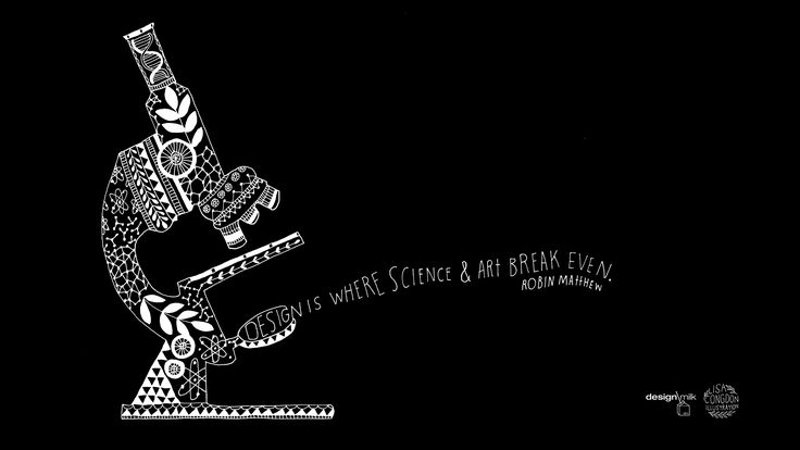
Typography is a dynamic blend of artistry and precision, where the beauty of design meets the rigor of structured communication. It involves the arrangement and presentation of letters, numbers, and symbols in a visually appealing and meaningful way. The art and science of typography delve into the delicate balance between aesthetics, readability, and effective communication.
The Art of Typography
Typography is inherently artistic, driven by the creative choices that designers make to evoke emotions, capture attention, and convey meaning. Every typeface carries a unique personality, and selecting the right typeface is akin to choosing the perfect brushstroke for a painting. Here, creativity flourishes:
- Typeface Selection: Designers carefully select typefaces that align with the project’s purpose and tone. Whether it’s a classic serif font for elegance or a bold sans-serif for a modern edge, typeface selection is a creative decision that sets the visual tone.
- Visual Impact: Typography has the power to captivate and engage viewers. Creative arrangements of text, such as eye-catching headlines or intriguing typographic compositions, draw attention and leave a lasting impression.
- Expressing Emotion: Different typefaces evoke different emotions. From the warmth of a handwritten script to the stability of a geometric sans-serif, typography infuses content with feelings that resonate with the audience.
- Layout and Composition: Typography influences the overall layout and composition of a design. Balancing text with negative space, aligning elements, and establishing visual hierarchy are artistic choices that contribute to a harmonious design.
The Science of Typography
Beneath the artistic surface lies a structured foundation rooted in principles that ensure effective communication and readability. The science of typography establishes rules and guidelines that enable clear transmission of information:
- Readability and Legibility: At its core, typography is about conveying information. The science of typography focuses on ensuring that text is easy to read and understand. Proper font sizes, line spacing, and letter spacing contribute to optimal legibility.
- Hierarchy and Organization: A well-structured hierarchy guides readers through content, presenting essential information prominently. Clear differentiation between headings, subheadings, and body text ensures that readers can quickly grasp the content’s structure.
- Consistency and Branding: Consistency is a key principle in effective typography. Establishing a consistent visual identity through typeface choices and formatting ensures brand recognition and a cohesive design.
- Accessibility: The science of typography also considers accessibility for all readers. Choosing accessible typefaces, maintaining sufficient contrast, and providing appropriate font sizes contribute to inclusive design.
- Precision in Alignment: The alignment of text elements ensures a clean and organized appearance. Aligning text to a grid or baseline grid maintains a sense of order within the design.
- Kerning and Tracking: Adjusting the spacing between individual letters (kerning) and adjusting the spacing between all letters in a block of text (tracking) contributes to a visually pleasing and balanced composition.
In essence, the art and science of typography form a symbiotic relationship. The artistry engages emotions, captures attention, and creates aesthetic appeal, while the science ensures clarity, readability, and effective communication. The mastery of both aspects empowers designers to craft typographic compositions that engage, inform, and leave a lasting impression.