As an experienced writer, I’ve always been fascinated by the power of typography in the casino industry. In this article, we’ll explore the intricate world of casino typography and discover how it can elevate the gaming experience for players.
Typography is the art of arranging and designing text, and it plays a crucial role in the visual identity of any casino. From the elegant logos adorning the entrance to the captivating displays on the gaming tables, every typographic element contributes to the overall atmosphere and branding of the establishment.
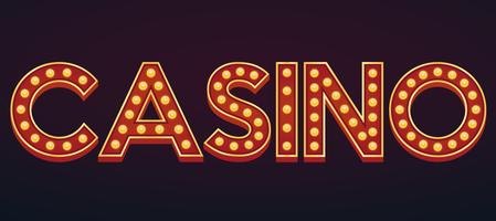
casino
Contents
- 1 The Importance of Typography in the Casino Industry
- 2 Elements of Effective Casino Typography
- 3 Case Studies: Stunning Examples of Casino Typography
- 4 Typography Trends in the Gaming Industry
- 5 Tips for Creating Captivating Casino Typography Designs
- 6 The Impact of Typography on the Gaming Experience
- 7 Tools and Resources for Designing Casino Typography
- 8 The Role of Casino Typography in Branding and Marketing
- 9 Conclusion: Elevating the Gaming Experience with Captivating Typography
The Importance of Typography in the Casino Industry
In the fast-paced and visually-driven world of casinos, typography serves as a powerful tool to captivate and engage players. It not only conveys information but also evokes emotions, sets the tone, and reinforces the brand’s personality. Effective casino typography can make the difference between a forgettable experience and a truly memorable one.
By carefully crafting the typographic elements, casino designers can create a sense of excitement, sophistication, or even a touch of mystery – all of which can contribute to the player’s overall enjoyment and keep them coming back.
Elements of Effective Casino Typography
When it comes to creating captivating casino typography, there are several key elements to consider:
- Legibility: The text must be easy to read, even in low-light conditions or from a distance. This is crucial for ensuring that players can quickly and effortlessly navigate the casino environment.
- Branding: The typography should align with the casino’s brand identity, reflecting its values, personality, and overall aesthetic. This consistency helps to build a strong and recognizable brand.
- Emotion: The typography should evoke the desired emotions, whether it’s a sense of luxury, excitement, or sophistication. The right font choices and typographic treatments can have a significant impact on the player’s experience.
- Hierarchy: Effective typography establishes a clear hierarchy, guiding the player’s attention to the most important information, such as game names, jackpot amounts, or promotions.
- Versatility: Casino typography must be adaptable, working seamlessly across various applications, from signage and gaming tables to digital displays and marketing materials.
Case Studies: Stunning Examples of Casino Typography
To illustrate the power of casino typography, let’s explore a few captivating examples:
The Wynn Las Vegas
The Wynn Las Vegas is renowned for its elegant and sophisticated branding, which is reflected in its typography. The casino’s logo features a refined, serif-based font that conveys a sense of luxury and exclusivity. This typographic style is consistent throughout the property, from the grand entrance to the gaming tables, creating a cohesive and visually striking experience.
Caesars Palace
Caesars Palace, a legendary Las Vegas casino, has embraced a bold and iconic typographic approach. The casino’s logo, featuring a classic Roman-inspired font, evokes a sense of grandeur and historical significance. This typographic theme is further reinforced through the use of ornate and decorative elements in the signage and marketing materials, transporting players to a world of ancient Roman opulence.
Encore Boston Harbor
The Encore Boston Harbor casino takes a more modern and minimalist approach to its typography. The clean, sans-serif font used in the logo and throughout the property creates a sense of sophistication and contemporary elegance. This typographic style complements the casino’s sleek and modern architectural design, providing a harmonious visual experience for players.
Typography Trends in the Gaming Industry
As the casino industry continues to evolve, we’re witnessing the emergence of new typographic trends that are shaping the gaming experience. Some of the noteworthy trends include:
- Adaptive Typography: Casinos are increasingly embracing responsive and adaptive typography, ensuring that their text-based elements seamlessly adapt to various screen sizes and devices, providing an optimal viewing experience for players.
- Augmented Reality (AR) Typography: Casinos are exploring the integration of AR technology to create dynamic and interactive typographic experiences, adding an extra layer of excitement and engagement for players.
- Personalized Typography: Some casinos are experimenting with personalized typography, tailoring the visual elements to individual players based on their preferences, gaming behavior, or loyalty status.
- Minimalist Approach: In contrast to the traditionally ornate and decorative casino typography, a growing number of establishments are adopting a more minimalist and clean typographic style, reflecting a modern and sophisticated aesthetic.
Tips for Creating Captivating Casino Typography Designs
Crafting effective casino typography requires a keen eye for detail and a deep understanding of the industry’s unique needs. Here are some tips to help you create captivating designs:
- Prioritize Legibility: Ensure that your typography is easily readable, even in low-light conditions or from a distance. Opt for clear and legible font choices, and consider the size, spacing, and contrast of the text.
- Align with Brand Identity: Develop a typographic style that seamlessly aligns with the casino’s brand identity, reinforcing its values, personality, and visual aesthetic.
- Evoke Emotions: Carefully select font styles, weights, and treatments that evoke the desired emotions, such as excitement, luxury, or sophistication, to enhance the player’s overall experience.
- Establish Hierarchy: Use typography to create a clear hierarchy, guiding the player’s attention to the most important information and ensuring a smooth and intuitive navigation.
- Embrace Versatility: Design your casino typography to be adaptable and scalable, allowing it to work effectively across various applications, from physical signage to digital displays.
The Impact of Typography on the Gaming Experience
Effective casino typography has the power to transform the gaming experience, elevating it to new heights. By carefully crafting the typographic elements, casino designers can create a sense of immersion, excitement, and engagement that keeps players captivated and coming back for more.
From the moment a player steps into the casino, the typography sets the tone and establishes the overall atmosphere. Legible and visually striking signage guides them through the space, while the typography on the gaming tables and displays enhances the thrill of the games.
Beyond the physical environment, casino typography also plays a crucial role in the digital realm. Responsive and adaptive typography ensures that the player’s experience remains seamless and engaging, whether they’re accessing the casino’s website or mobile app.
Tools and Resources for Designing Casino Typography
Designing captivating casino typography requires a diverse set of tools and resources. Some of the essential tools and resources include:
- Font Libraries: Comprehensive font libraries, such as Google Fonts or Adobe Fonts, offer a wide range of typefaces suitable for casino design.
- Graphic Design Software: Tools like Adobe Illustrator, Adobe InDesign, or Figma allow you to create and manipulate typography, as well as integrate it into various design elements.
- Typographic Guidelines: Industry-specific guidelines and best practices, such as the principles of casino branding and design, can help ensure your typography aligns with the industry standards.
- Inspiration Galleries: Exploring online galleries and case studies of successful casino typography designs can provide valuable inspiration and insights.
- Feedback and Collaboration: Seeking feedback from casino industry experts, designers, and players can help refine and improve your typography designs.
The Role of Casino Typography in Branding and Marketing
Beyond its impact on the gaming experience, casino typography plays a crucial role in branding and marketing efforts. The typographic elements used throughout the casino, from the logo to the signage, contribute to the overall brand identity and recognition.
Consistent and well-crafted typography helps to build a strong and memorable brand, making it easier for players to associate the casino with a specific set of values, emotions, and experiences. This brand recognition can then be leveraged in marketing campaigns, both online and offline, to attract new players and retain existing ones.
Furthermore, the strategic use of typography in promotional materials, such as advertisements, social media posts, and email campaigns, can enhance the visual appeal and effectiveness of these marketing efforts, ultimately driving engagement and conversions.
Conclusion: Elevating the Gaming Experience with Captivating Typography
In the dynamic and competitive world of the casino industry, captivating typography can be the key to elevating the gaming experience and creating a lasting impression on players. By carefully crafting the typographic elements, casino designers can establish a strong brand identity, evoke desired emotions, and guide players through the space with ease and elegance.
As we’ve explored in this article, the art of casino typography is a multifaceted discipline that requires a deep understanding of the industry’s unique needs, as well as a keen eye for design and attention to detail. By embracing the latest trends and best practices, and leveraging the right tools and resources, casino designers can create typographic masterpieces that captivate and engage players, ultimately elevating the overall gaming experience.