Newspapers have long been a staple of the media landscape, providing information and entertainment to millions of readers worldwide. While the content and layout of newspapers have evolved over the years, one element that remains constant is the use of fonts. Fonts play a crucial role in capturing readers’ attention and conveying the intended message effectively. In this article, we will explore the diverse types of newspaper fonts and their significance in creating visually appealing and readable publications.
Contents
- 1 The importance of choosing the right font for newspapers
- 2 Serif vs. sans-serif fonts for newspapers
- 3 Popular serif fonts for newspapers
- 4 Popular sans-serif fonts for newspapers
- 5 Display fonts for headlines in newspapers
- 6 The role of typography in newspaper design
- 7 Factors to consider when selecting a newspaper font
- 8 Examples of successful use of newspaper fonts
- 9 Conclusion and final thoughts
The importance of choosing the right font for newspapers
Selecting the right font for a newspaper is vital as it sets the tone and enhances the overall reading experience. A well-chosen font can evoke a sense of credibility, professionalism, and trustworthiness. On the other hand, a poorly chosen font can lead to readability issues and make the newspaper appear unprofessional. It is essential to strike a balance between visual appeal and legibility when choosing a font for newspapers.
Serif vs. sans-serif fonts for newspapers
When it comes to newspaper fonts, two primary categories dominate the landscape: serif and sans-serif fonts. Serif fonts are characterized by the presence of small decorative lines at the end of each stroke, while sans-serif fonts lack these embellishments. Serif fonts are generally considered more traditional, formal, and easier to read in print. They have been widely used in newspapers for their timeless appeal and legibility. On the other hand, sans-serif fonts offer a more modern and clean aesthetic, often used in headlines and subheadings to grab readers’ attention.
Popular serif fonts for newspapers
Several serif fonts have stood the test of time and are widely used in newspapers. Times New Roman, with its classic and elegant design, remains a popular choice for its readability and familiarity. Garamond, known for its refined and sophisticated appearance, is another serif font commonly used in newspapers. Baskerville, with its balanced proportions and distinctive serifs, is also a favorite among newspaper designers for its readability and versatility.
Popular sans-serif fonts for newspapers
Sans-serif fonts have gained popularity in recent years due to their clean and modern look. Arial, a widely recognized sans-serif font, is often chosen for its simplicity and readability, making it suitable for newspaper body text. Helvetica, with its timeless appeal and versatility, is another popular choice for newspapers. Its clean and uniform design makes it highly legible, especially in smaller sizes.
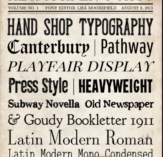
Display fonts for headlines in newspapers
In addition to body text fonts, newspapers often use display fonts for headlines and titles. Display fonts are typically more decorative and attention-grabbing, meant to draw readers’ attention to important articles or sections. Some popular display fonts for newspapers include Impact, known for its bold and impactful appearance, and Franklin Gothic, a versatile font that can add a touch of elegance to headlines.
The role of typography in newspaper design
Typography plays a vital role in newspaper design, influencing how readers perceive and interact with the content. The right typography can enhance the overall aesthetic appeal, readability, and comprehension of a newspaper. Careful consideration should be given to font styles, sizes, spacing, and alignment to create a visually appealing and harmonious layout. Typography should complement the content and convey the intended tone and message effectively.
Factors to consider when selecting a newspaper font
Several factors should be taken into account when selecting newspaper fonts. Firstly, legibility is of utmost importance. The font should be easily readable, even at smaller sizes, to ensure a smooth reading experience. Secondly, the font should align with the newspaper’s brand identity and target audience. Different fonts evoke different emotions and associations, so it is crucial to choose a font that resonates with the newspaper’s image and readership. Lastly, the font should be versatile and adaptable, allowing for various typographic needs within the newspaper.
Examples of successful use of newspaper fonts
Many newspapers have successfully implemented well-chosen fonts to enhance their visual appeal and readability. The New York Times, for instance, has long utilized the classic and reliable font family, Cheltenham, for its headlines and body text. The Guardian, on the other hand, has embraced the modern and clean aesthetic of the Guardian Egyptian font, which complements its digital and print editions seamlessly. These examples showcase how the right font choice can contribute to a newspaper’s distinct identity and overall success.
Conclusion and final thoughts
In conclusion, selecting the right font for newspapers is a crucial aspect of creating visually appealing and readable publications. Serif and sans-serif fonts each have their own unique advantages and are suitable for different purposes within a newspaper. Display fonts can add a touch of creativity and draw readers’ attention to important articles. Typography plays a significant role in newspaper design, and careful consideration should be given to factors such as legibility, brand identity, and versatility when selecting a font. By choosing the right font, newspapers can enhance their overall aesthetic appeal, convey their intended message effectively, and engage readers in a meaningful way.