Are you fascinated by maps, geographic data, and the art of visual storytelling through spatial design? If so, a cartography degree online might be the perfect path to combine your creativity and analytical skills in a field that’s both traditional and rapidly evolving. With the flexibility of online learning, pursuing a cartography degree has never been more accessible.
In this guide, we’ll explore everything you need to know about earning a cartography degree online—including what the coursework looks like, what tools you’ll use, the skills you’ll develop, and how this degree can prepare you for a rewarding career in geospatial science.
Contents
- 1 Table of Contents
- 2 1. What Is Cartography?
- 3 2. Why Choose a Cartography Degree Online?
- 4 3. Core Subjects in Online Cartography Programs
- 5 4. Hands-On Learning: Tools and Software You’ll Use
- 6 5. Key Skills You’ll Develop
- 7 6. Sample Coursework You Can Expect
- 8 7. Capstone Projects and Internships
- 9 8. Common Career Paths with a Cartography Degree
- 10 9. Online vs. Traditional Cartography Programs
- 11 10. Choosing the Right Online Cartography Degree Program
- 12 11. Tips for Succeeding in an Online Cartography Program
- 13 12. FAQs About Online Cartography Degrees
- 14 13. Final Thoughts
Table of Contents
- What Is Cartography?
- Why Choose a Cartography Degree Online?
- Core Subjects in Online Cartography Programs
- Hands-On Learning: Tools and Software You’ll Use
- Key Skills You’ll Develop
- Sample Coursework You Can Expect
- Capstone Projects and Internships
- Common Career Paths with a Cartography Degree
- Online vs. Traditional Cartography Programs
- Choosing the Right Online Cartography Degree Program
- Tips for Succeeding in an Online Cartography Program
- FAQs About Online Cartography Degrees
- Final Thoughts
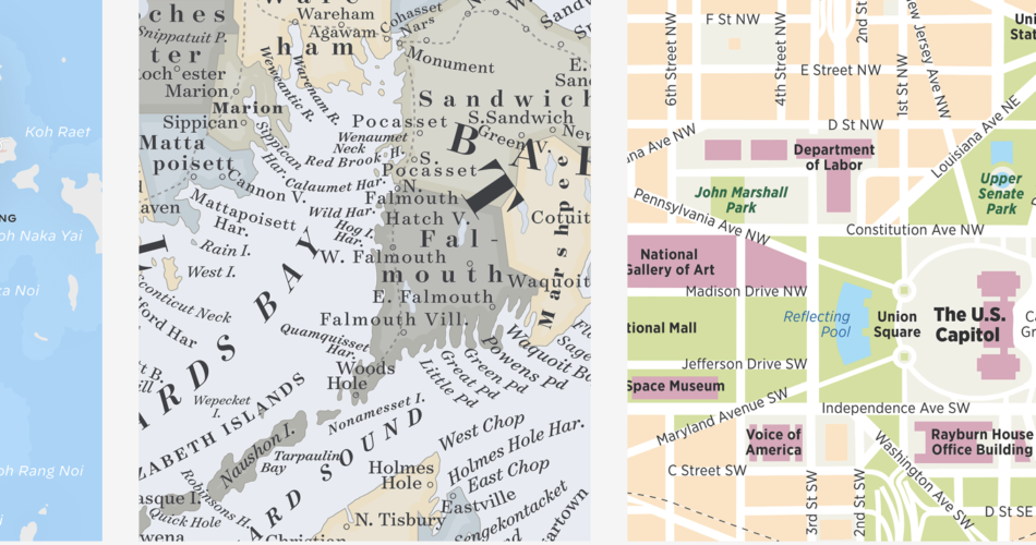
1. What Is Cartography?
Cartography is the art and science of making maps. But in the 21st century, it’s far more than drawing borders and labeling cities. Cartographers use data, technology, and visual design principles to communicate geographic information clearly and accurately.
Modern cartography blends:
- Geospatial analysis
- Geographic Information Systems (GIS)
- Remote sensing
- Data visualization
- Digital design tools
Whether it’s for environmental planning, urban development, or emergency response, cartography plays a crucial role in how we interpret our world.
2. Why Choose a Cartography Degree Online?

Pursuing a cartography degree online offers several advantages:
- Flexibility: Learn from anywhere, on your schedule.
- Affordability: Online programs often cost less than traditional on-campus options.
- Accessibility: Great for working professionals or those with family commitments.
- Tech-Forward Curriculum: Most online programs integrate cutting-edge tools and software.
This format is ideal for self-motivated learners who want to enter or advance in the geospatial field.
3. Core Subjects in Online Cartography Programs
A typical cartography degree online curriculum includes foundational and advanced courses such as:
a) Introduction to Cartography
Learn the history, principles, and modern applications of cartography.
b) Geographic Information Systems (GIS)
Understand how to collect, manage, and analyze spatial data using GIS tools.
c) Spatial Analysis and Data Interpretation
Explore statistical and geospatial methods for interpreting geographic information.
d) Remote Sensing
Use satellite imagery and aerial photography to gather and process geographic data.
e) Map Design and Visualization
Study the art of presenting complex data in intuitive, user-friendly ways.
f) Programming for Cartography
Gain exposure to languages like Python, JavaScript, and R for automating tasks and customizing visualizations.
4. Hands-On Learning: Tools and Software You’ll Use
Online cartography programs are highly technical. You’ll work with industry-standard software including:
- ArcGIS
- QGIS (Open Source GIS)
- Google Earth Engine
- ENVI and ERDAS (for remote sensing)
- Adobe Illustrator or Photoshop
- Tableau or Power BI (for data visualization)
- Python and R
Some programs even offer access to virtual labs or downloadable datasets to support project-based learning.
5. Key Skills You’ll Develop
Through a cartography degree online, you’ll acquire a broad set of technical and analytical skills:
- Data collection and geocoding
- GIS analysis and database management
- Spatial thinking and problem-solving
- Map layout and visual storytelling
- Programming and automation for geospatial tasks
- Project management and presentation
These skills are applicable in multiple industries including government, environmental science, public health, and urban planning.
6. Sample Coursework You Can Expect
Let’s break down some example courses you’ll likely encounter:
1. Digital Cartography
Focuses on creating interactive maps using digital tools.
2. Advanced GIS Techniques
Explores topics like 3D mapping, network analysis, and spatial modeling.
3. Cartographic Design Principles
Covers typography, color theory, and layout for effective map communication.
4. Geovisualization
Teaches how to build web-based and mobile-friendly maps using APIs.
5. Thematic Mapping
Instructs how to represent specific data themes like population, climate, or economics.
Each course blends theoretical lectures with real-world projects.
7. Capstone Projects and Internships
Most online cartography programs culminate in a capstone project. This is your chance to:
- Solve a real-world mapping challenge
- Showcase your skills with a portfolio-ready project
- Collaborate with instructors or industry partners
Some universities also help coordinate internships, even for online learners. Interning with a GIS firm or government agency provides valuable experience.
8. Common Career Paths with a Cartography Degree
A cartography degree online can open doors to many careers:
- Cartographer
- GIS Analyst
- Geospatial Data Scientist
- Remote Sensing Specialist
- Environmental Consultant
- Urban Planner
- Map Designer
According to the U.S. Bureau of Labor Statistics, cartographers and photogrammetrists earned a median pay of $71,890 per year in 2022, with strong job growth expected.
9. Online vs. Traditional Cartography Programs
| Feature | Online Program | On-Campus Program |
|---|---|---|
| Flexibility | High | Limited |
| Interaction | Virtual | In-person |
| Tools Access | Cloud-based/Remote Labs | Physical Labs |
| Cost | Often lower | Higher tuition/housing |
| Hands-on Training | Project-based | Fieldwork + labs |
Both have pros and cons. Choose based on your learning style and lifestyle.
10. Choosing the Right Online Cartography Degree Program
When evaluating programs, consider:
- Accreditation: Ensure the school is accredited.
- Curriculum: Look for a balance of theory, software training, and real-world projects.
- Faculty: Are instructors experienced in GIS/cartography?
- Support Services: Tech support, tutoring, and career counseling are a plus.
- Alumni Success: Do grads land relevant jobs?
Some top-rated institutions offering cartography or GIS-focused degrees online include:
- Penn State University (Online GIS programs)
- University of Wisconsin-Madison
- Oregon State University
11. Tips for Succeeding in an Online Cartography Program
- Stay organized: Use planners or digital tools to track assignments.
- Engage in discussions: Participate in online forums and virtual meetups.
- Practice software regularly: Don’t just watch — do.
- Seek feedback: Share your maps with peers or mentors for critique.
- Build a portfolio: Save your best work for future job applications.
12. FAQs About Online Cartography Degrees
Is a cartography degree online respected by employers?
Yes, especially if it’s from an accredited institution. Employers care more about your skills, portfolio, and software proficiency.
Can I study cartography part-time?
Most online programs offer part-time options to accommodate work or family schedules.
Do I need a background in geography or math?
It helps, but it’s not required. Many programs start with beginner-friendly courses.
How long does it take to complete a cartography degree online?
Bachelor’s degrees take 3–4 years, while certificates or master’s programs can take 1–2 years.
Will I learn to code?
Yes. Expect to use languages like Python or R, especially in advanced courses.
13. Final Thoughts
Choosing a cartography degree online is a smart step for anyone interested in mapping, data visualization, and spatial technology. With high demand in industries like urban planning, climate science, and emergency management, cartographers are more vital than ever.
Through flexible, hands-on coursework, you’ll learn to transform data into stunning, meaningful maps that influence real-world decisions. And best of all, you can do it from anywhere in the world.
Whether you’re looking to start a new career or advance in your current one, this online degree could be your map to a successful future.