When it comes to design projects, every detail matters, and number fonts are no exception. Number fonts play a crucial role in conveying information and adding visual appeal to your designs. Whether you are creating a logo, poster, website, or any other design project, choosing the right number font is essential to make a lasting impact.

Contents
- 1 Different Types of Number Fonts
- 2 Factors to Consider When Choosing a Number Font
- 3 Popular Number Fonts and Their Characteristics
- 4 Number Fonts for Different Design Projects
- 5 Best Practices for Using Number Fonts Effectively
- 6 Tools and Resources for Finding and Testing Number Fonts
- 7 Examples of Successful Design Projects Using Number Fonts
- 8 Conclusion and Final Tips for Choosing the Perfect Number Font
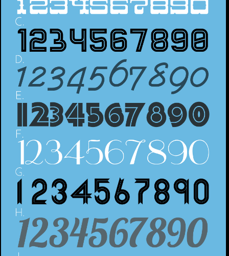
Different Types of Number Fonts
Before diving into the world of number fonts, it is important to understand that there are various types to choose from. Each type has its own unique characteristics and purpose. Here are some of the most common types of number fonts:
Serif Number Fonts
Serif number fonts are characterized by the small decorative lines or strokes attached to the ends of the characters. These fonts are often associated with elegance, tradition, and formality. Serif number fonts are commonly used in formal documents, such as wedding invitations, certificates, and academic publications.
Sans-Serif Number Fonts
Sans-serif number fonts, on the other hand, do not have the decorative lines attached to the characters. They are known for their clean and modern look. Sans-serif number fonts are versatile and can be used in various design projects, from websites to posters. They are especially popular in minimalist and contemporary designs.
Display Number Fonts
Display number fonts are designed to grab attention and make a bold statement. These fonts are often decorative, unique, and eye-catching. Display number fonts are commonly used in headlines, logos, and other design elements that require emphasis. They add personality and flair to your designs.
Handwritten Number Fonts
Handwritten number fonts simulate the look of handwritten text. They have a personal and informal feel, perfect for designs that require a touch of authenticity and warmth. Handwritten number fonts are often used in greeting cards, invitations, and other projects where a personal touch is desired.
Factors to Consider When Choosing a Number Font
Choosing the perfect number font for your design project can be challenging. To make the process easier, consider the following factors:
Legibility
The primary purpose of a number font is to convey information. Therefore, it is crucial to choose a font that is easy to read. Consider the legibility of the font at different sizes and distances. Make sure the numbers are distinguishable and clear, especially when used in smaller sizes.
Consistency with Branding and Design
When selecting a number font, it is important to consider your overall branding and design. The font should align with the style, tone, and personality of your brand. Consistency is key to creating a cohesive and professional look. Choose a font that complements your other typography and design elements.
Context and Purpose
The context and purpose of your design project should also influence your font choice. Consider the industry, target audience, and intended message of your design. For example, a playful and whimsical font may be suitable for a children’s website, while a sophisticated and elegant font may be more appropriate for a high-end fashion brand.
Popular Number Fonts and Their Characteristics
Now that you understand the different types of number fonts and the factors to consider, let’s explore some popular number fonts and their characteristics:
Helvetica
Helvetica is a timeless and versatile sans-serif font that works well in various design projects. It is known for its clean and modern look, making it a popular choice for minimalist designs. Helvetica is highly legible and widely available, making it a safe bet for many designers.
Times New Roman
Times New Roman is a classic serif font that exudes elegance and sophistication. It is commonly used in formal documents and print publications. Times New Roman is known for its high legibility, especially in smaller sizes. It adds a touch of tradition and professionalism to your designs.
Futura
Futura is a geometric sans-serif font with a distinct and futuristic look. It is often associated with modernism and simplicity. Futura is highly versatile and can be used in a wide range of design projects. It adds a contemporary and sleek touch to your designs.
Lobster
Lobster is a popular handwritten script font that has gained attention for its playful and casual style. It is perfect for designs that require a personal and informal touch. Lobster adds a sense of warmth and friendliness to your designs, making it a popular choice for invitations and greeting cards.
Number Fonts for Different Design Projects
Now that you are familiar with popular number fonts and their characteristics, let’s explore how to choose the right font for different design projects:
Logos
When choosing a number font for a logo, consider the personality and values of your brand. The font should align with your brand’s identity and message. Playful and bold fonts may work well for a children’s brand, while elegant and sophisticated fonts may be more suitable for a luxury brand.
Posters
Posters often require fonts that are attention-grabbing and readable from a distance. Consider using bold and display number fonts that stand out and make a statement. Experiment with different styles and sizes to find the perfect combination for your poster design.
Websites
For websites, it is important to prioritize legibility and readability. Choose a font that is easy to read on different devices and screen sizes. Sans-serif fonts are often preferred for web design due to their clean and modern look. Consider the overall style and tone of your website when selecting a number font.
Other Design Projects
The choice of number font for other design projects, such as brochures, packaging, and social media graphics, will depend on the specific requirements and target audience. Consider the context, purpose, and branding of your project to make an informed decision.
Best Practices for Using Number Fonts Effectively
Now that you have a better understanding of number fonts and their applications, let’s explore some best practices for using them effectively in your designs:
Use Hierarchy
In designs that involve multiple numbers, such as charts or tables, it is important to establish a clear hierarchy. Use different font sizes, weights, or styles to differentiate between primary and secondary numbers. This will help guide the viewer’s attention and enhance readability.
Avoid Overusing Decorative Fonts
While decorative number fonts can add visual interest to your designs, it is important to use them sparingly. Overusing decorative fonts can make your design appear cluttered and difficult to read. Reserve decorative fonts for special occasions or design elements that require emphasis.
Test for Legibility
Before finalizing your design, make sure to test the legibility of your chosen number font. Print or display your design at different sizes and distances to ensure that the numbers are clear and easy to read. Consider seeking feedback from others to get different perspectives on legibility.
Tools and Resources for Finding and Testing Number Fonts
Finding the perfect number font can be overwhelming with the vast array of options available. Fortunately, there are several tools and resources that can help you in your search:
Font Libraries
Font libraries, such as Google Fonts, Adobe Fonts, and Font Squirrel, offer a wide selection of free and premium number fonts. These platforms allow you to browse and test different fonts before making a decision. They often provide additional information about the font, such as its characteristics and recommended usage.
Font Pairing Tools
When it comes to pairing number fonts with other typography, there are tools available to help you find the perfect combinations. Tools like Fontjoy and Typ.io suggest font pairings based on complementary styles and characteristics. Experiment with different combinations to find the right balance between your number font and other text elements.
Design Communities and Forums
Engaging with design communities and forums can provide valuable insights and recommendations for number fonts. Websites like Behance and Dribbble showcase designers’ work and often include information about the fonts used. Participate in discussions and seek inspiration from fellow designers to discover new and unique number fonts.
Examples of Successful Design Projects Using Number Fonts
To further inspire you in your quest for the perfect number font, here are a few examples of successful design projects that effectively utilized number fonts:
Nike
Nike’s iconic “Just Do It” slogan is often accompanied by bold and impactful number fonts. The numbers are designed to evoke a sense of strength, energy, and athleticism, aligning perfectly with the brand’s image. The choice of font enhances the brand’s message and creates a memorable visual identity.
Coca-Cola
Coca-Cola’s vintage-inspired number fonts are instantly recognizable and evoke a sense of nostalgia. The numbers are elegantly designed, reflecting the brand’s long-standing heritage and classic appeal. The font choice reinforces Coca-Cola’s brand identity and adds a touch of authenticity to their designs.
Apple
Apple’s sleek and minimalist number fonts are a hallmark of their design aesthetic. The numbers are clean, legible, and seamlessly integrated into their product designs. The font choice reflects Apple’s commitment to simplicity and enhances the user experience.
Conclusion and Final Tips for Choosing the Perfect Number Font
Choosing the perfect number font for your design projects is a crucial decision that can greatly impact the overall look and effectiveness of your designs. By considering factors such as legibility, consistency with branding and design, and the context and purpose of your project, you can make an informed choice.
Remember to explore different types of number fonts, such as serif, sans-serif, display, and handwritten, to find the one that best suits your needs. Experiment with popular fonts like Helvetica, Times New Roman, Futura, and Lobster, but don’t be afraid to explore lesser-known fonts to create a unique and memorable design.
Utilize best practices for using number fonts effectively, such as establishing hierarchy, avoiding overuse of decorative fonts, and testing for legibility. Take advantage of tools and resources like font libraries, font pairing tools, and design communities to aid you in your search for the perfect number font.
By applying these tips and examples of successful design projects, you can confidently choose the perfect number font for your next design project and create visually stunning and impactful designs. So go ahead, explore the world of number fonts, and let your creativity shine.