Number fonts play a crucial role in enhancing the visual appeal and readability of various design projects. Whether you’re creating a website, designing a logo, or working on a print publication, the right choice of number font can make a significant difference in how your content is perceived. In this comprehensive guide, we will explore the art of selecting the perfect number fonts to elevate your design to new heights. From understanding the factors to consider when making your choice to exploring popular number fonts and their characteristics, we will provide you with the knowledge and resources necessary to make informed decisions.
Number Fonts
Contents
- 1 The Role of Number Fonts in Enhancing Visual Appeal
- 2 Factors to Consider When Choosing Number Fonts
- 3 Popular Number Fonts and Their Characteristics
- 4 Tips for Selecting the Perfect Number Font for Your Project
- 5 Case Studies: Examples of Effective Number Font Usage
- 6 Implementing Number Fonts in Different Design Contexts
- 7 Tools and Resources for Finding and Using Number Fonts
- 8 Best Practices for Combining Number Fonts with Other Typography
- 9 Conclusion: Harnessing the Power of Number Fonts for Improved Visual Appeal and Readability
The Role of Number Fonts in Enhancing Visual Appeal
The visual appeal of any design project relies on various elements, and number fonts are no exception. Number fonts have the power to evoke emotions, set the tone, and create a harmonious visual experience for the audience. When chosen thoughtfully, number fonts can contribute to the overall aesthetic of a design, making it more memorable and visually appealing.
The right number font can enhance the readability of your content, ensuring that the numbers are easily recognizable and legible. This becomes particularly important when dealing with data, statistics, or any numerical information that needs to be conveyed accurately. By choosing a number font that is clear, well-spaced, and easily distinguishable, you can improve the legibility of your content and make it more accessible to your audience.
Factors to Consider When Choosing Number Fonts
When selecting the perfect number font for your project, it is essential to consider several factors that will influence the overall visual appeal and readability. These factors include the purpose of your design, the target audience, the context in which the numbers will be used, and the overall design style.
The purpose of your design will dictate the tone and style of the number font you choose. For example, if you’re working on a formal business report, you may opt for a clean and professional-looking font. On the other hand, if you’re designing a playful children’s book, you might consider a more whimsical and fun number font.
Understanding your target audience is crucial in determining the readability of your number font. Different age groups and demographics may have different preferences and visual capabilities. It is important to choose a font that is appropriate for your audience and aligns with their expectations and needs.
The context in which the numbers will be used also plays a significant role in font selection. If the numbers will be displayed in a small size or within limited space, it is important to choose a font that remains legible even at a reduced scale. Additionally, considering the overall design style and theme will ensure that the number font complements the other design elements harmoniously.
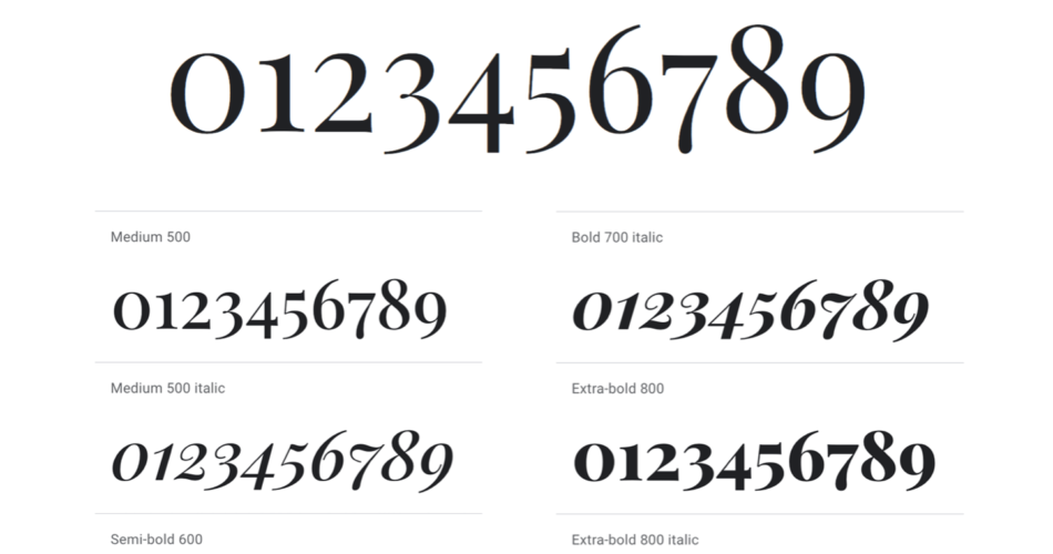
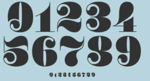
Popular Number Fonts and Their Characteristics
There is a wide range of popular number fonts available, each with its own unique characteristics and visual style. Understanding the distinguishing features of these fonts can help you make an informed decision when selecting the perfect number font for your project. Here are some popular number fonts and their key characteristics:
- Helvetica: Helvetica is a classic and versatile font that is known for its clean and modern look. It offers a timeless appeal and works well in various design contexts.
- Gotham: Gotham is a contemporary and geometric font that exudes a sense of professionalism and sophistication. It is often used in corporate branding and editorial design.
- Roboto: Roboto is a modern and highly readable font that is designed specifically for digital interfaces. It offers a clean and friendly look, making it suitable for websites and mobile applications.
- Bebas Neue: Bebas Neue is a bold and condensed font that is popular for its strong and impactful visual presence. It is often used in headlines and large-scale designs.
- Playfair Display: Playfair Display is an elegant and serif font that adds a touch of sophistication to any design. It is commonly used in print publications and high-end branding.
By familiarizing yourself with these popular number fonts and their characteristics, you can narrow down your options and choose a font that aligns with your design goals and aesthetics.
Tips for Selecting the Perfect Number Font for Your Project
Selecting the perfect number font for your project can be a challenging task. To make the process easier and more effective, consider the following tips:
- Define your design goals: Before you start browsing through countless number fonts, take a moment to define your design goals. What message do you want to convey? What emotions do you want to evoke? By having a clear understanding of your design objectives, you can narrow down your choices to fonts that align with your vision.
- Consider readability: While aesthetics are important, never compromise on the readability of your number font. Make sure the numbers are easily recognizable and legible, even at different sizes and in various contexts.
- Test different options: Don’t settle for the first number font that catches your eye. Experiment with different fonts and compare them side by side. This will give you a better sense of how each font looks in your design and help you make an informed decision.
- Seek inspiration: Look for inspiration from other design projects, both within your industry and beyond. Pay attention to how different number fonts are used and analyze their effectiveness in conveying the intended message.
- Consider the scalability: If your design will be used across various platforms and media, consider how the number font will scale. Ensure that the font remains legible and visually appealing even when displayed on different devices or in different sizes.
By following these tips, you can approach the selection process with confidence and choose a number font that enhances the visual appeal and readability of your project.
Case Studies: Examples of Effective Number Font Usage
To further illustrate the impact of choosing the right number font, let’s explore some case studies of effective number font usage in design projects:
- Case Study 1 – Sports Logo: The number font used in a sports team’s logo can greatly contribute to its overall identity and appeal. For example, a bold and dynamic number font may be chosen to convey strength and power, while a more elegant and stylized font may be used for a high-end sports brand.
- Case Study 2 – Infographics: Infographics often rely on numbers and statistics to convey information. By choosing a number font that is clear, well-spaced, and visually engaging, the infographic becomes more effective in communicating its message and capturing the audience’s attention.
- Case Study 3 – Digital Interfaces: Number fonts used in digital interfaces, such as websites and mobile applications, need to be highly readable and visually appealing. Fonts like Roboto, with its clean and friendly look, are commonly used to ensure a positive user experience.
By studying these case studies and analyzing the successful implementation of number fonts, you can gain valuable insights and inspiration for your own design projects.
Implementing Number Fonts in Different Design Contexts
The implementation of number fonts can vary depending on the design context. Whether you’re working on a web design, a brand identity, or a print publication, it is important to consider how the number font will be used and integrated into the overall design. Here are some key considerations for implementing number fonts in different design contexts:
- Web Design: When choosing a number font for web design, it is important to consider factors such as browser compatibility, loading speed, and responsiveness. Opt for fonts that are web-safe and can be easily rendered across different devices and browsers.
- Brand Identity: Number fonts used in brand identities should align with the overall brand personality and values. The font choice should reflect the brand’s tone, whether it’s bold and modern or elegant and sophisticated.
- Print Publications: In print publications, legibility is crucial. Choose a number font that is easy to read, even at small sizes. Consider the overall layout and hierarchy of the design to ensure that the numbers flow seamlessly with the rest of the content.
By considering these design contexts and their specific requirements, you can ensure that your chosen number font integrates seamlessly into your project, enhancing its visual appeal and readability.
Tools and Resources for Finding and Using Number Fonts
Finding the perfect number font for your project can be made easier with the help of various tools and resources available online. Here are some popular platforms and websites where you can discover and utilize number fonts:
- Adobe Fonts: Adobe Fonts offers a vast collection of high-quality fonts, including a wide range of number fonts. Explore their library to find the perfect font for your project.
- Google Fonts: Google Fonts provides a diverse selection of open-source fonts that are free to use. Their collection includes numerous number fonts suitable for various design contexts.
- Font Squirrel: Font Squirrel is a platform that offers a curated collection of commercial-use fonts. Their search feature allows you to filter fonts by category, including number fonts.
- DaFont: DaFont is a popular website that offers a wide range of free fonts, including number fonts. It is a great resource for finding unique and creative fonts for your design projects.
By utilizing these tools and resources, you can easily discover and implement the perfect number font for your project, elevating its visual appeal and readability.
Best Practices for Combining Number Fonts with Other Typography
Successful design projects often involve the combination of different typography elements, including number fonts. To ensure a cohesive and visually pleasing result, it is important to follow some best practices when combining number fonts with other typography:
- Maintain contrast: Choose number fonts that contrast well with the other typography elements used in your design. This will help create visual interest and ensure that the numbers stand out.
- Consider hierarchy: Establish a clear hierarchy within your design by using different font styles and sizes for different elements. Make sure the number font aligns with the overall hierarchy and doesn’t overpower other important elements.
- Limit the number of fonts: Avoid using too many different fonts in a single design. Stick to a maximum of three fonts, including the number font, to maintain a cohesive and balanced look.
- Pay attention to spacing: Proper spacing between numbers and other typography elements is crucial for readability. Ensure that there is enough white space around the numbers for easy recognition.
By following these best practices, you can create visually appealing designs that effectively combine number fonts with other typography elements.
Conclusion: Harnessing the Power of Number Fonts for Improved Visual Appeal and Readability
In conclusion, the art of choosing the perfect number font involves considering various factors such as the purpose of your design, target audience, context, and overall design style. By understanding the role of number fonts in enhancing visual appeal and readability, exploring popular number fonts and their characteristics, and implementing them effectively in different design contexts, you can elevate your projects to new heights.
Remember to consider factors like readability, scalability, and compatibility when selecting number fonts. Seek inspiration from case studies and utilize tools and resources to find the perfect font for your project. By following best practices for combining number fonts with other typography, you can create visually appealing designs that effectively convey your message.
Harness the power of number fonts to enhance the visual appeal and readability of your designs. Choose wisely, experiment, and let your creativity shine through the art of typography.