When it comes to effective communication, we often focus on the words we use, the images we choose, and the overall design of our message. However, one crucial element that is often underestimated is the typeface. Typeface, also known as font, plays a significant role in conveying the right tone, mood, and message to the audience. Whether it’s in print or digital media, the choice of typeface can make or break the impact of your communication.
Contents
- 1 Importance of Choosing the Right Typeface
- 2 Different Types of Typefaces and Their Characteristics
- 3 The Psychology Behind Typefaces and How They Affect Perception
- 4 How Typefaces Impact Readability and Legibility
- 5 Case Studies: Examples of Effective Use of Typeface in Branding and Communication
- 6 Tips for Choosing the Right Typeface for Your Design Projects
- 7 Tools and Resources for Exploring and Experimenting with Typefaces
- 8 The Future of Typeface Design and Its Impact on Communication
- 9 Conclusion
Importance of Choosing the Right Typeface
Selecting the right typeface is crucial because it sets the visual tone for your message. Different typefaces have unique characteristics that evoke specific emotions and convey different messages. For example, a bold and modern typeface can give a sense of strength and professionalism, while a playful and whimsical typeface can create a lighthearted and friendly atmosphere.
Moreover, the chosen typeface should align with the purpose and target audience of your communication. For instance, a formal business document would require a more traditional and serious typeface, while a children’s book might benefit from a fun and imaginative typeface. By carefully selecting the appropriate typeface, you can enhance the overall impact and effectiveness of your communication.
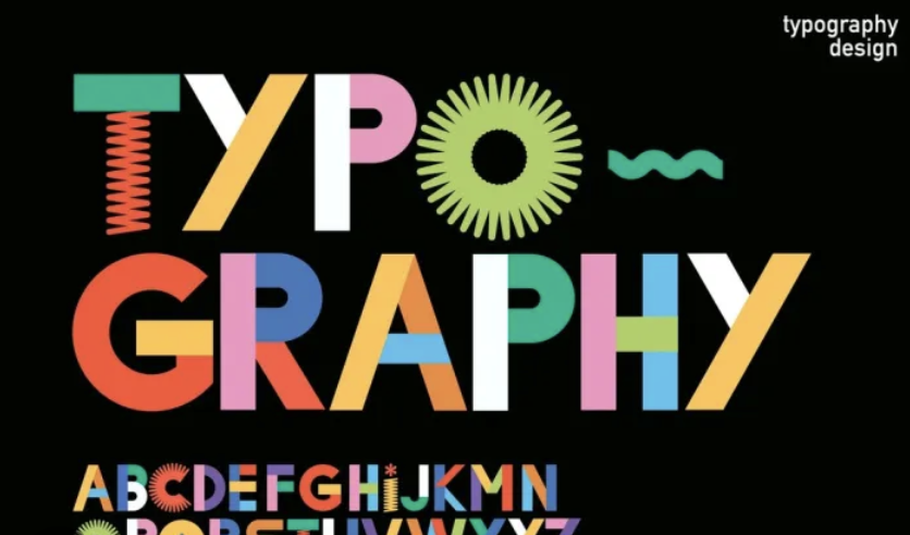
Different Types of Typefaces and Their Characteristics
There are various categories of typefaces, each with its own distinct characteristics. Serif typefaces, such as Times New Roman, have small decorative lines at the ends of letters and are often associated with tradition, elegance, and authority. On the other hand, sans-serif typefaces, like Arial or Helvetica, lack these decorative lines and are considered more modern, clean, and straightforward.
Additionally, script typefaces mimic handwritten or calligraphic styles, adding a personal and artistic touch to the communication. Display typefaces are bold, decorative, and attention-grabbing, often used for headlines or logos. Finally, monospaced typefaces, like Courier, have fixed-width characters and are commonly used in coding or typewriter-like designs.
By understanding the characteristics of different typefaces, you can choose the one that best suits your message and effectively communicates your intended tone and style.
The Psychology Behind Typefaces and How They Affect Perception
Typefaces have a profound impact on perception and can influence how your audience interprets your message. Studies have shown that certain typefaces can evoke specific emotions and create subconscious associations. For example, rounded typefaces are often perceived as friendly and approachable, while angular typefaces can convey a sense of strength and seriousness.
Furthermore, the legibility and readability of a typeface can affect how easily your message is understood. Legibility refers to how easily individual characters can be recognized, while readability refers to the ease of reading a whole block of text. Typefaces with clear letterforms and appropriate spacing contribute to better legibility and readability, ensuring that your message is easily comprehensible to your audience.
Understanding the psychological impact of typefaces can help you craft your communication in a way that resonates with your audience and elicits the desired response.
How Typefaces Impact Readability and Legibility
The choice of typeface has a significant impact on the readability and legibility of your text. Readability refers to how easily the text can be read and understood, while legibility focuses on the recognition of individual characters. Both factors are essential for effective communication.
Typefaces with clear and distinct letterforms, appropriate spacing, and good contrast between letters and the background contribute to better readability. Sans-serif typefaces, such as Arial or Verdana, are often preferred for digital media due to their clean and legible design.
Legibility, on the other hand, is influenced by factors such as letterforms, x-height (the height of lowercase letters), and the overall shape of the typeface. Serif typefaces, like Times New Roman or Georgia, are often considered more readable in print due to the added visual cues provided by the serifs.
By choosing a typeface that enhances both readability and legibility, you ensure that your message is easily accessible to your audience, regardless of the medium.
Case Studies: Examples of Effective Use of Typeface in Branding and Communication
Numerous brands have successfully utilized the power of typeface to enhance their branding and communication. One such example is Coca-Cola, which employs a unique and recognizable script typeface for its logo. This typeface not only conveys a sense of tradition and authenticity but also evokes a feeling of nostalgia, as it has remained largely unchanged for over a century. The choice of typeface has played a significant role in establishing Coca-Cola’s brand identity and creating a strong emotional connection with its audience.
Another example is the use of bold and modern typefaces in technology companies such as Apple and Google. These typefaces communicate innovation, professionalism, and a forward-thinking approach, aligning with the brands’ values and target audience.
These case studies highlight the importance of carefully selecting the right typeface to reinforce brand identity and effectively communicate with the intended audience.
Tips for Choosing the Right Typeface for Your Design Projects
When selecting a typeface for your design projects, there are several factors to consider. First, assess the purpose and target audience of your communication. Are you designing a formal document, a playful advertisement, or an informative website? Understanding the context will help you narrow down the typeface options.
Next, evaluate the readability and legibility of the typeface. Ensure that the letterforms are clear, the spacing is appropriate, and the contrast is sufficient for easy reading. Consider the medium in which your design will be presented – print or digital – and choose a typeface that suits the specific requirements of that medium.
Furthermore, experiment with different typeface pairings to create visual hierarchy and enhance the overall design. Use contrasting typefaces for headlines and body text, or combine a serif typeface with a sans-serif typeface for a balanced and dynamic composition.
Lastly, trust your intuition and seek feedback from others. Sometimes, the best way to determine the right typeface is to see how it resonates with your target audience and aligns with your overall design vision.
Tools and Resources for Exploring and Experimenting with Typefaces
Fortunately, there are numerous tools and resources available to help you explore and experiment with typefaces. Online platforms like Google Fonts and Adobe Fonts provide a vast library of typefaces that can be previewed and downloaded for various design projects. These platforms often offer filters and search options to help you find the perfect typeface based on your specific criteria.
Design software such as Adobe Creative Cloud also offers a wide range of typeface options and customization features, allowing you to fine-tune the typography to suit your design needs.
Additionally, design communities and forums provide valuable insights and inspiration for typography enthusiasts. Websites like Behance and Dribbble showcase the work of designers from around the world, giving you the opportunity to discover new typefaces and learn from their application in real-life design projects.
By utilizing these tools and resources, you can expand your typography knowledge, experiment with different typefaces, and enhance your design skills.
The Future of Typeface Design and Its Impact on Communication
As technology advances and design trends evolve, the future of typeface design holds exciting possibilities. With the rise of augmented reality (AR) and virtual reality (VR), typefaces can be integrated into immersive experiences, enhancing the overall communication and creating unique visual narratives.
Additionally, the increasing focus on accessibility and inclusivity in design will likely influence typeface design. Typeface designers will strive to create typefaces that are easily readable for individuals with visual impairments and cater to a diverse range of cultural and linguistic backgrounds.
Moreover, the development of artificial intelligence (AI) and machine learning algorithms will enable designers to create custom typefaces that adapt and respond to specific user preferences and contexts.
The future of typeface design holds immense potential to revolutionize communication and create more engaging and impactful experiences.
Conclusion
In conclusion, typeface plays a significant role in effective communication. By carefully selecting the right typeface, you can convey the intended tone, evoke specific emotions, and enhance the overall impact of your message. Understanding the characteristics and psychology behind different typefaces, as well as their impact on readability and legibility, empowers you to make informed design decisions.
Through case studies and examples, we have seen how typeface can strengthen branding and create a strong connection with the audience. Tips for choosing the right typeface and utilizing tools and resources enable you to explore and experiment with typography. Looking ahead, the future of typeface design holds exciting possibilities for enhancing communication in a rapidly evolving digital landscape.
Embrace the power of typeface in your design projects, and unlock the potential for more impactful and engaging communication.