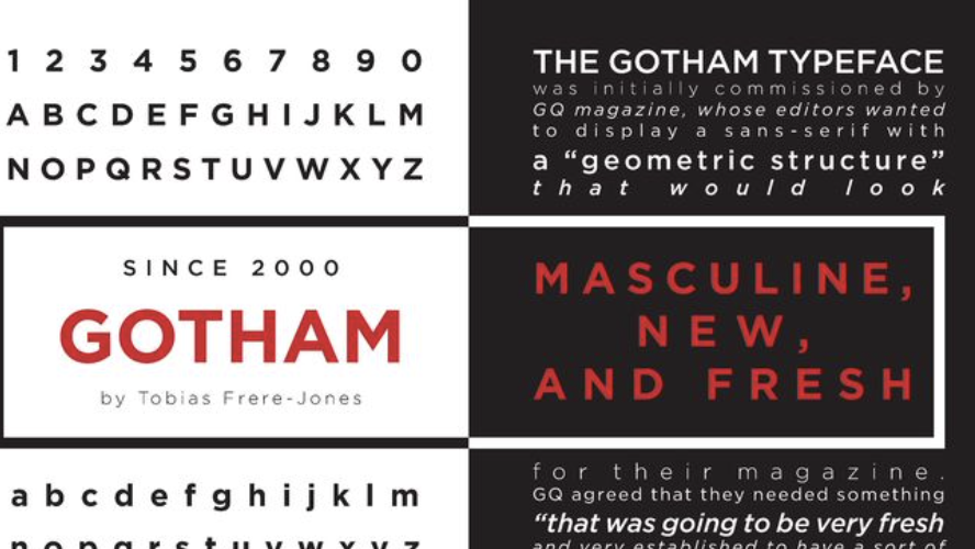
Gotham font is widely regarded as a timeless classic in the world of typography. Its clean and modern aesthetic, coupled with its versatility, has made it a popular choice among designers and brands alike. Gotham font was first introduced in 2000 by American type designer Tobias Frere-Jones, and it has since become one of the most recognizable typefaces in the industry.
.
Gotham font
Contents
- 1 History and origin of Gotham font
- 2 Characteristics and unique features of Gotham font
- 3 Popular uses of Gotham font in design and branding
- 4 The enduring appeal of Gotham font
- 5 How to use Gotham font effectively in design projects
- 6 Alternatives to Gotham font
- 7 Tips for choosing the right font for your design project
- 8 Resources for downloading and purchasing Gotham font
- 9 Conclusion: The timeless elegance of Gotham font
History and origin of Gotham font
The story behind Gotham font is as fascinating as its design. Inspired by the architectural lettering found in New York City, Frere-Jones set out to create a typeface that captured the essence of the city. He meticulously studied the signage of the city’s buildings, subways, and streets, drawing inspiration from the simple, geometric forms he encountered. The result was Gotham font, a typeface that pays homage to the city that never sleeps.
Characteristics and unique features of Gotham font
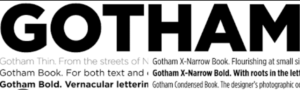
Gotham font is characterized by its clean lines, even stroke widths, and geometric shapes. It is a sans-serif typeface that exudes a sense of modernity and simplicity. One of its unique features is its extensive range of weights and widths, which allows for a wide variety of design possibilities. Whether you need a bold headline or a subtle body text, Gotham font has you covered.
Another notable feature of Gotham font is its legibility. Its clear and balanced letterforms make it easy to read, even at small sizes. This makes it a popular choice for both print and digital applications. Additionally, Gotham font’s versatile nature allows it to be paired with other typefaces seamlessly, making it a go-to choice for designers looking to create harmonious and visually appealing compositions.
Popular uses of Gotham font in design and branding
Gotham font has found its place in a wide range of design projects and branding initiatives. Its clean and modern aesthetic makes it a popular choice for corporate identities, logos, and branding materials. Many well-known companies, such as Netflix, Spotify, and Barack Obama’s 2008 presidential campaign, have utilized Gotham font to create a sense of modernity, professionalism, and trustworthiness.
In addition to corporate branding, Gotham font is often seen in editorial design, advertising campaigns, and web design. Its versatility allows it to adapt to different design styles and contexts, making it a reliable choice for designers working in various industries.
The enduring appeal of Gotham font
The enduring appeal of Gotham font lies in its ability to stand the test of time. Despite being introduced over two decades ago, Gotham font continues to be a popular choice among designers and brands. Its clean and modern aesthetic remains relevant in today’s design landscape, and its versatility allows it to adapt to ever-changing design trends.
Furthermore, Gotham font’s association with New York City gives it a sense of authenticity and timelessness. The font captures the essence of the city’s iconic signage and architectural lettering, allowing it to evoke a sense of urban sophistication and modernity.
How to use Gotham font effectively in design projects
When using Gotham font in design projects, it is important to consider its strengths and best practices. Here are a few tips to help you make the most out of this timeless font:
- Pair it wisely: Gotham font pairs well with a variety of typefaces, but it is important to choose complementary fonts that enhance its clean and modern aesthetic. Experiment with different combinations to find the perfect balance.
- Use appropriate weights and widths: Gotham font offers a wide range of weights and widths. Consider the context and purpose of your design project and choose the appropriate weight and width to convey the desired message.
- Pay attention to spacing: Proper spacing is crucial when working with Gotham font. Ensure that the letters have enough breathing room and avoid overcrowding the text. This will enhance legibility and overall visual appeal.
- Consider hierarchy: Utilize Gotham font’s versatility to establish a clear hierarchy within your design. Use different weights and sizes to differentiate headlines, subheadings, and body text, creating a visually pleasing and organized composition.
Alternatives to Gotham font
While Gotham font is undoubtedly a popular choice, there are alternatives available that can offer a similar aesthetic. Some notable alternatives to Gotham font include Proxima Nova, Montserrat, and Avenir. These typefaces share Gotham font’s modern and clean characteristics, allowing you to achieve a similar look and feel in your design projects.
Tips for choosing the right font for your design project
Choosing the right font for your design project can be a daunting task. Here are a few tips to help you make an informed decision:
- Consider the context: Think about the purpose and context of your design project. Is it for a corporate identity, a magazine layout, or a website? Different fonts evoke different emotions and convey different messages, so choose a font that aligns with the intended tone and purpose of your design.
- Evaluate legibility: Legibility is key when choosing a font. Ensure that the letters are clear and easily readable, even at small sizes. Avoid overly decorative or intricate fonts that may compromise legibility.
- Test for compatibility: When working with multiple fonts, test their compatibility to ensure they harmonize well together. Fonts that clash or compete for attention can create a visually jarring experience, while well-paired fonts can create a cohesive and visually appealing composition.
- Consider versatility: Opt for fonts that offer a range of weights and styles. This will allow you to create visual hierarchy and adapt to different design scenarios.
Resources for downloading and purchasing Gotham font
If you’re interested in using Gotham font for your design projects, there are several resources available for downloading and purchasing the font. Some popular websites where you can find Gotham font include:
- typography.com: The official website of Hoefler & Co., the foundry that distributes Gotham font.
- Adobe Fonts: Adobe Fonts provides a wide range of typefaces, including Gotham font, for both personal and commercial use.
- Fontspring: Fontspring offers a selection of high-quality fonts, including Gotham font, for purchase and download.
Conclusion: The timeless elegance of Gotham font
Gotham font has rightfully earned its place as a timeless classic in the world of typography. Its clean lines, modern aesthetic, and versatility have made it a go-to choice for designers and brands looking to create visually appealing and impactful designs. Whether it’s for corporate branding, editorial design, or web design, Gotham continues to captivate audiences with its enduring appeal. By understanding its history, characteristics, and best practices, designers can effectively utilize this font to elevate their design projects and leave a lasting impression. Embrace the timeless elegance of Gotham font and unlock its potential in your next design endeavor.