Typography transcends mere font selection and word arrangement; it’s an art form deeply rooted in understanding the typography anatomy. This anatomy refers to the intricate details and elements that constitute the design and structure of letters, characters, and symbols. By exploring the type anatomy, we cultivate a deeper appreciation for the meticulous thought and precision involved in crafting visually appealing and legible typography.
Contents
- 1 The basic elements of typography
- 1.1 Understanding letterforms and their anatomy
- 1.2 Exploring the role of ascenders and descenders in typography
- 1.3 The importance of x-height and its impact on legibility
- 1.4 The anatomy of serifs and their various styles
- 1.5 Different types of typographic kerning and spacing
- 1.6 The significance of baseline and its effect on readability
- 1.7 The anatomy of punctuation marks in typography
- 2 Conclusion: Appreciating the intricate anatomy of typography
The basic elements of typography
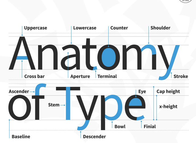
To grasp the anatomy of type, it’s essential to familiarize ourselves with its foundational elements. Typography is composed of various components, such as letterforms, ascenders and descenders, x-height, serifs, kerning and spacing, baseline, and punctuation marks. Each element plays a pivotal role in defining the overall appearance and legibility of the text, making the parts of a letter critical to typography.
Understanding letterforms and their anatomy
Letterforms serve as the foundational building blocks of typography. These individual characters that constitute a typeface each have their unique anatomy, featuring different parts like the stem, bowl, counter, ascender, descender, among others. The meticulous arrangement and proportions of these elements are key to the aesthetics and readability of the typeface, highlighting the importance of the anatomy of a letterform.
Exploring the role of ascenders and descenders in typography
Ascenders and descenders, integral parts of letterforms, extend beyond the x-height, adding verticality and variation to typography. Ascenders rise above the x-height, while descenders fall below the baseline. These elements are vital for creating rhythm and balance in typography, underscoring the need for careful management to ensure legibility and avoid collisions between letters.
The importance of x-height and its impact on legibility
The x-height, marking the height of lowercase letters within a typeface, significantly influences typography’s legibility and appearance. A larger x-height tends to enhance readability, offering a more approachable typeface, whereas a smaller x-height can impart elegance and refinement. Balancing x-height is crucial for achieving the perfect blend of legibility and aesthetics in typography.
The anatomy of serifs and their various styles
Serifs, the small decorative strokes extending from letterforms’ ends, greatly affect typography’s mood and readability. These strokes vary in style, from bracketed to slab serifs, and sans serifs. Serifs evoke tradition and elegance, while sans serifs project a modern, clean aesthetic. Understanding the anatomy and characteristics of different serif styles is essential for choosing the right typeface for any given context.
Different types of typographic kerning and spacing
Kerning and spacing, the art of adjusting space between letters and characters, are fundamental for achieving even and consistent spacing in typography. This contributes to text’s legibility and visual appeal. With different kerning types like metric, optical, and manual, mastering kerning and spacing is key to harmonious and balanced typography.
The significance of baseline and its effect on readability
The baseline, an imaginary line where letters rest, is pivotal for maintaining consistent alignment and ensuring legibility in typography. Proper alignment along the baseline is essential for organized and visually appealing typography. Deviations can disrupt text flow and readability, making understanding the baseline’s significance and implementing proper alignment techniques crucial.
The anatomy of punctuation marks in typography
Punctuation marks, though small, play a significant role in typography. Each mark has its unique anatomy, with specific guidelines for placement and spacing. Proper use and positioning of punctuation marks enhance text clarity and coherence. Overlooking the typography anatomy and rules of punctuation can lead to confusion, highlighting the importance of attention to detail in typography.
Conclusion: Appreciating the intricate anatomy of typography
Typography is more than font selection and word arrangement; it’s an art form enriched by understanding typography anatomy. From the basic elements to the detailed typography anatomy of letterforms, ascenders and descenders, x-height, serifs, kerning and spacing, baseline, and punctuation marks, every aspect contributes to typography’s aesthetics and readability. Delving into the anatomy of typography elevates design skills, enabling the creation of standout typography.