Change Font on your website to create a visually stunning first impression. Your website is often the first thing people see when they interact with your brand. A well-designed site can grab attention, keep visitors engaged, and even boost your SEO. One of the simplest yet most powerful ways to improve your website’s look is by choosing the right fonts. The right typography can enhance readability, strengthen your brand identity, and improve the overall user experience.
In this guide, we’ll walk you through how to change fonts on your website and make it visually appealing while keeping SEO in mind.
Contents
Why Typography Matters

Why Typography Matters
Typography isn’t just about picking a pretty font—it plays a key role in how visitors experience your website. Here’s why it’s important:
- Better User Experience (UX): Clear, easy-to-read fonts help visitors navigate your site effortlessly.
- Stronger Brand Identity: Fonts convey emotion and personality. The right choice reflects your brand’s style and values.
- SEO Benefits: Google prioritizes sites that offer great user experiences, including readable, mobile-friendly typography.
By optimizing your typography, you’re not just improving design—you’re also making your website more effective and SEO-friendly.
How to Change Fonts on Your Website

How to Change Fonts on Your Website
1. Pick the Right Font
Your font choice sets the tone for your website. Here are some options:
- Web-Safe Fonts: These are standard fonts like Arial, Times New Roman, and Georgia that are available on all devices. They’re reliable but not very unique.
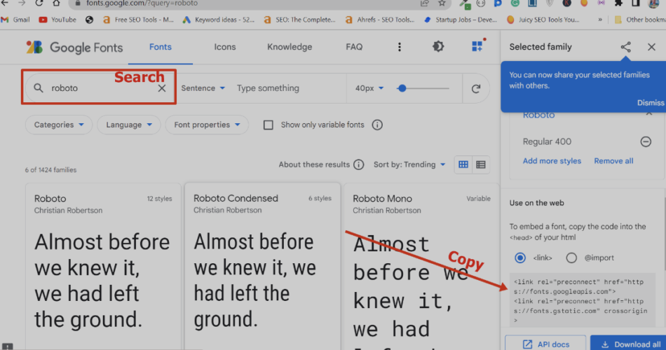
- Google Fonts: A free library with thousands of fonts that are easy to integrate into your site. Popular choices include Roboto, Open Sans, and Lato.
- Custom Fonts: If you want a completely unique look, you can upload custom fonts. Just make sure they’re optimized so they don’t slow down your site.
Pro Tip: Stick to 2-3 fonts max—one for headings, one for body text, and maybe one for accents. Too many fonts can make your site look messy.
2. Change Fonts in Your Website Builder or CMS
Depending on your platform, here’s how to update your fonts:
- WordPress: Use the Customizer or a plugin like “Elementor” or “WP Google Fonts.”
- Wix: Go to “Text” settings in the editor and choose from Wix’s font library or upload your own.
- Squarespace: Open “Design” and update fonts under “Fonts.”
- Custom HTML/CSS: If coding your site, use CSS:
body {
  font-family: 'Roboto', sans-serif;
}
3. Optimize Font Size and Line Height
- Body text: Keep it between 16px and 18px for readability.
- Headings: Range from 24px to 48px based on their importance.
- Line height: Use 1.5 to 1.6 times the font size for easy reading.
4. Ensure Mobile Friendliness
Test your fonts on different devices to make sure they scale well. Using relative units like em or rem in CSS can help fonts adjust properly.
5. Pair Fonts Smartly
- Serif + Sans-Serif: Pairing a serif font (like Merriweather) with a sans-serif font (like Open Sans) creates contrast.
- Use Font Pairing Tools: Websites like Font Pair can help you find great combinations.
Enhancing Visual Appeal with Typography
1. Create Hierarchy
Use bigger, bolder fonts for headings to guide readers through your content easily.
2. Add Contrast
Make sure your text stands out against the background. Dark text on a light background (or vice versa) works best.
3. Use White Space
Avoid crowding text—proper spacing makes your site look clean and professional.
4. Add Subtle Typography Effects
Letter spacing, italics, and text shadows can add flair without overwhelming readers.
SEO Considerations When Changing Fonts
1. Page Speed
Fonts can slow down your website if they’re not optimized. To avoid this:
- Use Google Fonts, which load quickly.
- Compress font files.
- Add
font-display: swap;in your CSS to prevent layout shifts.
2. Readability Matters
Avoid fancy, hard-to-read fonts. Google prefers sites with high readability, so keep it simple.
3. Make It Mobile-Friendly
Test fonts on mobile devices to ensure they display correctly, as Google ranks mobile-friendly sites higher.
4. Use Proper HTML Tags
Use <h1>, <h2>, <p>, etc., correctly. This helps search engines understand your content structure.
5. Accessibility Counts
Pick fonts that are easy to read for all users, including those with visual impairments. Tools like WebAIM can help you test font accessibility.
Useful Tools for Choosing and Implementing Fonts
- Google Fonts: Free web fonts.
- Adobe Fonts: Premium, high-quality fonts.
- Font Pair: Helps find complementary fonts.
- WhatFont: Browser extension to identify fonts.
- Google PageSpeed Insights: Checks website speed and font optimization.
Final Thoughts
Changing fonts might seem like a small detail, but it can make a huge difference in how your website looks and performs. By picking the right fonts, optimizing for readability, and ensuring mobile-friendliness, you can create a site that not only looks stunning but also ranks well on search engines.