Typography plays a vital role in design. It has the power to evoke emotions, convey messages, and create a memorable visual experience. As a designer, understanding the art of typography is crucial for creating a polished design. In this article, I will guide you through the process of identifying fonts, using font identifier and provide you with the tools, resources, and best practices to enhance your typography skills.
Contents
- 1 The Importance of Typography in Design
- 2 Understanding the Basics of Typography
- 3 The Different Types of Fonts
- 4 How to Identify Fonts
- 5 Tools and Resources for Font Identification
- 6 Best Practices for Using Fonts in Design
- 7 Common Typography Mistakes to Avoid
- 8 Case Studies of Effective Typography in Design
- 9 The Role of Typography in Branding
- 10 Conclusion
The Importance of Typography in Design
Typography is more than just selecting a font. It is about creating harmony between the text and the overall design. The right typography can enhance the readability, legibility, and aesthetic appeal of a design. It can set the tone, evoke emotions, and engage the audience. Typography is an essential element in branding, marketing materials, websites, and any form of visual communication.
Understanding the Basics of Typography
Before diving into font identification, it is essential to understand the basics of typography. Typography consists of various elements such as typefaces, fonts, font families, letter spacing, line spacing, and hierarchy. Each element contributes to the overall typographic design. Typefaces are the different styles of fonts, while fonts refer to the specific variations within a typeface. Font families encompass a collection of related fonts, offering different weights, styles, and variations.
The Different Types of Fonts
Fonts can be broadly categorized into four main types: serif, sans serif, script, and display. Serif fonts have small decorative lines at the end of each stroke, which makes them more traditional and formal. Sans serif fonts, on the other hand, have clean and simple lines without any decorative strokes. They are often used for modern and minimalist designs. Script fonts mimic handwriting and add a touch of elegance and sophistication to a design. Display fonts are highly decorative and eye-catching, perfect for titles and headlines.
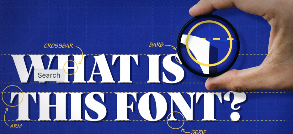
How to Identify Fonts
Identifying fonts can be a challenging task, especially when you come across a beautiful typeface that you want to use in your own design. Fortunately, there are several tools and resources available to help you with font identification. One popular tool is WhatFontIs, which allows you to upload an image or enter a URL to identify fonts. You can also use websites like Identifont and WhatTheFont, which provide a step-by-step process to narrow down the font options based on specific characteristics.
Tools and Resources for Font Identification
In addition to the tools mentioned above, there are other valuable resources for font identification. Adobe Typekit is a vast library of fonts that you can browse and search. It also offers a feature called “match font” where you can upload an image to find similar fonts. Google Fonts is another excellent resource that provides a wide range of free fonts for web and print design. Font Squirrel is a website that offers free fonts as well as a font identifier tool. These resources, along with the various font identification tools available, will help you in your quest to find the perfect font.
Best Practices for Using Fonts in Design
Once you have identified the right font for your design using font identifier , it is crucial to use it effectively. Here are some best practices for using fonts in design:
- Consistency: Maintain consistency by using a limited number of fonts throughout your design. Stick to two or three fonts to maintain visual harmony.
- Hierarchy: Establish a clear hierarchy by using different font weights, sizes, and styles. This will guide the reader’s eye and emphasize important information.
- Readability: Ensure that the chosen font is easily readable. Avoid using overly decorative or elaborate fonts for body text, as they can be challenging to read.
- Contrast: Create contrast between different elements of your design, such as headings and body text, by using fonts with varying weights, styles, or sizes.
- Whitespace: Use whitespace effectively to give your typography room to breathe. Avoid cluttering your design with too much text or elements that distract from the typography.
Common Typography Mistakes to Avoid
While it is essential to know what to do when it comes to typography, it is equally important to know what mistakes to avoid. Here are some common typography mistakes to steer clear of:
- Poor Font Pairing: Avoid pairing fonts that clash or create visual discord. Choose fonts that complement each other and create a harmonious design.
- Inconsistent Spacing: Maintain consistent spacing between letters, words, and lines. Inconsistent spacing can make the text difficult to read and disrupt the overall design.
- Lack of Hierarchy: Failing to establish a clear hierarchy can result in a confusing design. Ensure that important information stands out and is easily distinguishable from secondary text.
- Overusing Special Effects: While special effects can add visual interest, overusing them can make the design look amateurish. Use effects sparingly and with purpose.
- Ignoring Accessibility: Accessibility is crucial in design. Ensure that your chosen fonts are accessible to people with visual impairments by considering factors like legibility and color contrast.
Case Studies of Effective Typography in Design
To further understand the impact of typography in design, let’s explore some case studies of effective typography:
- Apple: Apple’s branding is renowned for its clean and minimalist typography. Their use of the San Francisco font on all their devices and marketing materials creates a consistent and recognizable brand identity.
- The New York Times: The New York Times uses a combination of serif and sans serif fonts to create a hierarchy and guide readers through their articles. The typography is elegant, professional, and easy to read.
- Coca-Cola: Coca-Cola’s typography is iconic and instantly recognizable. The flowing script font used in their logo evokes a sense of nostalgia and captures the essence of their brand.
The Role of Typography in Branding
Typography plays a significant role in branding. It helps establish a brand’s personality, evoke emotions, and create a memorable visual identity. Consistent and well-executed typography can differentiate a brand from its competitors and reinforce its message. Whether it’s a logo, website, packaging, or advertising, typography is a powerful tool for building brand recognition and loyalty.
Conclusion
Typography is an art form that requires a keen eye, attention to detail, and a deep understanding of design principles. By mastering the art of identifying fonts and using them effectively, you can elevate your designs to new heights. Remember to explore the various tools and resources available for font identification, and always adhere to best practices to create visually stunning and polished designs. Typography is the backbone of design, and by unveiling its art, you can create impactful and memorable experiences for your audience.
CTA: Take your typography skills to the next level and explore the world of fonts with our comprehensive guide on font identifier and best practices. Enhance your designs and create visually stunning experiences today!