
Contents
- 1 The Role of Fonts in Design and Communication
- 2 The Psychology Behind Fonts and How They Influence Perception
- 3 Surprising Facts About Fonts and Their Impact on Reading Speed
- 4 The Connection Between Fonts and Brand Identity
- 5 The Evolution of Fonts Throughout History
- 6 The Importance of Choosing the Right Font for Different Types of Content
- 7 Popular Fonts and Their Characteristics
- 8 Font Trends in Modern Design
- 9 Tips for Using Fonts Effectively in Your Designs
- 10 Conclusion: Embracing the Power of Fonts in Your Creative Endeavors
The Role of Fonts in Design and Communication
As a designer, I’ve always been fascinated by the power of fonts. They are the unsung heroes of the visual world, silently shaping the way we perceive and interact with the content we consume. From the sleek elegance of a corporate brochure to the whimsical charm of a children’s storybook, fonts play a crucial role in conveying the intended message and evoking the desired emotions.
In this article, we’ll delve into the intriguing world of fonts, uncovering surprising facts that will leave you spellbound. We’ll explore the psychology behind font choices, the evolution of typography throughout history, and the crucial role fonts play in brand identity and modern design trends.
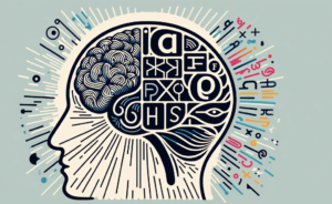
The Psychology Behind Fonts and How They Influence Perception
Fonts are more than just a collection of letters and symbols; they are powerful tools that can shape our perceptions and emotions. Studies have shown that the choice of font can significantly impact how we interpret the meaning and tone of a message. For instance, a bold, angular font might convey a sense of strength and authority, while a delicate, cursive font might evoke feelings of elegance and sophistication.
The psychology of fonts is a fascinating field of study, and researchers have uncovered some surprising insights. Did you know that certain fonts can actually influence our reading speed and comprehension? Fonts with higher legibility, such as Serif fonts, have been found to improve reading efficiency, while decorative or script fonts can sometimes hinder the reading experience.
The Psychology Behind Fonts
Surprising Facts About Fonts and Their Impact on Reading Speed
One of the most surprising facts about fonts is their impact on reading speed. While we might assume that all fonts are created equal, the reality is quite different. Studies have shown that certain fonts can significantly affect how quickly we can read and process information.
For example, did you know that the font Courier, a monospaced font commonly used in coding and technical documents, can actually slow down reading speed by up to 26% compared to more proportionally spaced fonts like Times New Roman? This is because the uniform character spacing in Courier can make it more difficult for our eyes to quickly recognize and process the words.
On the other hand, fonts like Verdana and Georgia have been found to be more readable on digital screens, leading to faster reading speeds. This is due to their larger x-height (the height of the lowercase letters) and wider letter spacing, which makes them easier on the eyes.
The Connection Between Fonts and Brand Identity
Fonts are not just a matter of aesthetics; they are an integral part of a brand’s identity. The fonts used in a company’s logo, marketing materials, and digital presence can convey a wealth of information about the brand’s personality, values, and target audience.
Consider the iconic Coca-Cola logo, with its elegant cursive font that evokes a sense of timelessness and sophistication. Or the bold, sans-serif font used by tech giant Apple, which communicates a sleek, modern, and innovative brand image. The font choices made by these companies are not accidental; they are carefully crafted to align with the brand’s overall identity and resonating with their target consumers.
The Connection Between Fonts and Brand Identity
The Evolution of Fonts Throughout History
Fonts have a rich and fascinating history, evolving alongside the development of written language and the technological advancements that have shaped the way we communicate.
From the ornate calligraphic scripts of the Middle Ages to the clean, modernist typefaces of the 20th century, the evolution of fonts has been a reflection of the cultural, social, and technological changes that have shaped our world. The invention of the printing press, for example, revolutionized the way fonts were created and disseminated, paving the way for the mass production of books and the democratization of knowledge.
As we move into the digital age, the evolution of fonts continues, with designers and typographers pushing the boundaries of what is possible. From the emergence of variable fonts, which allow for seamless adjustments in weight, width, and other properties, to the increasing use of custom-designed typefaces in branding and digital experiences, the world of fonts is constantly evolving and expanding.
The Importance of Choosing the Right Font for Different Types of Content
When it comes to effective communication and design, the choice of font is crucial. Different types of content require different font choices to ensure maximum impact and readability.
For example, a formal business document might call for a classic Serif font, such as Times New Roman or Garamond, to convey a sense of professionalism and authority. On the other hand, a creative blog post might benefit from a more playful, Sans-Serif font like Roboto or Open Sans to create a more approachable and engaging tone.
The choice of font can also have a significant impact on the accessibility of your content. Fonts with higher legibility, such as those with clear letter shapes and generous spacing, can make it easier for readers with visual impairments or dyslexia to engage with your content.
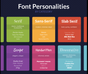
Popular Fonts and Their Characteristics
In the world of fonts, there are a few that have achieved iconic status, each with its own unique characteristics and personality. Let’s take a closer look at some of the most popular fonts and what makes them so distinctive:
- Times New Roman: A classic Serif font known for its timeless elegance and readability. Often used in academic and professional settings.
- Arial: A versatile Sans-Serif font that is widely used in digital and print media. Its clean, modern aesthetic makes it a popular choice for a wide range of applications.
- Helvetica: A highly influential Sans-Serif font that is renowned for its neutrality and legibility. Commonly used in branding, signage, and corporate communications.
- Futura: A geometric Sans-Serif font that conveys a sense of modernity and efficiency. Often used in design, fashion, and technology-related contexts.
- Baskerville: A Serif font with a distinctive old-world charm, known for its high contrast and elegant curves. Frequently used in book publishing and high-end print materials.
Font Trends in Modern Design
As the design landscape continues to evolve, so too do the trends in font usage. In recent years, we’ve seen a growing emphasis on unique, custom-designed typefaces that help brands stand out and create a more personalized visual identity.
One emerging trend is the rise of variable fonts, which allow for seamless adjustments in weight, width, and other properties. This gives designers greater flexibility in creating dynamic and responsive typographic experiences, particularly in the digital realm.
Another trend is the increased use of display fonts, which are often decorative or script-based, in branding and marketing materials. These attention-grabbing fonts can add a touch of personality and flair to a design, helping to capture the audience’s attention and convey a specific brand aesthetic.
Tips for Using Fonts Effectively in Your Designs
As a designer, I’ve learned that the effective use of fonts is a delicate balance of art and science. Here are some tips to help you leverage the power of fonts in your creative endeavors:
- Understand the Personality of Your Fonts: Familiarize yourself with the unique characteristics and emotional associations of different font families. This will help you make informed decisions about which fonts best align with your design goals and the overall brand identity.
- Prioritize Legibility: While decorative fonts can be visually striking, it’s essential to ensure that your primary content remains highly readable. Consider factors like font size, line spacing, and letter spacing to optimize readability.
- Limit Your Font Choices: Resist the temptation to use too many different fonts in a single design. Stick to a harmonious palette of 2-3 complementary fonts to create a cohesive and visually appealing aesthetic.
- Experiment with Hierarchy: Use variations in font size, weight, and style to establish a clear visual hierarchy and guide the reader’s eye through your content. This can help to emphasize the most important information and create a more engaging layout.
- Stay Up-to-Date with Trends: Keep an eye on the evolving landscape of font trends and innovations. This will help you incorporate fresh, modern typefaces that resonate with your target audience and keep your designs feeling current and relevant.
Ready to unlock the full potential of fonts in your design projects? Contact us today to learn more about our font selection and typography services. Our team of experts is here to help you choose the perfect fonts that will captivate your audience and elevate your brand’s visual identity.
Conclusion: Embracing the Power of Fonts in Your Creative Endeavors
Fonts are the unsung heroes of the design world, quietly shaping the way we perceive and interact with the content we consume. By understanding the psychology behind font choices, the evolution of typography, and the crucial role fonts play in brand identity and modern design trends, we can harness the power of fonts to create truly captivating and effective visual experiences.
As you embark on your own creative journeys, I encourage you to embrace the mysteries and wonders of the font world. Experiment, explore, and let your font choices reflect the unique personality and vision of your brand or project. After all, the right font can be the difference between a design that merely functions and one that truly captivates and inspires.