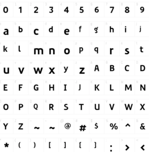
In the world of typography, a well-crafted typeface can be a work of art in itself, conveying emotion, style, and character in the strokes and curves of its letters. G-Type, a renowned type foundry known for its exceptional design and craftsmanship, has recently unveiled its latest masterpiece: Precious Sans Two. This new typeface release has garnered attention from designers, typographers, and creatives alike. In this article, we’ll take an in-depth look at Precious Sans Two, exploring its unique features, versatility, and the creative possibilities it unlocks.

Precious Sans Two
Contents
The Evolution of Precious Sans
Precious Sans Two is the refined successor to the original Precious Sans, a typeface that had already established itself as a beloved choice for design projects. G-Type, known for its commitment to perfection and innovation, sought to enhance an already impressive creation.
Enhanced Legibility
One of the primary improvements in Precious Sans Two is enhanced legibility. While the original Precious Sans was admired for its elegance, the designers at G-Type have carefully tweaked letterforms to make Precious Sans Two even more readable without sacrificing its distinct aesthetic appeal. This makes it an ideal choice for a wide range of applications, from print to digital media.
Extended Character Set
Precious Sans Two boasts a comprehensive character set, including extended language support. This means that designers can now work with a broader range of languages and special characters, making it a versatile choice for projects with diverse textual needs.
Variety of Styles
The typeface comes in multiple styles, including regular, italic, and bold variations. This variety allows designers to maintain consistency while adding emphasis and style when necessary. Whether you’re designing a brand identity, a publication, or a website, Precious Sans Two has the perfect style to suit your project.
Applications and Creative Possibilities
Precious Sans Two offers a wide array of creative possibilities, making it a versatile choice for designers across different industries.
Branding and Identity
When it comes to brand identity, typography plays a crucial role in conveying a brand’s personality. Precious Sans Two’s elegant and refined appearance makes it suitable for luxury brands, upscale restaurants, and high-end products. Its versatility also allows it to adapt to the identity of modern startups and tech companies, making it a valuable asset in the world of branding.
Editorial Design
For editorial designers working on magazines, newspapers, or books, Precious Sans Two provides a timeless elegance that can elevate the overall reading experience. Its readability ensures that the content remains accessible and visually engaging.
Web Design
In the digital realm, Precious Sans Two excels. It renders beautifully on screens, making it an excellent choice for website design, app interfaces, and user interfaces. Its versatility across various digital platforms ensures that the message remains consistent and appealing to a wide audience.

The Evolution of Precious Sans
Conclusion
G-Type’s release of Precious Sans Two is a testament to their commitment to excellence in typography. With improved legibility, an extended character set, and a variety of styles, this typeface offers designers a versatile tool for a wide range of projects. Its applications are diverse, spanning from branding and editorial design to web and digital interfaces. Precious Sans Two is a timeless, elegant, and sophisticated typeface that has quickly become a must-have in the arsenal of any discerning designer. Whether you’re crafting a brand’s visual identity or designing a captivating publication, Sans Two is poised to elevate your creative endeavors to new heights.
