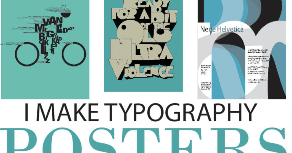
Typography is a cornerstone of design, especially when it comes to creating impactful posters. It’s not just about selecting attractive fonts; it’s an art form that combines typefaces, sizes, spacing, and colors to communicate a message effectively. In this article, you will learn typography poster analysis, exploring the key elements, techniques, and principles that make a poster stand out.
Contents
Why Typography Matters in Posters
Before we delve into learn typography poster analysis, it’s essential to understand why typography is so crucial in poster design. Posters are visual tools designed to grab attention, convey information quickly, and leave a lasting impression. The right typography can make a poster memorable, while poor choices can render it ineffective.
Typography in posters serves three primary purposes:
- Communication: It delivers the message clearly and concisely.
- Aesthetics: It enhances the visual appeal of the design.
- Emotion: It evokes feelings and sets the tone for the message.
Key Elements of Typography in Poster Design
When you learn typography poster analysis, you’ll notice that several elements work together to create a cohesive design. Here are the key components to focus on:
1. Typeface Selection
The choice of typeface sets the tone for the poster. Serif fonts (e.g., Times New Roman) convey tradition and elegance, while sans-serif fonts (e.g., Helvetica) feel modern and clean. Script fonts add a personal touch, and display fonts are ideal for bold, attention-grabbing headlines.
2. Hierarchy
Hierarchy refers to the arrangement of text to guide the viewer’s eye. The most important information (e.g., the event name) should be the most prominent, often through larger size, boldness, or color.
3. Alignment
Text alignment—whether left, right, centered, or justified—affects readability and aesthetics. Symmetrical alignment creates balance, while asymmetrical layouts can add dynamism.
4. Color
Color plays a vital role in setting the mood and drawing attention. Bright colors evoke energy, while muted tones suggest sophistication. Ensure the font color contrasts well with the background for readability.
5. Contrast
High contrast between text and background improves legibility, while low contrast can create subtle, artistic effects.
6. Spacing
Spacing includes:
- Tracking: Space between all characters.
- Kerning: Space between two specific characters.
- Leading: Space between lines of text.
Proper spacing ensures the text is easy to read and visually appealing.
How to Analyze a Typography Poster
When you learn typography poster analysis, follow these steps to evaluate a design effectively:
1. Examine the Layout
Start by looking at the overall layout. Is it clean and organized, or chaotic and busy? Both styles can work, depending on the poster’s purpose.
2. Evaluate Typeface Selection
Ask yourself:
- Do the fonts match the poster’s theme?
- Are they modern, traditional, or decorative?
For example, a music festival poster might use bold, edgy fonts, while a charity event poster could feature soft, approachable typefaces.
3. Assess Hierarchy
Identify the focal point of the poster. Is the most important information immediately visible? Effective posters use size, weight, and placement to create a clear hierarchy.
4. Check Alignment
Look at how the text is aligned. Symmetrical designs feel balanced, while asymmetrical layouts can create visual interest and movement.
5. Analyze Color Choices
Consider how color influences the poster’s mood. Bright, vibrant colors suggest excitement, while neutral tones convey elegance and calm.
6. Evaluate Contrast and Spacing
Ensure the text is easy to read. High contrast between text and background is essential for legibility. Also, check if the spacing feels cramped or balanced.
Examples of Typography in Poster Design
To better understand learn typography poster analysis, let’s look at some examples:
1. Concert Posters
These often use bold, display fonts with high contrast and vibrant colors to convey energy and excitement.
2. Corporate Event Posters
These typically feature clean, sans-serif fonts with a balanced layout and muted colors to project professionalism.
3. Art Exhibition Posters
These may use creative, decorative fonts with asymmetrical layouts and unique color palettes to reflect artistic expression.
Tools for Typography Poster Analysis
If you want to learn typography poster analysis, these tools can help:
- Adobe Illustrator: For creating and analyzing typography designs.
- Canva: A user-friendly tool for experimenting with fonts and layouts.
- Font Pairing Tools: Websites like Fontjoy help you find complementary typefaces.
- Contrast Checkers: Tools like WebAIM ensure your text is readable against the background.
Common Mistakes to Avoid
When analyzing typography posters, watch out for these pitfalls:
- Poor Contrast: Text that blends into the background is hard to read.
- Overcrowding: Too much text or insufficient spacing can overwhelm the viewer.
- Inconsistent Hierarchy: If the most important information isn’t prominent, the message gets lost.
Conclusion: Learn Typography Poster Analysis
Learn typography poster analysis is about understanding how every design choice—from typeface selection to spacing—contributes to the poster’s effectiveness. By mastering these elements, you can create or evaluate posters that communicate clearly, captivate audiences, and leave a lasting impression.
Whether you’re a designer, marketer, or student, learning to analyze typography in posters will enhance your appreciation for the art and science of visual communication. So, the next time you see a poster, take a moment to analyze its typography—you might be surprised by what you discover!
