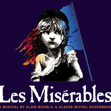
In tracing the history of the iconic Les Misérables musical logo, we uncover a captivating fusion of art and typography. Cosette’s image in the logo derives from Gustave Brion’s etching, inspired by Émile Bayard’s illustration for Victor Hugo’s first edition. In 1985, Russ Eglin, Dewynters’ creative director, incorporated this artistic heritage into the London production’s logo, pairing it with the distinguished Caslon Antique typeface. Eglin also extended his remarkable design portfolio to other Cameron Mackintosh productions, including The Phantom of the Opera and Cats.
The Timeless Significance of the Les Misérables Logo
While Cosette’s image carries immense cultural weight, the logotype itself is equally iconic. It stands as a testament to enduring design, gracing multiple decades and seamlessly adapting to the recent Hollywood rendition. In this version, the classic illustration gracefully transitions to a photograph of the talented actor portraying Cosette.
Caslon Antique: A Typeface from a Bygone Era
Caslon Antique, the prominent typeface in the Les Misérables logo, has roots in the 1800s. Bernd Nadall crafted it, and it entered the world of typography when Barnhart Brothers & Spindler released it in metal during the late 19th century. Interestingly, Caslon Antique‘s design has no direct lineage with the original Caslon typeface; it was likely adopted for strategic marketing reasons.
Various digital interpretations of Caslon Antique exist today, differing in source sizes and intentional smoothing of certain rough contours. Nonetheless, the enduring appeal of this typeface continues to captivate audiences, leaving an indelible mark on Les Misérables‘ visual identity.