Typography plays a pivotal role in design, shaping how we perceive and interact with written content. Among the many typeface classifications, Neo Grotesque fonts stand out as a refined and modernized evolution of the traditional Grotesque typefaces of the 19th century. This article explores the history, characteristics, and significance of Neo-Grotesque fonts, their impact on design, and their enduring relevance in contemporary typography.
Contents
What Are Neo Grotesque Fonts?
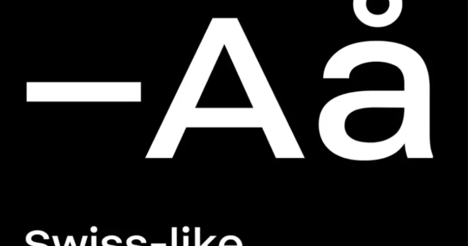
Neo-Grotesque fonts are a subcategory of sans-serif typefaces that emerged in the mid-20th century. They are characterized by their clean, neutral, and highly functional design, making them a popular choice for both print and digital media. These fonts evolved from the earlier Grotesque typefaces but were refined to meet the demands of modern design, emphasizing simplicity, readability, and versatility.
The History of Neo-Grotesque Fonts
The Origins of Grotesque Typefaces
The story of Neo-Grotesque fonts begins with their predecessors, the Grotesque typefaces, which originated in the 19th century. Grotesque fonts were among the first sans-serif typefaces, breaking away from the traditional serif styles that dominated typography at the time. They were named “Grotesque” because their clean, sans-serif design was considered unconventional and even ugly by some standards.
The Transition to Neo-Grotesque
By the mid-20th century, designers sought to refine the Grotesque style, leading to the development of Neo-Grotesque fonts. This new generation of typefaces retained the simplicity of Grotesque fonts but introduced more geometric precision, uniformity, and neutrality. The goal was to create typefaces that were highly functional and adaptable to the growing demands of advertising, corporate branding, and mass communication.
Key Milestones in Neo Grotesque Typography
- 1957: The release of Helvetica by Max Miedinger and Eduard Hoffmann marked a defining moment for Neo-Grotesque fonts. Helvetica became a global phenomenon, celebrated for its neutrality and versatility.
- 1957: Univers, designed by Adrian Frutiger, was another landmark Neo-Grotesque typeface, known for its extensive range of weights and styles.
- 1960s-1970s: Neo-Grotesque fonts gained widespread adoption in corporate branding, signage, and public communication, solidifying their place in modern design.
Characteristics of Neo Grotesque Fonts
Neo-Grotesque fonts are defined by several key features:
- Neutrality and Simplicity:
These fonts are designed to be unobtrusive, making them ideal for a wide range of applications. They avoid excessive stylistic elements, focusing instead on clarity and readability. - Uniform Stroke Width:
Neo-Grotesque fonts typically have consistent stroke widths, contributing to their clean and balanced appearance. - Geometric Precision:
While not as rigidly geometric as other sans-serif categories like Geometric Sans, Neo-Grotesque fonts exhibit a subtle geometric influence in their letterforms. - Open Letterforms:
The apertures (openings) in letters like ‘a’, ‘e’, and ‘c’ are often wider, enhancing legibility, especially at smaller sizes. - Minimal Contrast:
Unlike Humanist sans-serif fonts, Neo-Grotesque fonts have minimal contrast between thick and thin strokes, contributing to their modern and streamlined look. - Versatility:
These fonts are highly adaptable, making them suitable for both body text and headlines, as well as for digital and print media.
Popular Neo Grotesque Fonts
Several Neo-Grotesque fonts have become iconic in the world of typography:
- Helvetica:
Often referred to as the “king of typefaces,” Helvetica is the quintessential Neo-Grotesque font. Its neutrality and versatility have made it a favorite for brands, governments, and designers worldwide. - Univers:
Designed by Adrian Frutiger, Univers is known for its extensive family of weights and styles, offering unparalleled flexibility for designers. - Arial:
Although often compared to Helvetica, Arial has its own distinct characteristics and is widely used in digital environments. - Akzidenz-Grotesk:
A precursor to Neo-Grotesque fonts, Akzidenz-Grotesk influenced the development of later typefaces like Helvetica and Univers. - Roboto:
Designed for Google’s Android operating system, Roboto is a modern take on the Neo-Grotesque style, optimized for digital screens.
The Impact of Neo Grotesque Fonts on Design
Corporate Branding
Neo-Grotesque fonts have become synonymous with corporate identity. Their neutrality and professionalism make them ideal for brands seeking a clean and modern image. Companies like BMW, American Airlines, and Panasonic have used Neo-Grotesque fonts in their logos and branding.
Public Communication and Signage
The clarity and readability of Neo-Grotesque fonts make them a popular choice for public communication, including transportation signage, wayfinding systems, and government documents. For example, Helvetica is used in the signage systems of major airports and subway systems worldwide.
Digital Design
With the rise of digital media, Neo-Grotesque fonts have found a new home on screens. Their clean and legible design makes them well-suited for user interfaces, websites, and mobile apps.
Neo Grotesque Fonts in Contemporary Design
Despite being rooted in mid-20th-century design, Neo-Grotesque fonts remain highly relevant today. Their timeless appeal and adaptability have ensured their continued use in a variety of contexts. Modern designers often pair Neo-Grotesque fonts with other typefaces to create dynamic and visually engaging layouts.
Trends in Neo Grotesque Typography
- Customization: Brands are increasingly customizing Neo Grotesque fonts to create unique identities while retaining the font’s inherent neutrality.
- Variable Fonts: The development of variable fonts has expanded the possibilities of Neo Grotesque typography, allowing for greater flexibility in weight, width, and other attributes.
- Minimalist Design: The rise of minimalist design trends has further cemented the popularity of Neo Grotesque fonts, as they align perfectly with the principles of simplicity and functionality.
Conclusion
Neo Grotesque fonts represent a significant evolution in typography, bridging the gap between the traditional Grotesque typefaces of the 19th century and the demands of modern design. Their clean, neutral, and versatile design has made them a staple in corporate branding, public communication, and digital media. As design trends continue to evolve, Neo Grotesque fonts remain a timeless choice, proving that simplicity and functionality never go out of style.