In the realm of typography, few typefaces have endured and evolved quite like Arial. Created in 1982 by Robin Nicholas and Patricia Saunders, designers at Monotype, Arial was designed as a metrically-compatible and subtly redesigned alternative to Helvetica. The typeface was intended to be bundled with Microsoft software, serving as a core font for the Windows operating system. Since its inception, Arial has become one of the most widely used and recognizable typefaces in the world, finding its place in everything from corporate branding to academic publications.
Contents
Historical Context and Design Influence
Arial’s design draws heavily from Helvetica, a Swiss typeface created in 1957. Helvetica was celebrated for its clean, modernist aesthetic and quickly became a popular choice for designers and typographers. However, Helvetica’s widespread adoption was hindered by its limited availability on early digital platforms. Arial was developed to address this issue, offering a font that retained the characteristics of Helvetica while being more readily accessible on digital systems.
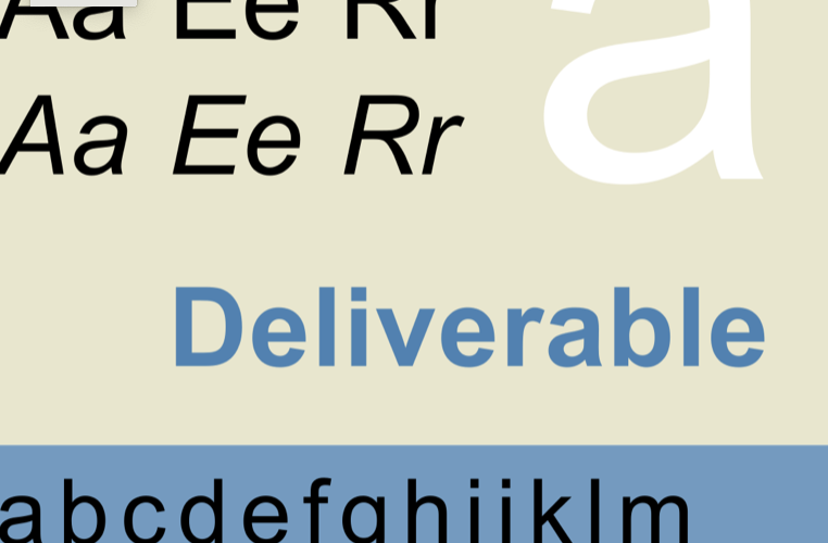
The design of Arial reflects the trends of the 20th century modernist movement, characterized by simplicity, clarity, and neutrality. Its sans-serif design features uniform stroke widths, open counters, and a lack of decorative elements, making it highly legible and versatile. These attributes have contributed to Arial’s enduring popularity across a wide range of applications.
Versatility and Application
One of Arial’s key strengths is its versatility. The typeface is well-suited for a variety of contexts, from print to digital media. Its clean, unadorned appearance makes it particularly effective for conveying information in a straightforward and easily readable manner. Arial’s neutrality also allows it to adapt to different design styles and aesthetics, making it a popular choice for both formal and informal communication.
Arial’s versatility is further enhanced by its extensive character set, which includes a wide range of weights and styles. This allows designers to use Arial in a variety of contexts, from body text to headlines, while maintaining visual consistency. Additionally, Arial’s availability on most operating systems and software platforms ensures that it can be easily used and shared across different environments.
Criticism and Controversy
Despite its widespread use, Arial has not been without its critics. One of the primary criticisms of Arial is its perceived lack of originality, with many designers noting its similarity to Helvetica. This has led to accusations of Arial being a “rip-off” or “clone” of Helvetica, sparking debates about the ethics of typeface design and intellectual property.
Another criticism of Arial is its design quirks, such as its slightly condensed letterforms and uneven spacing, which can make it less aesthetically pleasing compared to Helvetica. Some typographers also argue that Arial’s design compromises legibility and readability in certain contexts, particularly at smaller sizes or in dense blocks of text.
Conclusion
In conclusion, Arial stands as a testament to the enduring appeal and adaptability of modernist typography. Despite its origins as an alternative to Helvetica, Arial has carved out its own place in the typographic landscape, becoming a ubiquitous presence in visual communication. Its clean, neutral design and extensive character set have made it a versatile choice for designers across the globe.
While Arial may not be without its critics, its longevity and widespread use speak to its effectiveness as a typeface. Whether in print or on screen, Arial continues to serve as a reliable and functional choice for designers seeking a modern and legible typeface.