When it comes to typography, few fonts have stood the test of time quite like Times New Roman. Since its creation in the 1930s, this classic serif typeface has become synonymous with formal documents, academic papers, and professional publications. Its popularity endures to this day, despite the proliferation of countless other fonts. In this article, we delve into the history, characteristics, and enduring appeal of Times New Roman.
A Brief History
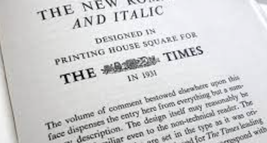
Times New Roman was commissioned by the British newspaper, The Times, in 1931. The goal was to create a new typeface that would be easy to read and conserve space, thus allowing for more content to fit into the newspaper’s narrow columns. Stanley Morison, an influential typographic designer, collaborated with Victor Lardent, a draftsman, to create the font.
The font was officially released by the Monotype Corporation in 1932 and quickly gained popularity not just in newspapers but also in books, magazines, and other printed materials. Its popularity surged in the digital age, becoming one of the default fonts in word processing software like Microsoft Word.
Characteristics of Times New Roman
Times New Roman is a serif font, which means it has small decorative strokes, or serifs, at the ends of its characters. These serifs help guide the eye along the text, making it easier to read. The font is known for its classic, timeless appearance, with a balance of thick and thin strokes that give it a traditional, authoritative look.
One of the key features of Times New Roman is its legibility. The font was designed with readability in mind, making it ideal for long passages of text. Its proportions are carefully balanced, with a moderate x-height (the height of lowercase letters) and open counters (the enclosed spaces within letters like ‘o’ and ‘e’), further enhancing its readability.
The Enduring Appeal
Despite the proliferation of new fonts in the digital age, Times New Roman continues to be widely used for several reasons.
- Familiarity: Times New Roman is ubiquitous. It’s the default font in many word processing programs, which means people are accustomed to seeing it. This familiarity makes it a popular choice for documents where readability and professionalism are paramount.
- Legibility: As mentioned earlier, Times New Roman is highly legible, especially in printed materials. Its serif design helps guide the eye along the text, making it easier to read for extended periods.
- Formality: Times New Roman is often associated with formality and tradition, making it a popular choice for academic papers, legal documents, and other formal communications. Its classic appearance lends a sense of authority and credibility to the text.
- Space Efficiency: Times New Roman is a relatively condensed font, meaning it takes up less horizontal space compared to other fonts. This makes it ideal for documents where space is limited, such as newspapers or academic papers with strict page limits.
- Digital Compatibility: Times New Roman translates well across different digital platforms. It remains readable even at small sizes, making it a practical choice for online content as well as printed materials.
Conclusion
Times New Roman’s enduring popularity can be attributed to its timeless design, excellent readability, and widespread availability. While trends in typography may come and go, this classic font continues to hold its own, proving that good design truly stands the test of time. Whether you’re writing an academic paper, drafting a resume, or designing a website, Times New Roman remains a reliable choice that combines tradition with modern practicality.