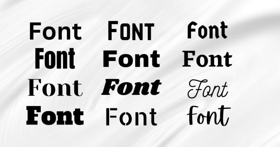
Typography plays a vital role in design, as it sets the tone and conveys the message of a visual piece. One of the key elements in typography is selecting the right font. With a vast array of different fonts available, understanding font classifications can help designers make informed choices. This section will delve into the various font classifications and their unique characteristics.
Different Fonts
Contents
- 0.1 Serif Fonts: Characteristics and Examples
- 0.2 Sans-Serif Fonts: Characteristics and Examples
- 0.3 Script Fonts: Characteristics and Examples
- 0.4 Display Fonts: Characteristics and Examples
- 1 Choosing the Right Font for Your Project
- 2 Pairing Fonts for Visual Harmony
- 3 Exploring Unique and Creative Fonts
- 4 Font Resources and Where to Find Them
- 5 Best Practices for Using Fonts in Design
- 6 Conclusion: Embracing the Art of Typography
Serif Fonts: Characteristics and Examples
Serif fonts are known for their small lines or strokes, called serifs, that extend from the ends of the letters. These serifs provide a classic and traditional feel to the text. Serif fonts are commonly used in print media, such as newspapers and books, as they enhance readability. Examples of popular serif fonts include Times New Roman, Georgia, and Baskerville.
Serif fonts are characterized by their elegance and sophistication. The serifs create a sense of structure and formality, making them suitable for professional documents and traditional designs. However, they might not be the best choice for digital platforms or designs that require a modern and minimalist aesthetic.
Sans-Serif Fonts: Characteristics and Examples
In contrast to serif fonts, sans-serif fonts do not have the small lines or strokes extending from the ends of the letters. This gives them a clean and modern appearance. Sans-serif fonts are widely used in digital media and display screens due to their legibility. Popular examples of sans-serif fonts include Arial, Helvetica, and Open Sans.
Sans-serif fonts are known for their simplicity and versatility. They are often used for contemporary designs and convey a sense of modernity and informality. However, they may not be the ideal choice for formal documents or designs that require a more traditional and elegant look.
Script Fonts: Characteristics and Examples
Script fonts mimic cursive handwriting, with flowing and interconnected letters. They add a sense of elegance, creativity, and personal touch to a design. Script fonts are commonly used for invitations, logos, and artistic designs. Examples of script fonts include Brush Script, Lobster, and Pacifico.
Script fonts are characterized by their decorative and artistic nature. They evoke a sense of sophistication and playfulness, making them suitable for designs that require a touch of flair. However, they may not be the best choice for long paragraphs or small font sizes, as they can be challenging to read.
Display Fonts: Characteristics and Examples
Display fonts are unique and attention-grabbing fonts that are designed to make a statement. They are often used for headlines, titles, and logos to create visual impact. Display fonts come in various styles, such as bold, decorative, or ornamental. Examples of display fonts include Impact, Blackletter, and Stencil.
Display fonts are characterized by their boldness and distinctiveness. They are excellent for attracting attention and creating a memorable visual impression. However, they should be used sparingly and in moderation, as they can overpower the overall design if overused.
Choosing the Right Font for Your Project
Selecting the right font for a project is crucial for effective communication and visual harmony. This section will provide insights and tips on choosing the most suitable font for your specific design needs.
Consider the Purpose and Audience
Before selecting a font, it is essential to consider the purpose of your project and the target audience. Different fonts convey different emotions and messages. For example, if you are designing a formal business report, a serif font might be a better choice to convey professionalism. On the other hand, if you are designing a playful children’s book, a whimsical script font could be more appropriate.
Additionally, consider the readability of the font for your target audience. Ensure that the chosen font is legible at different sizes and on various devices or mediums. If the font is difficult to read, it may hinder the communication of your message.
Maintain Visual Consistency
When selecting fonts, it is crucial to maintain visual consistency throughout your design. Using too many different fonts can create a cluttered and confusing visual experience. Aim for a harmonious balance by limiting the number of fonts used in a single design.
Consider pairing fonts from different classifications that complement each other. For example, a combination of a serif font for headings and a sans-serif font for body text can create a visually appealing contrast. Experiment with different font combinations to find the right balance that suits your design.
Test and Iterate
Typography is subjective, and what may look good to one person may not resonate with another. It is essential to test different fonts and gather feedback from others before finalizing your choice. Create prototypes or mockups to see how the fonts interact with other elements in your design.
Iterate and make adjustments based on the feedback received. Sometimes, a small tweak in font size or spacing can make a significant difference in the overall visual impact. Don’t be afraid to experiment and explore different options until you find the perfect font for your project.
Pairing Fonts for Visual Harmony
Pairing fonts is an art that can elevate the visual appeal of your design. When done correctly, font pairing creates a harmonious and balanced composition. This section will explore different techniques and tips for pairing fonts effectively.
Contrast and Complement
One approach to font pairing is to create contrast between two fonts. Pairing a serif font with a sans-serif font, for example, creates a visual distinction between the headings and body text. The contrasting styles add interest and hierarchy to the design.
On the other hand, font pairing can also be achieved by choosing fonts that complement each other. Selecting fonts from the same classification or with similar characteristics can create a cohesive and unified look. This approach works well when creating a design with a consistent theme or style.
Consider Font Size and Weight
When pairing fonts, it is essential to consider their sizes and weights. Fonts with similar weights can create a balanced and harmonious composition. Avoid pairing fonts with extreme differences in weight, as it can create an unbalanced visual experience.
Additionally, consider the font size hierarchy to establish a clear visual hierarchy in your design. The heading font should be larger and bolder than the body text font to differentiate the levels of importance.
Test for Readability
While font pairing is an opportunity for creativity, readability should not be compromised. Ensure that the paired fonts are legible at different sizes and in various contexts. Test the readability of the text by viewing it on different devices or mediums. If the text becomes difficult to read, consider adjusting the font size, spacing, or selecting a different font combination.
Experiment with different font pairings and seek feedback from others to ensure that the chosen combination enhances the overall visual appeal and readability of your design.
Exploring Unique and Creative Fonts
While commonly used fonts provide a solid foundation for design, exploring unique and creative fonts can add a touch of individuality and style to your projects. This section will introduce resources and methods for finding and incorporating unique fonts into your designs.
Online Font Marketplaces
Online font marketplaces, such as Adobe Fonts and Google Fonts, offer a vast selection of free and paid fonts. These platforms provide search filters and categories to help you navigate through the extensive font libraries. Explore different categories, such as novelty, retro, or futuristic, to find fonts that align with your design vision.
Independent Font Foundries
Independent font foundries are another excellent source for unique and high-quality fonts. These foundries often specialize in creating distinctive and original typefaces that cannot be found elsewhere. Some popular independent font foundries include Hoefler & Co, Lost Type Co-op, and Typofonderie.
Custom Font Design
For truly unique and bespoke fonts, consider working with a professional font designer to create a custom typeface. Custom fonts can be tailored specifically to your brand or project, ensuring a one-of-a-kind visual identity. Collaborate with a font designer to discuss your requirements, preferences, and brand personality to bring your vision to life.
Font Resources and Where to Find Them
In addition to online marketplaces and independent font foundries, several other resources can help you discover and access a wide range of fonts for your design projects. This section will highlight some popular font resources and where to find them.
Font Libraries and Aggregators
Font libraries and aggregators compile fonts from various sources into a single platform for easy access. These platforms offer a vast collection of fonts from different designers and foundries. Some popular font libraries include Fonts.com, MyFonts, and Font Squirrel.
Design Blogs and Websites
Design blogs and websites often curate and showcase unique and inspiring fonts. They provide font recommendations, free font downloads, and insights into the latest typography trends. Some well-known design blogs and websites include Behance, Dribbble, and Creative Market.
Social Media and Online Communities
Social media platforms and online communities dedicated to design and typography are excellent sources for font discovery. Follow designers, typographers, and font foundries on platforms such as Instagram, Twitter, and Pinterest. Engage with the community, ask for recommendations, and share your own font discoveries.
Best Practices for Using Fonts in Design
Using fonts effectively in design requires more than just selecting the right typeface. This section will cover some best practices to ensure the optimal use of fonts in your design projects.
Limit the Number of Fonts
As mentioned earlier, using too many different fonts can create visual clutter and confusion. Aim to limit the number of fonts used in a single design to maintain visual consistency and readability. As a general rule, two to three fonts are usually sufficient to create a harmonious and balanced composition.
Consider Accessibility
Accessibility should be a priority when designing with fonts. Ensure that the chosen fonts are legible for individuals with visual impairments or reading difficulties. Use fonts with clear and distinguishable letterforms, appropriate spacing, and suitable contrast between the text and the background.
Pay Attention to Spacing and Alignment
The spacing and alignment of the text can significantly impact the overall readability and visual appeal of your design. Pay attention to the leading (line spacing), kerning (letter spacing), and alignment of the text. Adjust these parameters to create a balanced and visually pleasing composition.
Use Hierarchy and Emphasis
Font hierarchy is essential to guide the reader’s attention and establish a visual hierarchy in your design. Utilize different font sizes, weights, and styles to differentiate headings, subheadings, and body text. Bold or italicize key words or phrases to add emphasis and draw attention to important information.
Test Across Different Devices and Mediums
Before finalizing your design, test the readability and visual appeal of the fonts on different devices and mediums. View your design on smartphones, tablets, laptops, and print to ensure that the fonts maintain their intended appearance. Make necessary adjustments to optimize the legibility and visual impact across various platforms.
Conclusion: Embracing the Art of Typography
Typography is an art form that can elevate the impact and effectiveness of your design projects. By understanding different font classifications, choosing fonts wisely, and exploring unique options, you can create visually appealing and engaging designs. Remember to consider the purpose and audience, maintain visual consistency, and test your choices to ensure optimal readability and visual harmony. Embrace the art of typography and let it be your guide in creating memorable and impactful designs.